(Also on Sb)
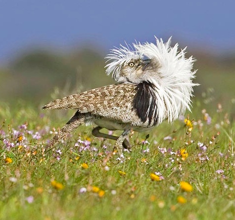
It turns out to be true, at least for bustards, that the fast, flashy life leads to earlier burnout. So what’s my excuse? I dunno.
(Also on FtB)

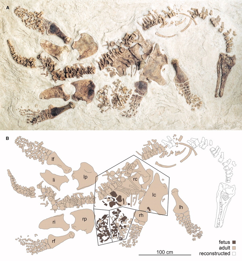
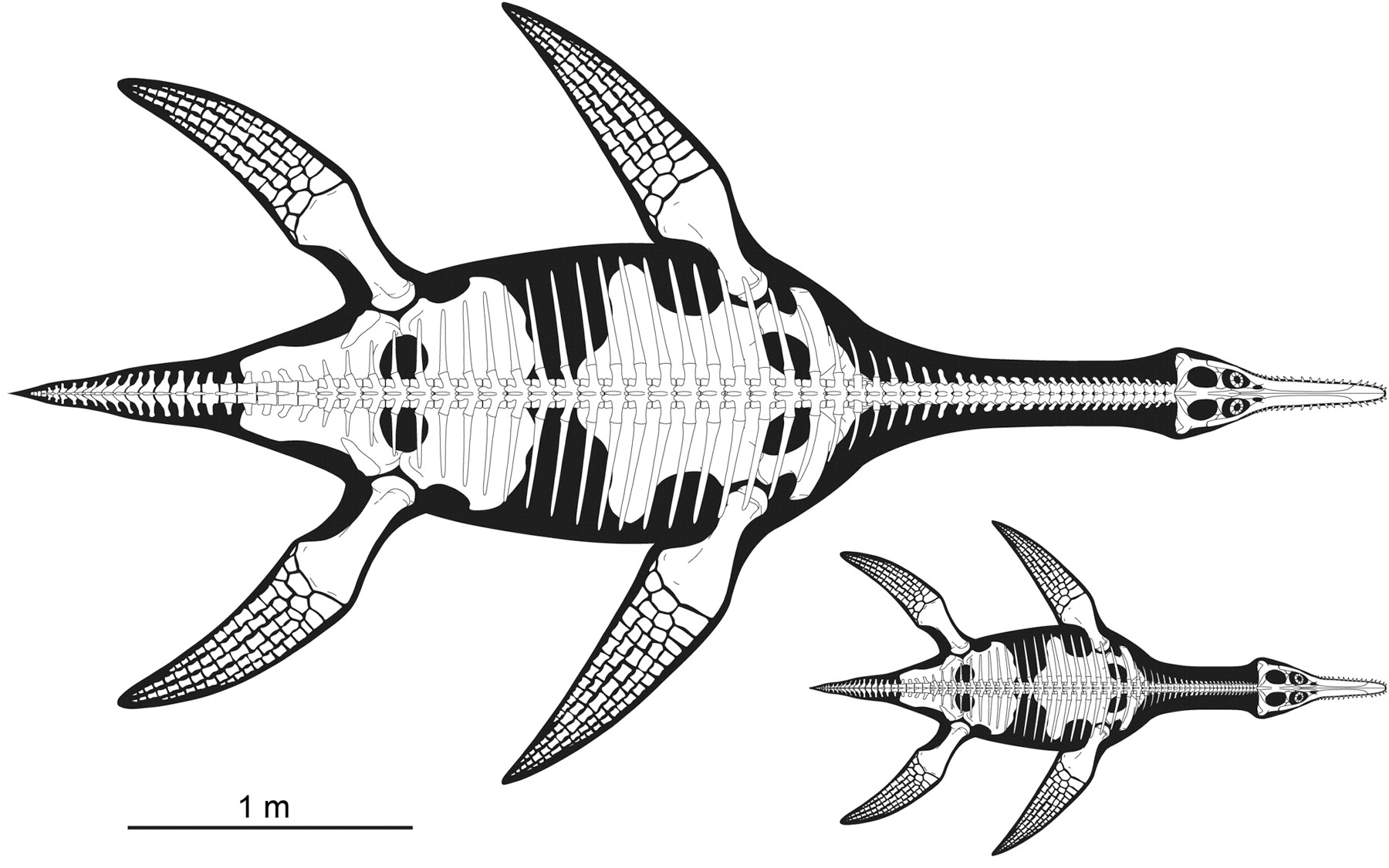
This is one beautiful plesiosaur, Polycotylus latippinus.

The unique aspect of this specimen is that it’s the only pregnant plesiosaur found; the fore and hind limbs bracket a jumble of bones from a juvenile or embryonic Polycotylus. It’s thought to actually be a fetal plesiosaur, rather than an overstuffed cannibal plesiosaur, because 1) the smaller skeleton is still partially articulated, and it’s large enough that it is unlikely it could have been swallowed whole, 2) the two sets are of the same distinctive species, 3) the juvenile is incompletely ossified and doesn’t resemble a post-partum animal, 4) the bones aren’t chewed, etched by acids, or accompanied by gastroliths. I think we can now confidently say that plesiosaurs were viviparous, which is what everyone expected.
There are other surprising details. The fetus is huge relative to the parent, and there’s only one — so plesiosaurs had small brood sizes and invested heavily in their offspring.

The authors speculate beyond this a bit, but it’s all reasonable speculation. That degree of parental investment in fetal development makes it likely that there would have been extended maternal care after birth, and rather more tenuously, that they may also have lived in larger social groups. The authors suggest that their lifestyle may have resembled that of modern social marine mammals — picture a pod of dolphins, only long-necked and lizardy.
O’Keefe FR, Chiappe LM (2011) Viviparity and K-Selected Life History in a Mesozoic Marine Plesiosaur (Reptilia, Sauropterygia) Science 333 (6044): 870-873.
(Also on FtB)

This is one beautiful plesiosaur, Polycotylus latippinus.
The unique aspect of this specimen is that it’s the only pregnant plesiosaur found; the fore and hind limbs bracket a jumble of bones from a juvenile or embryonic Polycotylus. It’s thought to actually be a fetal plesiosaur, rather than an overstuffed cannibal plesiosaur, because 1) the smaller skeleton is still partially articulated, and it’s large enough that it is unlikely it could have been swallowed whole, 2) the two sets are of the same distinctive species, 3) the juvenile is incompletely ossified and doesn’t resemble a post-partum animal, 4) the bones aren’t chewed, etched by acids, or accompanied by gastroliths. I think we can now confidently say that plesiosaurs were viviparous, which is what everyone expected.
There are other surprising details. The fetus is huge relative to the parent, and there’s only one — so plesiosaurs had small brood sizes and invested heavily in their offspring.
The authors speculate beyond this a bit, but it’s all reasonable speculation. That degree of parental investment in fetal development makes it likely that there would have been extended maternal care after birth, and rather more tenuously, that they may also have lived in larger social groups. The authors suggest that their lifestyle may have resembled that of modern social marine mammals — picture a pod of dolphins, only long-necked and lizardy.
O’Keefe FR, Chiappe LM (2011) Viviparity and K-Selected Life History in a Mesozoic Marine Plesiosaur (Reptilia, Sauropterygia) Science 333 (6044): 870-873.
(Also on Sb)

Isn’t it obvious that the story of Planet of the Apes is about apes from one planet dominated by apes finding themselves on a planet dominated by apes of a slightly different species?
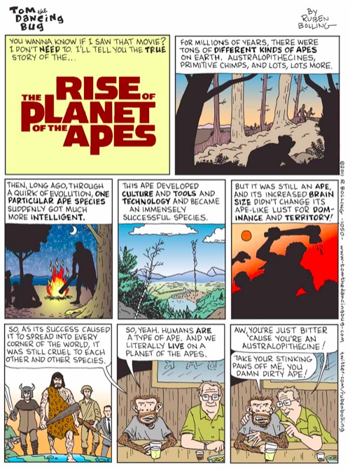
Also, this comic bugs me a little bit: I’m flying off to give a talk in which I argue that the hallmark of human evolution isn’t brutality and conquest, but cooperation.
(Also on Sb)

I’ve had all of these perspectives in my career, so I can tell you that they’re mostly right…except for the one about how professors see themselves. You should just substitute the postdoc:postdoc image for the professor:professor one.
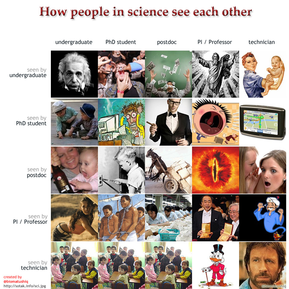
Also, I worked my way through college as an undergraduate technician. Even with my lowly status, I really did see all the undergrads/grads/postdocs as spoiled children who were there only to screw up my lab and my precious experimental animals. Especially when they’d leave a pile of gore and blood and dead animal parts scattered all over the surgery, and expected me to clean it all up.
(Also on FtB)

I’ve had all of these perspectives in my career, so I can tell you that they’re mostly right…except for the one about how professors see themselves. You should just substitute the postdoc:postdoc image for the professor:professor one.
Also, I worked my way through college as an undergraduate technician. Even with my lowly status, I really did see all the undergrads/grads/postdocs as spoiled children who were there only to screw up my lab and my precious experimental animals. Especially when they’d leave a pile of gore and blood and dead animal parts scattered all over the surgery, and expected me to clean it all up.
(Also on Sb)