While I appreciate the perspective on the relative investment in science, SciAm, this is a terrible graphic.
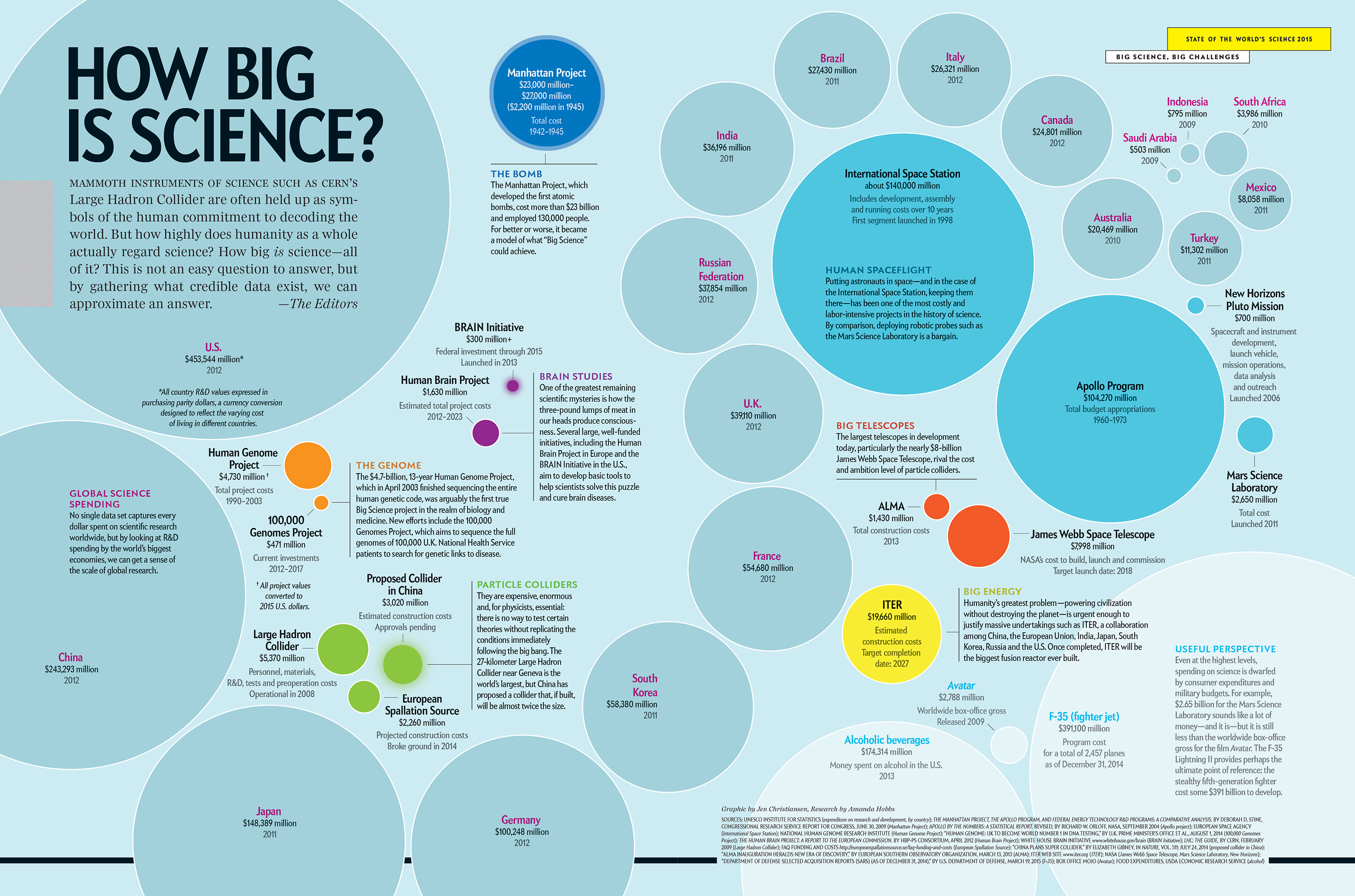
It’s interesting that the total American investment in science is slightly larger than what the military throws away on just the F-35 program, but otherwise, this image has very low information density.
Humans are lousy at comparing surface areas, and here the money spent on each project is represented by…the area of a circle. That’s poor data representation. I’m sorry, but the creator of this graphic is going to be lined up against the wall with the person who invented pie charts.
Each data point is shown as a circle drawn arbitrarily somewhere on the page. There is no information in relative location — I guess the circles were just splotched down in an arrangement that looked good to a graphic designer somewhere. Are there any relationships between any of these data?
Colors are also arbitrary. Nations are in blue, genomes are orange, brains are purple, and telescopes are red. Just because.
There is so little information in this wall of circles that it needs to be helped along with paragraphs of text dumped onto the page in teeny-tiny print, and most of that text doesn’t tell us anything about the relationships between the circles. They are just circles of varying size on a bland blue background.
A tidy table would have been more than adequate for expressing numbers.
Oh, and there is content. Let’s shut down the F-35, give all that money to the NSF, and double the amount of grant money.