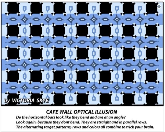
I have always been intrigued by optical illusions, seeing them as providing fascinating insights into how the brain works as well as warnings that what we think we see may not accurately represent what is actually there. I found this illusion (via David Pescovitz) to be particularly intriguing because the contradiction is so stark. You know that the four horizontal blue lines must be parallel because the background black and grey objects are all the same size, and yet to my eyes the top and third line unmistakably slope up to the right while the second and bottom lines slope down.
Since all four lines and the background seem identical, why do two lines seem to slope up and the other two slope down? The only thing that is slightly different is in the little squares at the intersection of the vertical and horizontal lines. In those small squares, the two tiny black squares are arranged either horizontally or vertically and this must be what tricks the brain into seeing the slopes.
This illusion is the creation of magician and illusion artist Victoria Skye who has many more at the link.


The diamond shapes are leaning slightly to the left in lines 1 and 3, slightly to the right in lines 2 and 4.
chigau @1: Yes, I think that’s it. Also, perhaps crucially, the lines meeting the tops and bottoms of the diamonds lean to meet them.
The title has me wondering what my brain would make of it if it were spread over 20 feet or more of wall. 🙂 With the picture we have it looks like the lines should meet a couple inches past the edge.
I also noticed that the blue diamonds and elongated hexagons have leaning lines that go into them. Curious, I fired up a image editor… but removing those elements did not undo the illusion.
It was only by making the two black specks (that Mano noticed) consistent that made the illusion go away.
I think the way it works is this: The specks kind of “extend” the edge of the larger square next to it. When the black specks are vertical, they make that end of the adjacent black square look smaller. When the black specks are horizontal, they make that end of the adjacent black square look larger. Same thing with the white specks and white squares.
This makes the row of black/white squares all look larger on the left, and smaller on the right even though they are not. The direction alternates every row which make it look crooked.
What we found interesting is that if you look at this through eyes that are nearly closed the lines straighten out.