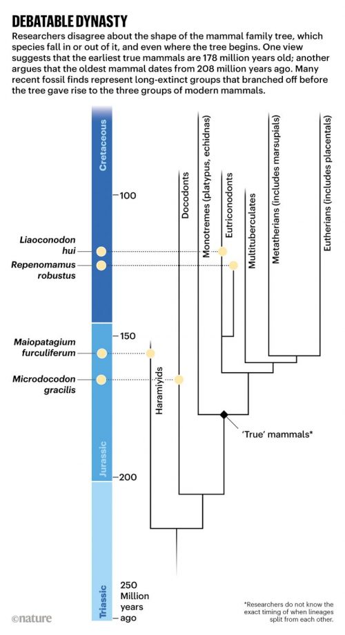
I can’t be the only one who reads outside my discipline to get material to help me cover all those evolutionary phenomena I know little about. I know a bit about fish and arthropods, but my understanding of the details of mammalian evolution is a bit thin — yet for some reason, students are more interested in the history of mammals than of spiders. I really appreciate it when I stumble across information that fills in the gaps in my knowledge in presentable ways, and Nature has done just that with a graphically rich article on How the earliest mammals thrived alongside dinosaurs. There is lots of good stuff here, and I particularly like the emphasis on the importance of fossilized infants. Development matters!
Sometimes it goes a little too far, though — for example, this illustration is way too dense to be useful, but it it interesting.


It’s a bit off-topic, but the fact people like cute furries has serious impacts on things like conservation. Even within mammals, the cuter animals get more of a focus, while more broadly the ‘less cute’ vertebrates are significantly understudied, even though they’re often facing more risks. As for invertebrates…
I don’t know about dense, but that illustration is a mess.
I am on board with you that spiders are cooler than mammals – scientifically at least (for a good chat I still prefer my fellow humans). They are both still only animals though which are nothing compared to the weird and wonderful world of protists and their fascinating taxonomy! :-)
I always wonder about the reproductive strategies of the many extinct groups of mammals.
Mammals are diverse, egg layers, marsupial pouches, and live birth placentals.
So did the extinct groups lay eggs or what?
This is a hard question to answer but not impossible.
AFAICT, it hasn’t been answered yet.
Oh c’mon, Lucas the Spider is a cute series about a cute spider.
PSA
This weeks Nova episode on PBS is entitled Rise of the Mammals.
The dense illustration is a composite of most of the other illustrations in the article itself, which are much easier to parse separately.
There’s nothing wrong with that ‘infographic’ (following an illustration tradition that used to be called ‘posters’). They can be ‘useful’ if presented at an appropriate size and venue, such as a classroom, or to zoom around on at an appropriate scale. Its only ‘way too dense’ if you’re trying to absorb the whole thing at a tiny size like a phone display, but that’s not what its meant to do. Its one image file which makes it convenient to be able to explore all those separate illos in one place at a decent scale. That makes it useful. The artwork/graphics is fairly handsome too, if a tad stiff in spots. Seen far worse.
Well, I’d say that it’s not the density but a) the organization and b) the design principles it mishandles. It has the look of haste and designers trying over hard to ‘wow’ rather than to inform. Sure, it could have been worse; could have been better IMO.
What’s this about furries now?
Why not have the cake and eat it, too?
https://www.google.com/search?q=furry+spiders&tbm=isch
The fact that science can’t tell us whether mammals developed 178 mya or 202 mya is PROOF, PROOF I tell you, that the world is only 6,000 years old and God made us separately from the rest of creation. Not to mention creating light before creating the sun.