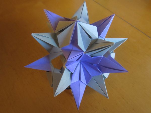
Sparaxis/Bitterroot, designed by Ekaterina Lukasheva
Some context on my origami blogging: I have hundreds of origami photos spanning over a decade. Every month I select one to blog about based on however I happen to be feeling at that moment. You can in fact find all my photos on my Flickr, if you are clever enough to find the link, but that’s a rather different experience.
I don’t follow any pattern in selecting photos, except that I separate the photos that I’ve blogged about and those that I haven’t. One of the consequences of this method is that sometimes it feels like the oldest remaining photos are the dregs. I don’t mean that they’re dregs in the general sense, I mean they’re my personal dregs, the models that I feel least enthusiastic about for one reason or another. So let’s talk about this model from 2014, which I have somehow never selected until now.
Sparaxis and Bitterroot are two different designs by Ekaterina Lukasheva, or rather two variants on the same design. I’m not casting aspersions on these designs, I like them a lot. The problem I have is with my own choices in how to use them. It has an unusual truncated octahedron structure, with 8 flowers, each with 6 petals. 4 of the flowers are Sparaxis (purple), and 4 are Bitterroots (grey). Something that isn’t clear from the photo is the model’s fragility–which is a common consequence of extending an origami design beyond its intended structure.
To top it all off, one of the flowers–facing away from the camera–is black.
It’s certainly unique, but there are way too many things going on. I disliked it the moment I finished it–see how I deliberately concealed the black flower in the photo. If I did it again, I would take just one of these three or four distinct ideas and do them better justice.
Other people still seem to like the model, of course. But I made the thing, I have a right to a critical opinion.

That’s pretty!