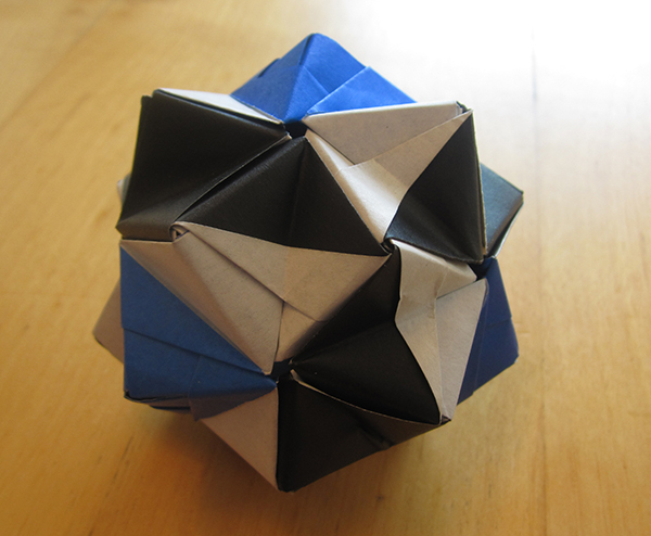
This was built using Ray Cube units, designed by Meenakshi Mukerji, contained in her book, Origami Inspirations.
This model shows how you can take a standard unit, and make something more out of it. First, this is obviously not the cube it was designed to be. Second, the colors form deliberate patterns. It’s not difficult to make, but required a bit of planning.
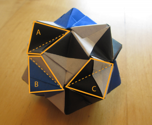
Each of these units ordinarily corresponds to the face of a cube. So they look like squares. To make this model, each square is folded along its diagonal. Here I highlight a few squares, with dashed lines indicating folds:

If I drew out all the dashed lines, they would make the edges of an icosahedron. There are 30 edges on an icosahedron, so this is made of 30 squares of paper.
You may notice that squares A, B, and C are colored differently. A is all black. B is blue on one half, white on the other, with the diagonal fold being along the dividing line between colors. C is black on one half, and white on the other, but the diagonal fold cuts across the colors. This results in blue pyramids surrounded by black and white spirals.
A little exercise: What’s the A:B:C ratio?

I made tons of Bascetta Stars for christmas. They looked way more complicated than they actually are.
@Gilliel,
It looks very nice, and I like the choice of paper. The Bascetta star has identical structure to my ray icosahedron, although because it is pointier it forms a polyhedron known as a great stellated dodecahedron.