

Notes:
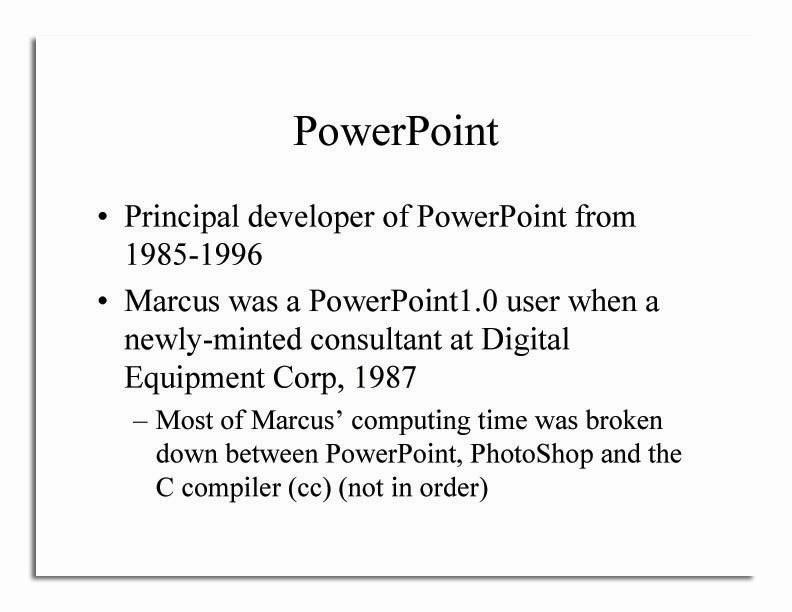
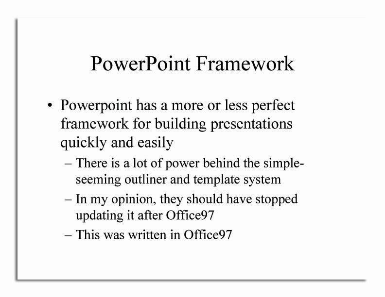
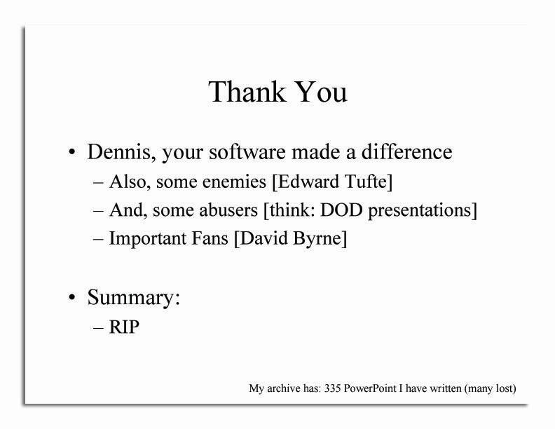
In terms of image size, when I run my save powerpoint process, it generates a PDF using microsoft print-to-pdf, then extracts each page as an image in photoshop, saving them sequentially. It saves the images at default resolution (8) which gives a file that is about 600kb! I then resample that with irfanview into a file that is about 23kb. The difference is substantial!
After Office97, Microsoft kept adding more and more widgets and slowing the software down to the point where it was a pain in the ass to figure out how to do anything. Even a certified PowerPoint Guru like myself had to go to the “search” function to figur out how to insert a footnote, which was just a simple keystroke under Office97. To get any usefulness out of newer versions of Office, you had to invest a lot more time learning the software than using it, which is one of the hallmarks of bad user interface design.
Update:
I should be clear, Austin was not a personal friend of mine. I wrote this obituary because his software had such a big role in my life, and I think it was important to the era that I come from.

Sorry about your colleague. I had forgotten how much I hated the new and improved versions of Office97. Where is my convert to PDF button? Where are all my handy tools? Arrghh, we hates it!
I was never a fan of PP, mainly because I sat through too many bad PP presentations and saw too many professors create the most dull lectures with it, putting every student to sleep. It might have been good code, but the program was perhaps the most misused application I’ve ever seen.
When my college upgraded to the latest version of MS Office in the early 2000s, I hated it so much that I began to look for something else. I’ve used Open Office ever since.
OT: is anyone going to comment of FtB going dark for the last x hours?
https://proxy.freethought.online/pharyngula/2023/09/13/its-alive-3/
It must be my fault FtB went dark. I read this comment, wrote the text below, hit the Post Comment button and FtB was down. Maybe it went down between my reading the post and hitting Post Comment, or maybe it was the ghost of Dennis Austin….
Let’s see if I can take out FtB again. Original comment follows.
—-
PowerPoint. The tool I use the most often at the office.
The replacement for the overhead projector transparencies, which the original PowerPoint format greatly resembled.
While I was in college, the overhead projector was *THE* tool for presentations, both by the instructor and the students.
So when Office 97 showed up, we were prepared for PowerPoint.
Does anyone remember the see-through video displays designed to be used with overhead projectors?
PowerPoint is indeed powerful tool, much abused, currently filled with bloat, but invaluable in the modern office.
I spend a lot of time with my reports teaching them how to generate a useful PowerPoint deck. Stressing simplicity and clarity. Teaching them to keep it simple and never put more than one idea on a slide. To use a cooking metaphor, to never crowd the pan. Teaching them not to read every word on the slide, but to paraphrase each slide because some people learn better by listening and some by reading, but having someone read aloud the words they are also reading tends to pull their focus in two directions with an overall loss of comprehension.
Then I teach my reports how to use the dark-side of PowerPoint. How to obfuscate and skip over inconvenient data. How sometimes, to return to the cooking metaphor, you need to make a gumbo. How every presentation is really selling an idea, so the presentation should stress the data which lead to the conclusion they want, and abridge (but not omit) data which could lead to the conclusion they don’t want. The stuff that Tufte hates (and I admire Tufte greatly), but is often necessary when presenting to non-experts who will choose what appears to be the simplest or cheapest course of action, even if choice is the wrong one.
I never knew who Dennis Austin was, but he changed the world far more than most politicians aspire.
I have a problem with PowerPoint, or at least the vast majority of users and presentations. If I have to sit through another meeting where someone creates a presentation consisting of nothing more than bulleted text, then merely reads the text to the captive audience, I’m going to self immolate right then and there. For all you PP fans out there, please see if you can adhere to this one philosophy: make your presentation slides devoid of text, except for labels and titles. They should be visual enhancements to your spoken words, not a replacement.
sonofrojblake@#3:
OT: is anyone going to comment of FtB going dark for the last x hours?
I suppose it’s interesting.
We’ve been silent about it because it appears to be a simple denial of clue attack that can be implemented against any website, easily. [cyberinsurgency]
TGAP Dad@#6:
For all you PP fans out there, please see if you can adhere to this one philosophy: make your presentation slides devoid of text, except for labels and titles. They should be visual enhancements to your spoken words, not a replacement.
I always used my slides as a mnemonic to remind me what I should be talking about, at that point in time. So my bullet points tended to be sparse and my lecture verbose. I tended toward minimal graphics unless I was trying to make a point about graphics.
I did have a reputation for sometimes cutting up in my presentations, like this, because Edward Tufte:
Then there is the famous “Chicken chicken chicken” talk:
@Marcus #8 ~ Like I said, labels and titles only. Perfect!
#13 ~ That’s hilarious; I can’t believe I’ve never even heard of it before!