A recent FOIA released an archive of NSA motivational posters.
The entire archive (it’s fascinating) is on governmentattic [ga]
When I worked at Trusted Information Systems in the early 90s, a lot of the company staff were ex-NSA; about 80% of them, in fact. Many of these ‘motivational posters’ hung non-ironically in offices.
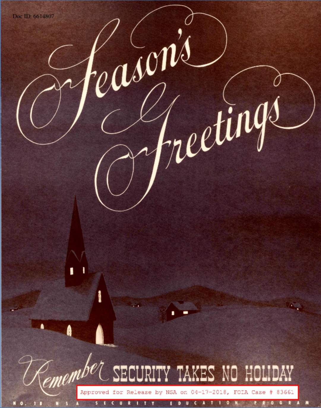
I wonder who designed them, and whether they believed in what they were doing? Probably. The NSA tends to recruit blindly ultra-nationalist staff, and a great deal of evangelicals, too.
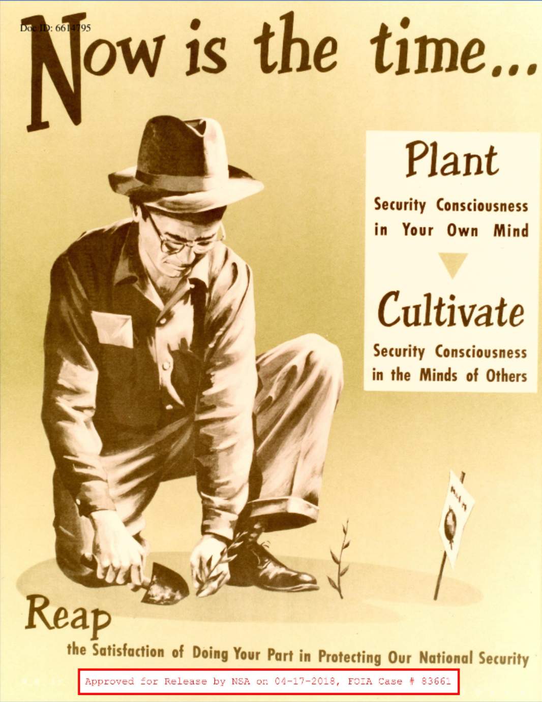
I wish the stupid release marks were not present (yes, I know: photoshop) – these would be pretty fun to print with one of those “instant print” services and hang up all over the walls at my studio.
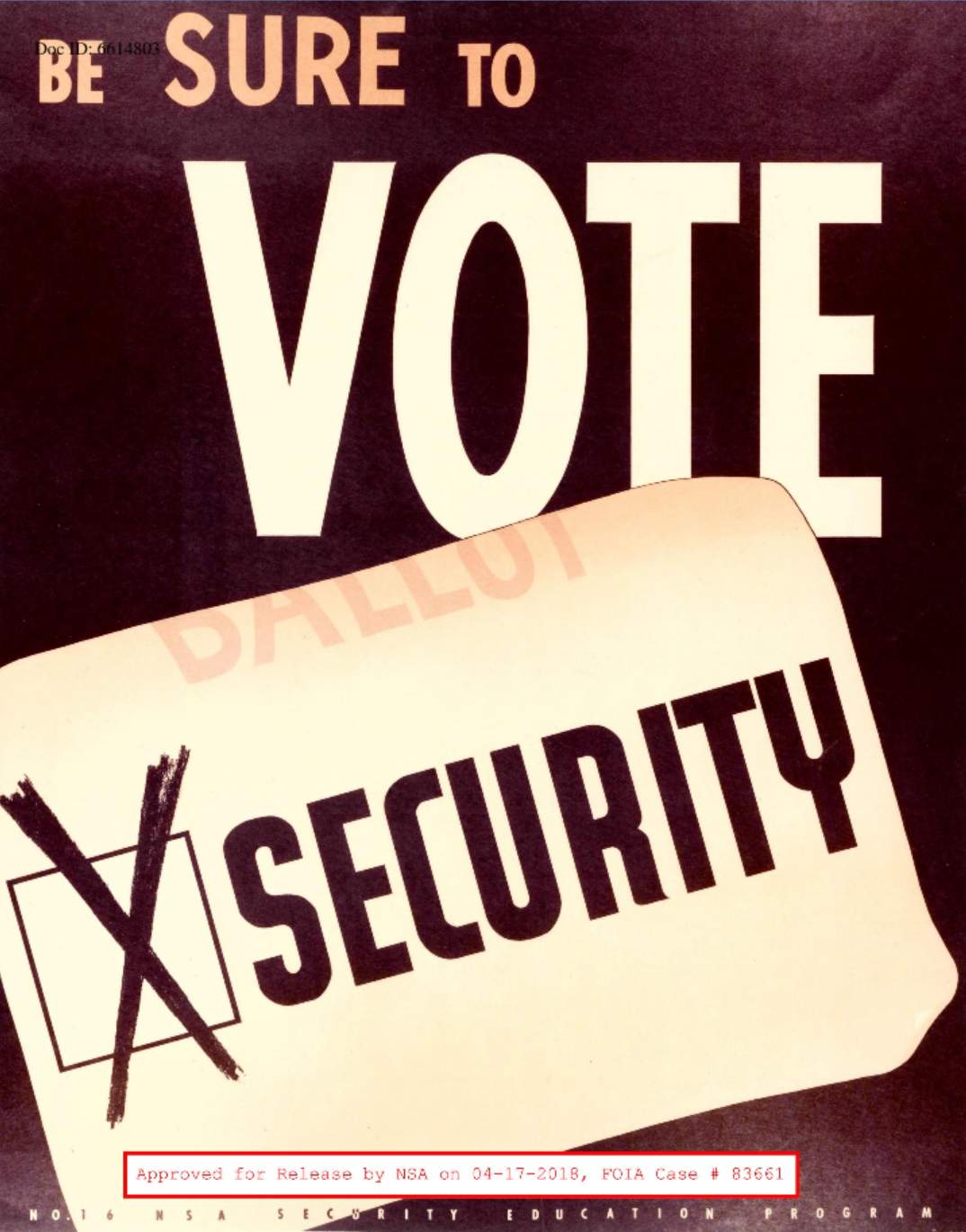
What security guy can’t get behind that message? Joking aside: we’ve been warning about voting machine security for almost 20 years now. It’s as if the powers in office want to be able to decertify a vote any time they, uh… uh oh.
This one is good: The primacy of the individual is a lie – The State is everything! Trust big brother.
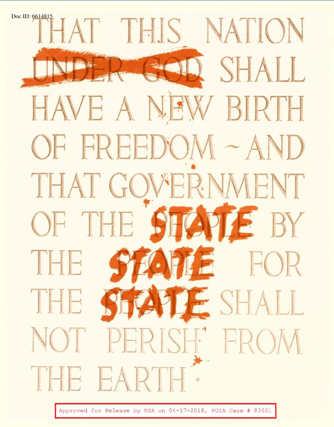
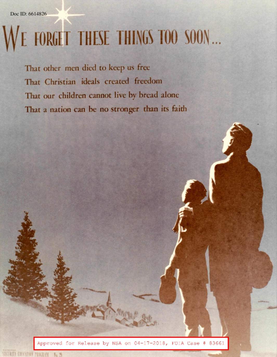
And lest ye be thinking “hey, progressive atheism!” – don’t worry. The poster archive includes lots of christian nationalism:
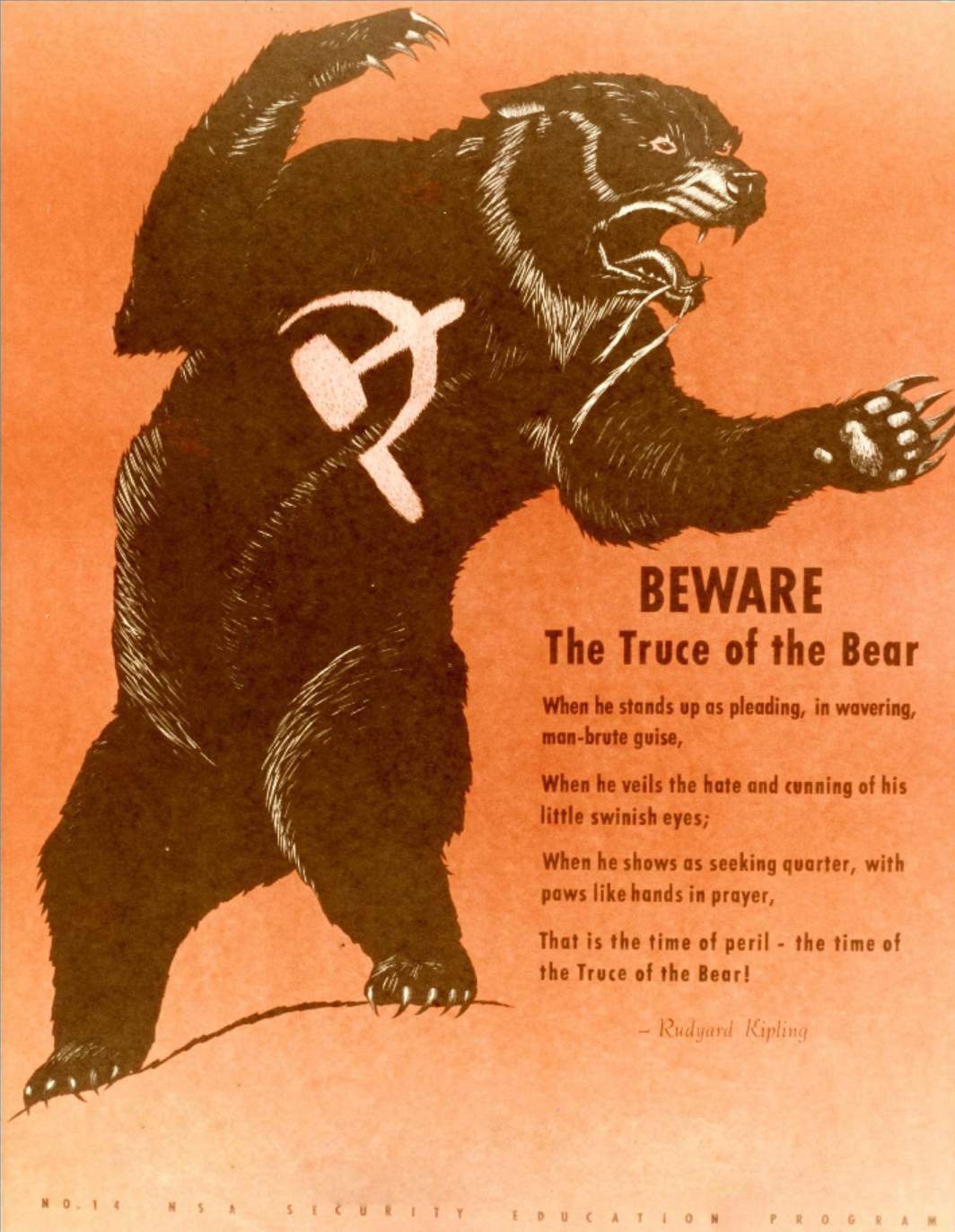
And Russians! Russians are evil! Because they are Russians! One of the core values of the US is its racism; it goes hand in hand with ultra-nationalism and imperialism: they serve to feed each other. Remember, Russians are evil because they do propaganda!

Whatever it was that the creators of these posters were ingesting …
I.do.not.want.
Yay! This was so fun! My favorite poster was the one with words, “Men must be governed by God or they will be ruled by tyrants” on page 21. It’s my favorite because of how many things are just so wrong with it.
In my school’s history curriculum we looked at Soviet propaganda posters. Thus I learned that totalitarian states hire artists to draw stupid propaganda posters. It was only years later that I learned about American propaganda posters. Whoops! Just how exactly was the USA supposed to be better than those evil communists? The similarities between American and Soviet propaganda posters are so charming. I can never get bored of comparing them.
Here are the Soviet equivalents:
https://avatars.mds.yandex.net/get-pdb/477388/0bd8a268-6f73-47c5-9197-0ea52d194ccb/orig This one says: “Don’t chat” (large letters). The smaller text on top says, “Always be careful, in such days the walls are listening. It is not far from the chatter and gossiper to the traitor.”
https://i.pinimg.com/originals/7f/6f/86/7f6f86a4beb31d16d44876fe6f0fe1c7.jpg Translation: “Don’t chat on the telephone—a gossiper is a find for the spy.”
https://i.pinimg.com/originals/b5/dd/a1/b5dda1bee555b3d4ecd79b30d7f4e936.jpg Translation: “To chat is to help the enemy.”
http://img11.nnm.me/7/d/a/3/b/fbd226c073aaf40fc0b4c45bb47.jpg Translation: “A gossiper is a find for the enemy.”
All of these posters use the Russian verb болтать, which is a bit tricky to translate. I could try to translate it with words “chat,” “gossip,” “chatter,” “talk,” but neither is an accurate translation. The Russian word has very negative connotations, it refers to trivial talk that is pointless, unnecessary, wasteful, or, alternatively, talk that gives incorrect information.
This time I actually prefer the Soviet. . . Hmm. . . Should I even use the word “equivalents” this time? This one, for example: https://i.pinimg.com/originals/e8/05/dd/e805dd72f42fe386811ce5c66c40dd04.jpg Translation: “Religion is a poison. Guard the children.” Notice the background. On one side there’s a crumbling church, on the other side there’s a school.
Hmm. . . Some of the Soviet anti-American posters were way better than this bear drawing.
http://image1.thematicnews.com/uploads/images/00/00/41/2016/03/29/19c4b0.jpg Text on the scarecrow: “Soviet danger.” Text on the money bag: “NATO.” Text on the bottom: “How one man fed two generals.”
https://azeri.today/media/articles/original/adebec6c193769a1f3a26233b36199de.jpeg Text on the bottom: “Freedom in the American style.” Upper left: “Freedom of the press.” Lower left: “Freedom of opinion.” Upper right: “Freedom of the person.” Lower right: “Freedom to gather and protest.”
http://image3.thematicnews.com/uploads/images/00/00/41/2016/03/29/58c4528cdc.jpg Upper: “Myth.”Lower: “And reality.”
http://image1.thematicnews.com/uploads/images/00/00/41/2016/03/29/77b86543fb.jpg From left bottom corner, clockwise: “Terror. Racism. Aggression. Neocolonialism. Espionage.”
http://image2.thematicnews.com/uploads/images/00/00/41/2016/03/29/5200303d70.jpg Translation: “American anti-soviet hysteria.” I love the art here. It’s so funny. And, as an added bonus, the message in this poster is sort of true.
http://image3.thematicnews.com/uploads/images/00/00/41/2016/03/29/d1532e2417.jpg Translation: “The shame of the United States.” This one is so damn true. Incidentally, it’s not like the Soviet Union didn’t have similar problems. Citizens who weren’t white and Russian were discriminated against.
http://image1.thematicnews.com/uploads/images/00/00/41/2016/03/29/17b55f19be.jpg Bottom: “There only the rich experience plentitude. We are trying to ensure plentitude for everybody.” Upper corner: “About 20 million Americans do not have the means to buy more than one liter of milk per month and consume more than 6 kilograms of meat per year.” Incidentally, it’s not like in the Soviet Union all the poor people had access to good nutrition. . . In fact, many of them were malnourished.
http://image1.thematicnews.com/uploads/images/00/00/41/2016/03/29/fb14212899.jpg Top: “Wallet or life.” Lower left: “In the country of the heartless rich, illnesses are a business for the doctors.” Lower right: “You give them your wallet, or else you lie down and die.”
http://image2.thematicnews.com/uploads/images/00/00/41/2016/03/29/5e93b98633.jpg Translation: “If this can be called the free regime, then what else can be called a prison?”
The interesting thing about these posters is that they are either somewhat true, or they at least make valid criticism about the capitalism. That’s a hell lot better than simply drawing a scary picture of a bear.
Wow. Those are fucking awful. Like, something out of a low-budget straight-to-video sci-fi dystopia awful.
Ieva Skrebele@#2:
My favorite poster was the one with words, “Men must be governed by God or they will be ruled by tyrants”
As you say, so many things wrong with it. Even the size/length of the guy’s arquebus is wrong.
Dunc@#3:
Wow. Those are fucking awful. Like, something out of a low-budget straight-to-video sci-fi dystopia awful.
Soviet propaganda is better. Some of the art in it is really lovely design.
chigau:
Whatever it was that the creators of these posters were ingesting …
I.do.not.want.
I think they were mainlining nationalism and snorting a big line of religion on top of it. Maybe washing it down with some cheap red wine.
I don’t know. I’ve never been that messed up.
The NSA posters are very instructive. Some of them are frightening, in a very John Fowles’s The Collector kind of way (that was one of the scariest books I’ve read). Some are ridiculously weak. The Russian bear is the wrong species (the Eurasian brown bear has a brown snout, same color as the rest of its fur).
The soviet posters are aesthetically superior. I think they were deluding themselves about the spies, much like the semi-illegal Communist activist of the old joke: “semi” because he was in hiding, but nobody was looking for him. The ones about America are mostly true, but boy are they a textbook case of the pot calling the kettle black. Maybe the Soviet Union did not starve its citizens by making food expensive: they did it by famine caused by taking away all the land from the farmers (and killing or imprisoning everyone who disagreed) and by disastrous politically-motivated planning (and killing or imprisoning everyone who disagreed). Racism, lack of freedom of the press, personal liberty violations: they did them differently, but they were better at those too.
You’d think the Soviets were better than the US at propaganda, but I’d say no. America has them beat. In the Soviet Union, it was clear what was propaganda, and most people were aware it was likely false, or at least misleading. Sure, with relentless repetition, a little seeped in, but, largely, the citizens were in on it and had no illusion that the regime was anything but self-serving and corrupt. In the US, I would go on a limb and say that most people used to buy into most of the lies, and a majority still do.
In other words, American propaganda is to Soviet propaganda like very convincing native advertising to annoying pop-up ads.
Of course. However, before we start criticizing the artist for failing to correctly draw an arquebus, there’s a more basic question to ask, namely, why the hell is there an arquebus in the first place? The poster was meant to depict happy people who are governed by God. What do they need guns for? You know, guns are what tyrants use in order to rule over others. . .
Saying that Soviet propaganda is better is a rather broad statement, and I do not think that it’s accurate. Some Soviet posters are very well drawn and artistically really good. Many others are plain ugly and poorly done. It depends. In my comment I gave links to those posters, which, in my opinion, seemed interesting. I basically offered a curated selection of the ones that seemed better in my eyes. When I look at Russian websites hosting huge archives of Soviet propaganda posters, most of the posters I see there really suck. When I look at English websites talking about Soviet propaganda posters, what I see there is always curated content (and not an archive where thousands of posters are just dumped for me to sort through). The person who selected and translated the posters picked the ones, which they liked (and which also tend to be artistically better).
By the way, I really liked that poster with the steaming teapot faces. It’s funny, the idea was good, and it’s also quite well drawn. I also liked the “Religion is poison” poster. The dynamic poses and body language there is really good. There’s another reason for me liking this poster. The face of that old lady who symbolizes religion and its preachers reminds me of how Baba Yaga is usually drawn in Russian children’s books. Baba Yaga is something similar to a witch (https://en.wikipedia.org/wiki/Baba_Yaga). She is portrayed as an old ugly woman. In modern Russian children’s books and fairy tales she is generally portrayed as evil. When she appears as a character is a fairy tale, she tends to be the villain. I don’t know whether the artist did this intentionally. Maybe it’s just me seeing that old lady as resembling an evil witch figure from the fairy tales, but I really like the idea of drawing preachers in such a way that they look like an evil witch. Just think about all the symbolism you get once you compare preachers with an evil witch figure from the folklore. After all, just like Baba Yaga also Christianity is nothing but mythology.
cvoinescu @#7
Yep. However, when looking for some interesting posters, I intentionally picked the ones, which were well drawn. I happen to work as an artist. Thus, whenever I see some piece of propaganda, I pay a lot of attention to how well it was drawn.
Yes, of course you are correct here.
The thing I liked about these anti-American posters was that they, at least, offered legitimate criticism and pointed to actual problems within the USA. Compare that with the American poster where they simply drew a scary looking bear and said that you must fear the communists, because. . . err. . . for some reason. I really feel disappointed with American anti-Soviet propaganda. There were so many things wrong with the Soviet Union. There was so much room for legitimate criticism. I don’t even know where to start. Famines, ethnic cleansing, Gulag camps, deportations and relocation of ethnic minorities in order to speed up the involuntary Russification, discrimination of non-Russians, totalitarianism, lack of even basic freedoms, mass executions, mistreatment of political prisoners. . . I could go on and on with this list. There were such ample opportunities for the American propagandists to make valid criticism about how the Soviet system sucked. But no. They just drew a picture of a scary looking bear. WTF?
Ieva Skrebele@#8:
The poster was meant to depict happy people who are governed by God. What do they need guns for?
For to do genocide, of course!
The ones that emphasize security remind me of the “careless talk costs lives” theme of WWII posters.
As for the gun being a symbol of tyranny, remember that in the American mythos or worldview guns are often seen as a symbol of resisting tyranny, rather than a symbol of tyranny. I tend to think that propaganda is at its most effective when it reinforces ideas that are already fairly common in the culture that it’s aimed at.
It is very ironic, though, that the quote about God and tyranny below the man carrying a gun comes from William Penn, a Quaker. Quakers of course were noted for pacifism – one of the subcultures in the US that did not have a positive view of guns!
Ieva Skrebele@#8:
True. It’s unfair to compare your selection, drawn out of probably thousands, with the bulk yield of a FOIA request.
The anti-American Soviet propaganda also criticized exaggerated, imagined, or made-up problems, so it was not exactly legitimate all the time. By selecting good posters, you probably chose the better criticisms too, that is, the ones that were true.
But your point stands. While the Soviet propaganda does not shame from relying on emotion (the propagandists would be in dereliction of their duty if they did), it seems to try to make a rational case. As you say, the American anti-Soviet propaganda seems free of both logical thought and empathy for the people suffering under the regime. It’s much closer to Two Minutes Hate in its approach: look, Soviet Russian bear! Hammer and sickle! Red!! Gnash!!! AAARGH! RAAAAAARGH!!1! Puff. Wheeze. Long pause. What were we talking about?
I am wondering what the Kipling poem was about — was it about real, actual bears, or was he referencing Russia even before the revolution?
I see that Russia has been symbolized by a bear for a long time, and here’s some pre-Russian revolution bear imagery
Hm. Kipling’s full poem certainly looks like it’s about an actual bear — but it is set in India, and Russia was Britain’s rival in India at the time Kipling was writing, and I have read Kim, which more explicitly references that rivalry (although I can’t recall any bear imagery).
(Of course, at the time Kipling was writing, Russia was Tsarist, not Communist, so . . . Russia is essentially bear-like in nature?)
Ieva @#:
I’d like to mention the ‘Wall Street’ inscription in the background, in cyrillic.