Ridiculously Complex

Things have gotten quiet over here, due to SIGGRAPH. Picture a giant box of computer graphics nerds, crossed with a shit-tonne of cash, and you get the basic idea. And the papers! A lot of it is complicated and math-heavy or detailing speculative hardware, sprinkled with the slightly strange. Some of it, though, is fairly accessible.

This panel on colour, in particular, was a treat. I’ve been fascinated by colour and visual perception for years, and was even lucky enough to do two lectures on the subject. It’s a ridiculously complicated subject! For instance, purple isn’t a real colour.

The visible spectrum of light. Copyright Spigget, CC-BY-SA-3.0.

Ok ok, it’s definitely “real” in the sense that you can have the sensation of it, but there is no single wavelength of light associated with it. To make the colour, you have to combine both red-ish and blue-ish light. That might seem strange; isn’t there a purple-ish section at the back of the rainbow labeled “violet?” Since all the colours of the rainbow are “real” in the single-wavelength sense, a red-blue single wavelength must be real too.

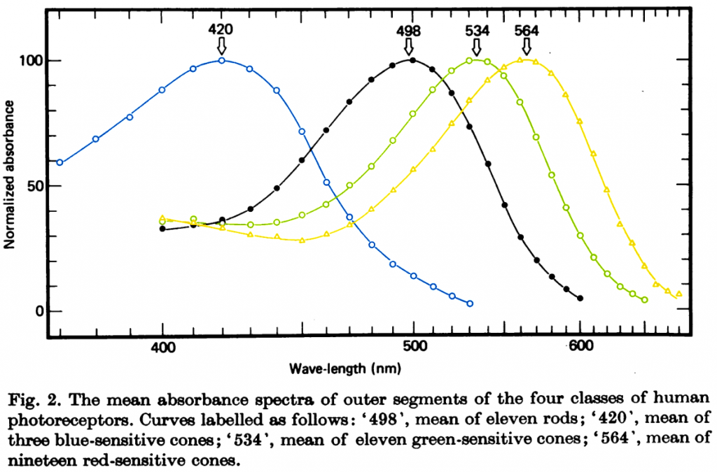
It turns out that’s all a trick of the eye. We detect colour through one of three cone-shaped photoreceptors, dubbed “long,” “medium,” and “short.” These vary in what sort of light they’re sensitive to, and overlap a surprising amount.

Figure 2, from Bowmaker & Dartnall 1980. Cone response curves have been colourized to approximately their peak colour response.

Your brain determines the colour by weighing the relative response of the cone cells. Light with a wavelength of 650 nanometres tickles the long cone far more than the medium one, and more still than the short cone, and we’ve labeled that colour “red.” With 440nm light, it’s now the short cone that blasts a signal while the medium and long cones are more reserved, so we slap “blue” on that.

Notice that when we get to 400nm light, our long cones start becoming more active, even as the short ones are less so and the medium ones aren’t doing much? Proportionately, the share of “red” is gaining on the “blue,” and our brain interprets that as a mixture of the two colours. Hence, “violet” has that red-blue sensation even though there’s no light arriving from the red end of the spectrum.

To make things even more confusing, your eye doesn’t fire those cone signals directly back to the brain. Instead, ganglions merge the “long” and “medium” signals together, firing faster if there’s more “long” than “medium” and vice-versa. That combined signal is itself combined with the “short” signal, firing faster if there’s more “long”/”medium” than “short.” Finally, all the cone and rod cells are merged, firing more if they’re brighter than nominal. Hence where there’s no such thing as a reddish-green nor a yellow-ish blue, because both would be interpreted as an absence of colour.

I could (and have!) go on for an hour or two, and yet barely scratch the surface of how we try to standardize what goes on in our heads. Thus why it was cool to see some experts in the field give their own introduction to colour representation at SIGGRAPH. I recommend tuning in.


A Little Racist Butterfly

Researchers have noted that, for decades, prison sentences have been just ever-so-slightly more harsh for black people than white people.

As a whole, these findings undermine the so-called ‘‘no discrimination thesis’’ which contends that once adequate controls for other factors, especially legal factors (i.e., criminal history and severity of current offense), are controlled unwarranted racial disparity disappears. In contrast to the no discrimination thesis, the current research found that independent of other measured factors, on average African-Americans were sentenced more harshly than whites. The observed differences between whites and African Americans generally were small, suggesting that discrimination in the sentencing stage is not the primary cause of the overrepresentation of African-Americans in U.S. correctional facilities.

Mitchell, Ojmarrh. “A meta-analysis of race and sentencing research: Explaining the inconsistencies.” Journal of Quantitative Criminology 21.4 (2005): 439-466.

Not as widely noted: incarceration sorta behaves like a contagious disease. [Read more…]

Continued Fractions

If you’ve followed my work for a while, you’ve probably noted my love of low-discrepancy sequences. Any time I want to do a uniform sample, and I’m not sure when I’ll stop, I’ll reach for an additive recurrence: repeatedly sum an irrational number with itself, check if the sum is bigger than one, and if so chop it down. Dirt easy, super-fast, and most of the time it gives great results.

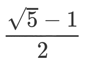
But finding the best irrational numbers to add has been a bit of a juggle. The Wikipedia page recommends primes, but it also claimed this was the best choice of all:\frac{\sqrt{5} - 1}{2}

I couldn’t see why. I made a half-hearted attempt at digging through the references, but it got too complicated for me and I was more focused on the results, anyway. So I quickly shelved that and returned to just trusting that they worked.

That is, until this Numberphile video explained them with crystal clarity. Not getting the connection? The worst possible number to use in an additive recurrence is a rational number: it’ll start repeating earlier points and you’ll miss at least half the numbers you could have used. This is precisely like having outward spokes on your flower (no seriously, watch the video), and so you’re also looking for any irrational number that’s poorly approximated by any rational number. And, wouldn’t you know it…

\frac{\sqrt{5} - 1}{2} ~=~ \frac{\sqrt{5} + 1}{2} - 1 ~=~ \phi - 1

… I’ve relied on the Golden Ratio without realising it.

Want to play around a bit with continued fractions? I whipped up a bit of Go which allows you to translate any number into the integer sequence behind its fraction. Go ahead, muck with the thing and see what patterns pop out.

Computational Propaganda

Sick of all this memo talk? Too bad, because thanks to Lynna, OM in the Political Madness thread I discovered a new term: “computational propaganda,” or the use of computers to help spread talking points and generate “grassroots” activism. It’s a lot more advanced than running a few bots, too. You’ll have to read the article to learn the how and why, but I can entice you with its conclusion:

The problem with the term “fake news” is that it is completely wrong, denoting a passive intention. What is happening on social media is very real; it is not passive; and it is information warfare. There is very little argument among analytical academics about the overall impact of “political bots” that seek to influence how we think, evaluate and make decisions about the direction of our countries and who can best lead us—even if there is still difficulty in distinguishing whose disinformation is whose. Samantha Bradshaw, a researcher with Oxford University’s Computational Propaganda Research Project who has helped to document the impact of “polbot” activity, told me: “Often, it’s hard to tell where a particular story comes from. Alt-right groups and Russian disinformation campaigns are often indistinguishable since their goals often overlap. But what really matters is the tools that these groups use to achieve their goals: Computational propaganda serves to distort the political process and amplify fringe views in ways that no previous communication technology could.”

This machinery of information warfare remains within social media’s architecture. The challenge we still have in unraveling what happened in 2016 is how hard it is to pry the Russian components apart from those built by the far- and alt-right—they flex and fight together, and that alone should tell us something. As should the fact that there is a lesser far-left architecture that is coming into its own as part of this machine. And they all play into the same destructive narrative against the American mind.

Democracies have not faced a challenge like this since yellow journalism.