Tegan Tuesday: When online mobs turn wholesome

There’s a lot going on this week in personal life, in the wider world, and in the internet world. So I thought I’d share a heartwarming story from tumblr. I’ve been a tumblr user since 2012 or so, as has probably been obvious by the amount of tumblr threads that I’ve shared, and it is a very specific culture. A lot of it is silly, a lot of it is incredibly intelligent, and most of it is anonymous.

On October 27th, tumblr user Aquila Calvitium posted this:

https://aquilacalvitium.tumblr.com/post/699296989413785600/okay-fuck-it-if-this-post-reaches-666k-notes-by

This user had never had a text post of theirs get more than a dozen notes, so betting against almost 700,000 notes felt like a sure bet and a funny little joke amongst their friends. Unfortunately for Aquila Calvitium, tumblr loves a challenge. The first several thousand notes were simply people reblogging the post with the air of ‘haha sucker! We’ll fix you!’ Tumblr user LizLuvsCupcakes stated the general vibe:

Well, OP, I’m officially invested in this shit. Your whiny ass is doing self care if I have to drive to your goddamn house and do it for you.

By October 30th, Aquila Calvitium had moved the deadline to the end of 2022. This still seemed like an unachievable goal.

Then after a discussion about throwing an osage orange at OP between users Headspace-Hotel and TheLeakyPen, user LaineysBucketList offered a gamechanging idea:

We should just fill this post with other interesting things as reasons to reblog it.

Within the versions of this post I’ve seen discussions of hagfish slime used as an egg white substitute; infodumping about beryls; the axial tilt of Venus; and many other interesting random facts from the interesting and random users of tumblr. This collection of smart people with wildly different interests posting informally and anonymously is one of the reasons why I still love tumblr. It’s where academics (formal and informal) go to infodump.

Another update from OP happened on November 4th.

I was going to wait until y’all hit the mark, But I feel like I should say this now
When I made this post, it was supposed to be a joke
I mean, none of my posts ever get more than 20 notes if I’m lucky, so what are the odds of one reaching 666k? Impossible, haha
But then, something happened, something I didn’t expect
People actually began to… like it? And… reblog? And comment?
Before I knew it, my notifications were swarmed with comments after comments after reblogs after comments all on this one post
Then, still in the mindset of this being a joke, I realised I’d made the goal too easy, so I upped the stakes
But… the notes just got more frequent from there
And it started to hit me just what was happening

[Editor’s note: there are inserted screenshots of comments like “i Will reblog this every time i see this. you WILL do self care op,” “how does nihilism still exist. when tens of thousand of people can band together to make a stranger take care of themself,” and “get self care’d idiot <3.”]

For a while, I was overwhelmed with a feeling
A feeling I wasn’t used to
It was like… all of a sudden… I mattered…
My existance was actually noteworthy
People actually… cared?
It wasn’t a game anymore, it was a race to assure a stranger on the Internet that they were actually worth something
Hundreds of people all gathering in one online place to help out
Leaving messages and well wishes
Making me smile
Making me laugh
Funny comments
Jokes
Fun facts
Even simple comments
It all suddenly felt so real
This was never a joke to you
This was important
And I won’t let any of that go in vain
So… stay tuned I suppose
I’ll look after myself, and I’ll post proof of it too
I’ll catalogue every time I put my health first
Physical and mental
I’ll acknowledge my bad days and celebrate my good days
But most of all
I won’t forget this
Any of this
Ever

I am happy to report that today, November 8th, 2022, was the first day of self-care for the original poster. Yesterday, a mere eleven days after the first post, we went over 666,000 notes. As of writing, there are over 697k. Here is OP’s first post about self care.

https://aquilacalvitium.tumblr.com/post/700357376093667329/starting-today-on-the-8th-of-november-2022-the

Aquila Calvitium, who normally has problems eating properly, made themselves a sandwich and hung out with their family. Three cheers to OP! I hope their sandwich was tasty and that their beginning steps for self care and self maintenance take off. And if the news you see in the world is cold and unfeeling, remember how thousands of anonymous people pulled together to convince a stranger that their life matters. The world can be a wonderful place, if we let ourselves see it.

Tegan Tuesday: A Semple Solution to Corporate Greed

It has been 0 days since fresh nonsense from Adobe. This round of unfriendly-to-users action is a team effort between Adobe and Pantone, both. Effective today, Pantone colors are paywalled and any programs that run with Pantone colors, like Adobe Photoshop and Illustrator, no longer work without a monthly subscription (the author of the above tweet mistook USD for AUSD, and later corrected to say that the price is AUS$21/month, or US$15). This is part of a larger trend from tech in general and Adobe in particular. You can only use the approved programs our technofeudal overlords tell us to use, in the manner that they require us to do so, or you are not only courting being out of step with industry standards (like the Pantone/Adobe situation) but you are in danger of felony charges if you alter a program to better suit your uses or budget.

A full breakdown of the situation by Cory Doctorow can be read here, and I do recommend reading his work if you haven’t yet – he’s probably one of my favorite non-fiction writers today. For this post, the short answer on why this is so tragic for digital artists requires looking into both Adobe and Pantone as companies and integral components of modern visual art.

It should be well-understood at this point that Adobe is a household name for digital image software. However for nearly a decade Adobe has used a Software as a Service (SaaS) model, with subscription fees forever. The days of just buying a program and being done with it are dead and buried, and Adobe has always been one of the worst offenders. This means that any changes to the program or the licensing go into effect immediately with no option to roll back to a previous version. Funnily enough, the first place that I’d ever heard about the old trick of changing the clock on your computer to a time before your license expired was in order to use Adobe products. The way Adobe got around this well-known hack? They got rid of the ability to use the program without web access so there’s no opting out of updates and license expirations. I’ve always been a little resentful when I lose a sneaky little computer trick, and Adobe’s been in my black books for decades for this and similar moves against users. It’s also fairly expensive AND the industry standard. Gotta love monopolies; Adobe also has the same hobby as other monopolies, buying their competition.

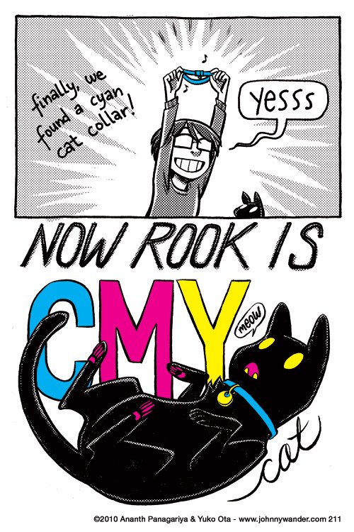
Why is Pantone in particular so important? The fact is that they have been the industry standard for physical and digital prints since the 1960s (even colored filters and films for stage lights are often described and ordered using Pantone colors). Part of working with Pantone is a very specific color blend, and, for physical printing, even the formula for making the ink or pigment. The company and their proprietary color system have been deeply embedded into every field that cares which particular red goes where. As Doctorow points out in his article on the situation, however, it also goes beyond that. Normal print is based around the combination of Cyan-Magenta-Yellow-blacK, or CMYK.

A strip from webcomic Johnny Wander, showing how with the addition of a cyan collar, their black cat ‘Rook’ is fully CMYK compliant with yellow eyes and ID tag, and magenta mouth and toe beans.

But Pantone also uses over a thousand ‘spot colors’ which can include fluorescents, metallics, pastels, and any number of colors not found in traditional CMYK printing. Beyond industry uses, Pantone is also fairly important culturally. Since 2000 the company has declared a Color of the Year (2022 is Very Peri) which impacts interior design, fashion, and cosmetics. Pantone colors are also specified for country flags, to ensure ‘brand standard’ across printing and manufacturing of materials for or with flags (the US flag uses Blue PMS 282 and Red PMS 193, also known as #002868 and #BF0A30 in hex). Pantone and its proprietary color system would be incredibly difficult to root out of modern culture, which means this move to a subscription model is devastating.

Unsurprisingly, many guides or alternatives around Pantone restrictions have already sprung up. A number of designers on Twitter were wondering if this is perhaps their push to move away from Adobe products and give Krita a go. This has the layered effect of keeping your new products out of step with the industry, potentially losing old work, and requires learning a new system at a professional level. But the colorful hero of the hour is of course, your friend and mine, Stuart Semple.

Semple and his (extremely talented!) chemistry shop made news when he protested Aneesh Khapoor’s copyrighting of ‘Vantablack,’ a proprietary “blackest black to ever black” pigment that was matte, absorbed nearly all light, and was also fairly toxic. Semple has since released three non-toxic versions of a  “Blackest Black,” the “Pinkest Pink,” the “Glitteriest Glitter,” and a number of other proprietary colors like “TIFF” (a Tiffany blue knock-off) and “Easy Klein” (an Yves Klein blue knock-off). The mission statement of his company, Culture Hustle, is a quote from Semple:

I believe art should be for everyone, that self-expression is a basic human right. To do that well, we need the best materials.

The fact that all of his materials are non-toxic bears repeating, because at industrial chemistry levels of pigment innovation, that is really not the standard. Semple’s approach to art is to encourage and raise up other artists, and hope that they stay in the field a long time to make more art and devise innovative ways to use existing materials. You can’t do that if exposure needs to be limited because of toxicity. All of this means that it makes sense that Semple, the champion of artists everywhere for open access to materials and colors, would create a Pantone clone. It’s called Freetone, because of course it is, and it is free to download and use, forever.

Unlike a lot of the workarounds linked above, Freetone is a one-to-one substitution for Pantone that has the full portfolio of colors and uses the same number identification system. Any program that uses Pantone colors can use Freetone seamlessly. The goal was to be as helpful and immediately useful as possible, and I think that Semple achieved that. But this is only a stopgap until Adobe tightens its walls and makes it harder to import different third-party color portfolios. It’s a never-ending arms race against companies who want to raise the walls and narrow the laneways of use, and I for one am tired to always have to worry about it. Wouldn’t it be nice if we reached a point again where when you bought a thing it stayed bought? Where your own work stayed yours? Here’s hoping for a brighter — more colorful? — future with fewer corporate monopolies steering the world.


If you like the content of this blog, please share it around. If you like the blog and you have the means, please consider joining my lovely patrons in paying for the work that goes into it. Due to my immigration status, I’m currently prohibited from conventional wage labor, so for the next couple years at least this is going to be my only source of income. You can sign up for as little as $1 per month (though more is obviously welcome), to help us make ends meet – every little bit counts!

Tegan Tuesday: Cursed without cursive?

Every couple of weeks I’ll see yet another article bemoaning the state of education because darn kids and their darn texting aren’t learning cursive! Occasionally the article will appeal to parents and educators from a pedagogical point of view: this argument is about how people remember things differently when typed or when handwritten, and, obviously, cursive is the fastest writing so it should be used. Sometimes the argument is an appeal to preservation and history: kids can’t read non-typed documents oh no! The rare article sticks to complaining about Kids These Days and how they need to learn cursive just because. Because I had to. Because they hate it. Because they’re on their phones too much. Just, because. Depending on how frothing at the mouth the author of the article is, I either laugh or roll my eyes at every single one. Because each argument is nonsense.

Those who argue that memory is aided by the process of writing by hand have flawed methodology in their research. The question is not ‘which is better, typing or handwriting data?’ but rather, ‘does a person learn better when using the data preservation method they were trained on?’ Up until extremely recently, the predominant method of data recording was by hand. Even the coding that took the men to the moon was done by hand, because processing power was expensive and because the human computers had trained that way. As a millenial, I learned to take notes and write essays by hand. This means that my first training was in manual recording and it is my default. Any time I type I am surrounded by paper with hand-scrawled notes and notebooks for additional commenting. I often do essay planning or rough drafts longhand and my processing speed is different for handwriting and typing. I am a touch typist, so when I have a script to follow, I have a fairly swift typing speed. When pulling from thoughts, there are stops and starts and stuttering of my keyboard as I think slower than I type. Whereas by hand? I rarely pause because my thoughts move at a speed related to my hand speed. This combines with my visual learning style to mean that writing and seeing a handwritten note is much stickier, mentally, than a typed comment. Most of my typing rarely sticks in my thoughts at all — it’s more dictation, even when it comes from my own brain.

Contrast this with Gen Z who have been typing since they were small and have had computers in the classroom their whole lives. Many of them barely have functional handwriting at all, because typing has been their default for decades. But they are the first generation to have this pedagogical change, and thus the first to possibly truly answer the research question mentioned above about how people best learn. Any research prior to the past few years has, naturally, been conducted on people who learned handwriting first. Surprise! They remember details best when handwritten. But how does this hold up when confronted with students who learned typing first? I suspect that Gen Z thinks through their fingers on a keyboard the same way that I think with a pen in my hand. Anecdotally, I dated someone with dysgraphia for a number of years, and their brain could not actually form the pathways to build the muscle memory to write. They were gifted a typewriter for Christmas when they were 7 and never looked back. This person, naturally, thought best through a keyboard where writing by hand was an exercise in frustration.

The other argument worth addressing about cursive — or its lack — is its value to history. If children aren’t taught cursive, they won’t be able to read texts from the past! Well, I’m sorry to say that that has always been the case. Scripts have always been regionally- and temporally-based, and it is difficult to read ones outside of your own time and area. Heck, I sometimes can’t read the handwriting of the person next to me and I have to ask what a word is! Learning cursive allows for more fonts to be pre-loaded into mental storage but Spencerian is different from Secretary Hand  which is different from Palmer Method or Chancery or Sütterlin. A postdoc application that I read once included the detail that because the scholar was already familiar with the 19th century composer’s handwriting, they could actually read their diaries in all of its historical German shorthand glory. Because that’s the other thing about historical writings: the format and actual text differs from situation to situation. The go-to examples of this are diaries which often have abbreviated phrasing and spellings that are individual decisions, or handwritten recipes which have standard abbreviations that might vary from culture to culture and by time period. Where my grandmother would write “van,” or my mother would write “1 t van,” I would be more likely to write “1 tsp vanilla” — and we would all mean the same thing. But let’s take a look at an example from my research.

This is the inside page of a dictionary published in 1749. In the second inscription, (“The Gift of Anna Maria Botterell, to Bridgett Hawkins, on June the 24th 1778”) there’s an 18th century handwriting convention of spelling ‘the’ as ‘ye’ with the ‘e’ a superscript above the ‘y’. This is an artefact from when the English language included the letter ‘thorn’ and it stuck around as a shorthand in words like ‘the’ for centuries. But also look at the way Anna Maria Botterell writes ‘Hawkins’ compared to Bridgett (‘B’) Hawkins, the next Hawkins who’s first name or initial I cannot parse, or Maria Bratt Hawkins. I only know that Maria Bratt’s married name is Hawkins because of its proximity to all of the other names — and that’s nothing on how differently she wrote her location (‘Edgbaston’) from the previous person! The first writer, Sarah Botterell, has a clear difference in script between her handwriting and Anna Maria’s, although both are fairly clear to read. These five people were literate, valued book-learning (this is inside of a dictionary that remained in use for a century after publication), and even in an inscription had varying levels of legibility. How much less legible would their diaries or a note to the grocer be!

When considering the historical handwriting question, I am reminded of a dilemma from other historical pursuits. Often people living in historical homes are interested in returning the house to its previous life and spend hours searching for paint chips or evidence of wallpaper. But there is no evidence whatsoever that the previous owners of the house had taste! Just because the wall used to be lime green does not mean that you need to paint it lime green in order to “restore” the building to some form of former glory. And just as our ancestors may not have had good taste, they might have had bad handwriting. A child learning cursive only gains an extra mental font — it does not guarantee ease of handwriting decipherment.

The skill I wish schools actually taught? Proper typing. When I learned cursive, there was a great deal of emphasis on proper hand shape and how to best hold a pen. Students are typing more than ever, and there are equally more cases of repetitive stress injuries than ever before and at younger and younger ages. Please teach your kids how to hold their hands properly! We only get one set of them and trashing them with repeated use in awkward and terrible positions from a young age does no one any good. But cursive? Eh, I could take or leave it. The kids who are interested in it will find their own way (I know a lot of people who are interested in calligraphy and paleography) and rather than chivvy along a group of recalcitrant children that time could be better spent on more productive things like preventing injurious typing behavior.


If you like the content of this blog, please share it around. If you like the blog and you have the means, please consider joining my lovely patrons in paying for the work that goes into it. Due to my immigration status, I’m currently prohibited from conventional wage labor, so for the next couple years at least this is going to be my only source of income. You can sign up for as little as $1 per month (though more is obviously welcome), to help us make ends meet – every little bit counts!

Tegan Tuesday: Backstage Beauty

The joy of doing gig work in the performing arts means that sometimes you are in non-public facing areas of interesting places. Now, I am someone who likes both history and architecture, so it’s not always hard to find something I’d consider interesting, but the specific quality of hidden or forgotten parts of a place that only exist once you’re past the ‘Employee Only’ door are always unexpected and sometimes truly bizarre. I know when I worked in the box office of a theatre in Boston I’d find abandoned safes, decades-old and abandoned merch, and we had a collection of several hundred CDs collected over the years. If I looked hard enough, I’d also find tape cassettes and inside jokes from dead actors scrawled on the walls.

This week I am in and out of Ireland’s National Concert Hall in Dublin. I had actually attended concerts here prior to my ever going ‘backstage.’ But this building has only loosely abandoned its earlier uses. Let’s take a brief photo journey through some NCH history.

The first image is a modern picture of the National Concert Hall from the street.

An image of a stone building, taken at a slight angle. It has columns and wings extending beyond a central point, and there are three visible floors.

This next image is one that’s posted in the upstairs hallway of an earlier life of the building. The accompanying caption reads: The Royal University Dublin pre-1908. During major University College Dublin reconstruction work, the campanile was dismantled and removed to the Royal College of Science in Dublin’s Merrion Street around 1915.

A photo of the previous building, clearly an older version. There is a front section with a cornice and pillars that is missing from the modern image.

That’s right! The NCH used to be one of the buildings for University College Dublin (one of the Irish state schools, along with others like UC Cork and UC Limerick) back when all of the Dublin universities were downtown. It makes sense that a state-owned building would remain a state building when UCD moved to their Belfield-area campus in the 1970s. According to wikipedia, the building was originally an exhibition hall until it was repurposed into a university in the late 19th century, so going from university to concert hall is hardly its first rebranding.

Just being an old school building or exhibition hall isn’t particularly fancy, as any number of buildings are abandoned schools, or churches, or supermarkets. It’s probably more common for a building to have had multiple uses throughout its life than to remain one single entity forever. The Boston theatre mentioned previously had been a church in its past, for example. But like so many areas of downtown Dublin, there were important connections to the Irish civil war too.

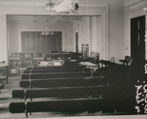
A black and white photo of a large room with molding on the walls and in archways. The room is full of benches and chairs, mostly visible from the back.

The caption accompanying this picture states: Council Chamber of UCD, now the Kevin Barry Room, where the Treaty debates took place between 14th December 1921 and 10th January 1922. On the reverse of this photograph, it was noted at the time ‘would not be allowed take photo during sitting.’ There are actually quite a few photos on the walls of civil war and independence relevant images and details, and so even wandering the halls can be an interesting experience. But notice the benches in that photo of the Council Chamber?

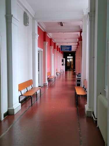
A photo of a hallway painted pink and white. Distinctive benches made of oblong planks are visible running the length of the hallway.

Those benches are still here! This is one end of the first floor hallway, each of these rooms are currently small rehearsal spaces and lesson rooms. They could of course be repro, but they are such an unusual shape I feel like it would be easier to just re-use old benches rather than source a modern recreation. It does look like some of the hardware has been changed, but the overall appearance is the same.

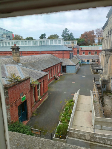
I have, however, saved the best secret for last. Any building can have a past. Any building can reuse furnishings from said past. But let’s take a peek out the windows of that hallway with all of the benches.

A photo of an outdoor area with low brick buildings and a driveway.

See it yet?

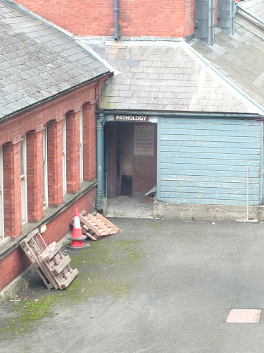
A zoomed-in photo of the previous driveway are, however the doorway in the back is visible and labled 'Pathology.'

A pathology lab! This UCD building had been where medicine and engineering studied and these traces are absolutely everywhere that concert patrons are not. Many of the rehearsal rooms and offices are labeled as the offices of former professors or different departments or specific classes. As many of these doors are starting to lose some of their letters, and I was technically working, I only snapped one quick photo of a particularly nice example of this.

A photo of a set of double doors. The focus is on the label 'Physiology' written on the glass above the doors.

Isn’t that just so charming? I love how the professors and students stepped out of this building one day and the building has waited for their return. As the main concert hall only opened in 1981, a friend of mine said his father had attended UCD when it was here, and that the concert hall was the exam room. It had apparently made for a nervewracking first concert experience, trying to overcome the training of four years worth of fear and stress that lurked behind the doors to that room.

What history is hidden in the buildings you frequent? Even the simplest thing gains shine when viewed from decades away, and it is often a fun game to try and find the evidence of the past.


If you like the content of this blog, please share it around. If you like the blog and you have the means, please consider joining my lovely patrons in paying for the work that goes into it. Due to my immigration status, I’m currently prohibited from conventional wage labor, so for the next couple years at least this is going to be my only source of income. You can sign up for as little as $1 per month (though more is obviously welcome), to help us make ends meet – every little bit counts!

Tegan Tuesday: The Banality of Bigotry

This is a tale of heartbreak. A tale of death. A tale of perpetual life. A tale of political outreach and artistic expression. This is a mystery, as well. A famous work – a minimalist political artistic representation of grief – was briefly denied the chance to be either political or grief-inducing. While the situation has been corrected, the mystery has not been solved, and may never be. Even so, let us explore this saga.

For those who follow queer art and art news, this will probably not be your first introduction to minimalist Félix González-Torres, and his many “Untitled” works. His “Untitled (Portrait of Ross in L.A.)” (1991) is among his most famous and rightfully so. As I do not have the digital image rights to this work, please have a quick glance at this youtube video from the National Portrait Gallery.

As described in the video, it is an extremely simple installation of 175lbs of candy. This weight represents the ideal, healthy body weight of González-Torres’s partner, Ross, prior to his illness and death due to AIDS in 1991. As visitors are encouraged to pick a candy from the pile, the slow diminishing of ‘Ross’ represents both the disease devouring his body and the societal dismissal and diminishing of those afflicted. It’s an incredibly moving piece, made all the more so by the participation and complicity of the gallery patron. It’s far from the artist’s only AIDS related art, but it is probably his most famous. In 1996, González-Torres himself passed from AIDS at age 38.

I also cannot emphasize enough: this piece is incredibly well-known and so is the context. I’ve discussed it in classes, I’ve read articles and gushing accounts of its impact on personal lives for at least a decade, and I’ve certainly seen pictures of it all over the web.

Imagine my surprise when I came across this bombshell of a tweet yesterday:

Published on September 28th of this year, the tweet came out the same day as an equally inflammatory letter published in The Windy City Times (The Voice of Chicago’s Gay, Lesbian, Bi, Trans and Queer Community Since 1985).  Both the tweeter, Will Scullin, and the letter-writer, Zac Thriffiley, noticed that the signage for the Art Institute of Chicago’s installation of “Untitled (Portrait of Ross in L.A.)” had removed any and all mention of Ross, AIDS, death, memorial, or anything personal at all. There were many pointed comments on Twitter about the concept of the 175lbs referring to “the average body weight of an adult male,” and a few mentioning “ideal weight.”

I tromped all over the internet, trying to source reasons or explanations, only to discover that, hallelujah! The text had been changed yet again and now included Ross and his death as well as opening the door to more abstract interpretations.

Felix Gonzalez-Torres produced meaningful and restrained sculptural forms out of common materials. “Untitled” (Portrait of Ross in L.A.) consists of an ideal weight of 175 pounds of shiny, commercially distributed candy. The work’s physical form and scale change with each display, affected by its placement in the gallery as well as audience interactions. Regardless of its physical shape, the label lists its ideal weight, likely corresponding to the average body weight of an adult male, or perhaps the ideal weight of the subject referred to in the title, Ross Laycock, the artist’s partner who died of complications from AIDS in 1991, as did Gonzalez-Torres in 1996. As visitors take candy, the configuration changes, linking the participatory action with loss—even though the work holds the potential for endless replenishment.

Problem solved, yes? Well, yes and no. The first change as well as the second were implemented with no fanfare, and according to some sources, this has been on-going since 2018. (Also, for all the wall text changed, the museum’s audio description remains unchanged from 2015)

Then the work was de-installed [in 2017], and when it was put back on display in the summer of 2018, it was accompanied by a wall label that made no mention of AIDS and focused solely on the work’s aesthetic value. (The accompanying audio focuses heavily on Laycock and the AIDS crisis and has gone unchanged since 2015, according to a museum spokesperson.)
“Felix Gonzalez-Torres’s work is characterized by a sense of quiet elegy,” read the new label. “He possessed an uncanny ability to produce elegant and restrained sculptural forms out of common materials.” The text acknowledged that 175 pounds “corresponds to the average body weight of an adult male” but excluded any biographical information.

“Untitled (Portrait of Ross in L.A.)” was taken down again in the summer of 2018 and reinstalled this July [2022], once more accompanied by the newer text that avoided any mention of AIDS. This time, visitors voiced their concern.

This, emphatically, does not make sense to me. Why would an incredibly famous AIDS-activism artwork be stripped of all of its context? One theory, put forth in both the article quote above and on twitter, lays the blame for this situation at the representative for the artist’s estate, David Zwirner of the Zwirner Gallery.

Well, sure, I’m always happy to think ill of the ‘men in suits’ who move the money in the art world, but I still couldn’t prove anything one way or the other, and I realized that I also had no real understanding of what could potentially be the motives from the institution side of the equation. Thankfully for me and my mystery, being in a performing arts department of a university means that I could find someone who knew.

A lovely hour-long discussion with the head of Art History at my school brought forth several revelations, if no clear answers. Firstly, the Zwirner Gallery is incredibly well-known in the art world, and there is absolutely no financial incentive or advantage to their demonstrating homophobia in 2022. Aside from museum directors, who are almost exclusively white, cis-het men, the art world is generally pretty queer. Whether it’s artists, collectors, buyers, curators, interns, patrons- many of the people in the art world just aren’t straight. The Zwirner Gallery would lose the representation of many of its artists as well as many lucrative sales or museum loans if this omission was known to come from them, so while this is possible that David Zwirner could have the influence on the wall plaque, it’s unlikely that he would have removed any mention of AIDS or of Ross.

It is also unlikely to have come from the board, or any donors of the Art Institute of Chicago. According to the professor I spoke with, the three areas of art that have censorship issues are: sex, body parts that are normally clothed, body fluids and scat. A pile of candies that is representative of the impact of AIDS hardly qualifies. It’s also unlikely to have censorship coming from the city government of Chicago in 2022. This isn’t Texas in the 1980s. Perhaps there are US galleries in communities that have such strict control over messaging that this work would be censored, but that isn’t the case here.

The likely reason for the signage change comes from one of two places, according to my source. If it’s a top-down decision, it likely comes from the family of the artist. González-Torres was Cuban-born and had strong family connections to the Cuban community in Florida. This community is often extremely conservative, extremely Catholic, and perhaps that someone in the family who is associated with the González-Torres Foundation is attempted to straight-wash the history of the artist. It is unusual that the gallery would bow to the whims of an estate on the verbiage of a wall plaque, but perhaps the visual rights could be held out of reach until such changes were made. It’s possible.

The other possibility? The poorly-received text was written by an intern, with very little oversight from a curator. Apparently writing the text for things like wall plaques is the museum version of grunt work that often gets fobbed off onto interns or Art History undergrads. This potential anonymous intern could equally have had an axe to grind about González-Torres’s representation as a gay artist who created art about AIDS (it seems unlikely that such an important thing would be changed “by accident”). And with the amount of work that is needed to put together exhibits and keep museums running, much of this grunt work is checked off as ‘done’ without much attention paid to the details by someone further up the food chain.

I guess the only way to discover the actual solution to this mystery is will be to watch González-Torres’s works in future exhibits. If the artist’s personal details continue to get lost from museum catalogs, then perhaps an outside influence like a family member is pulling some strings. If this remains a freak accident, it might very easily have been an intern’s barely-approved text getting printed. Either way, I am pleased that this story at least has a happy ending: the artist’s life details have been reunited with his art for future visitors to learn about this powerful and wonderful work. Who needs to solve mysteries anyway?


If you like the content of this blog, please share it around. If you like the blog and you have the means, please consider joining my lovely patrons in paying for the work that goes into it. Due to my immigration status, I’m currently prohibited from conventional wage labor, so for the next couple years at least this is going to be my only source of income. You can sign up for as little as $1 per month (though more is obviously welcome), to help us make ends meet – every little bit counts!

Tegan Tuesday: “Smart” devices are giving corporations the ability to surveil you and your family 24/7

Digital security is an actual nightmare. We are surrounded by internet-capable technology at all times. Even if you personally do not have a smart watch, a smart phone, GoogleGlass, a car run through a computer, a smart doorbell, a smart washer, a smart fridge, a smart printer, a smart tv, a smart thermostat… the chances are incredibly high that your neighbor does.

And every single one of them is tracking you.

How could advertisers know what to sell you if it didn’t know that you mentioned ‘oreos’ in a conversation just seconds ago? What makes it even more frustrating is that this kind of technology is useful.

A woman I know with mobility issues and extreme temperature regulation problems has a smart thermostat because she can adjust it from her phone; an obviously helpful aspect for someone who’s bed-bound and having temperature problems. What is less helpful is the built-in feature where the power company can override any of her settings and decide FOR HER what temperature her house should be. Another woman I know has her smart watch connected to her pacemaker, all the better to moniter her health. Many of the technologies in my earlier list have equally helpful aspects to them. But just as people with sleep apnea have their CPAP machines locked or taken away from a perceived ‘lack of compliance’, each of these life-saving technologies are primarily being used to erode personal liberty and privacy.

What is honestly even more frustrating than this kind of monitoring is how easy they are to hack. There are countless stories of baby monitors being hacked, not to mention cars, smart tvs, and smart fridges. Each one of these systems, logged into your personal network, is a door to your personal data that could be used in a myriad of ways. Some of the reasons for this is that tech companies often don’t bother putting any effort into dealing with security. How many of us have gotten letters or emails informing us that Macy’s, or WalMart had a security breach and “your credit card information may be among those affected”? But with the prevalence of technology in every aspect of life, that risk is both compounded, and an expected part of life.

Ah well. We are adults. We can make the call about what is an acceptable invasion of privacy for improved ease of living or comfort. What then about the increasing amount of technology on children? We know the effects of long-term surveillance on developing minds: extremely negative. There have been discussions of the the impact of Elf on the Shelf (and it’s 24/7 surveillance of the child) for nearly a decade.

This was about the status of the interaction of life and technology up until 2020. Then the pandemic and its resulting lockdowns began. Jobs and schools alike went remote. Workers were observed at all times (Fun fact: my admin job in 2009 put surveillance software on my computer, so my boss could observe every action, every mouse movement, every keyboard entry. My boss could also override my own actions on my computer. I put in my two weeks that day. But how easy is it to find that type of job without it now?) But of course the mandatory laptops and tablets provided to students are monitoring their every move, too. In the case discussed above, think about the long-term implications of your child accidentally uploading child pornography just because their phone put their (fully clothed) selfie on the cloud or the school district’s network? This is a problem with far-reaching implications and I Want It Gone. The reckless and unrelenting monitoring of private information needs to stop.

Which brings me to the spot of good news: remote test proctoring software has been ruled a violation of constitutional rights. Cleveland State University, much like every other university on the planet, used a third-party monitoring program to assess whether students taking remote exams were cheating (My opinions about the over-reliance on exams and a pathological fear of ‘cheating’ is a different story). But a student went to court claiming that the proctoring software, which scanned his room and stored that information, was a violation of his privacy. The judge agreed! This type of monitoring is a violation of the Fourth Amendment right protecting citizens against unreasonable searches and seizures. Which is absolutely wonderful news! Now to get from Stage: ‘It’s Illegal’, to Stage: ‘It’s Not Used.’

This is a long fight ahead, since laws always lag behind technology by at least a decade. But it’s a start.


If you like the content of this blog, please share it around. If you like the blog and you have the means, please consider joining my lovely patrons in paying for the work that goes into it. Due to my immigration status, I’m currently prohibited from conventional wage labor, so for the next couple years at least this is going to be my only source of income. You can sign up for as little as $1 per month (though more is obviously welcome), to help us make ends meet – every little bit counts!

Tegan Tuesday: Another day, another dollar stolen from creatives

HBO Max’s decision last week to scrub 36 titles from the internet has sent shockwaves throughout a lot of people either involved with, or emotionally invested in the arts. It’s not surprising, per se, when considering the merge with Discovery+, the discussion of how the streaming service had already lost the streaming wars before it started, or of course the shock from earlier this month how the new Batgirl movie would not be released, ever. There are rumors that 70% of the development staff for the media conglomerate will be laid off.

Media companies closing doors is hardly news. Media companies cancelling beloved shows is hardly news – remember Firefly? But what is new is the way that Warner Bros Discovery (the media conglomerate with more assets than I can shake a stick at) has handled the cancellations: silently removing the media without even telling the creators. An article from before the quarterly reports came out stated the issue quite plainly:

Like other streaming services, HBO Max issues monthly updates about titles being added and removed — for example, it announced that all eight original “Harry Potter” films will be exiting HBO Max at the end of August, while it’s also adding a big bucket of content including 28 films from A24 such as “Room” and “Ex Machina.” But none of the Warner Bros. original films purged from HBO Max were included in recent updates.

And, ok. Sure. Don’t announce to the general public that you’re doing shady business. That’s standard operating procedure for every corporation. But not even telling the artists? The creators of the most recent wave of cancelled shows mostly found out via twitter.

There are more tweets – from more creatives – as most of animation twitter was in mourning last week, but I feel these give enough of a flavor without dwelling in abject misery. Adding insult to injury, none of these creators even have copies of their work. If they want to watch their own creations, their own artwork, they now have to pirate the media. The art director of cancelled show Tig N’ Seek, Levon Jihanian tweeted as much last week.

This seemingly-bizarre disconnect between artist creation and the artist actually viewing their work, led many to wondering how, why, and what caused this situation. In response to such questions, an anonymous industry animator described the draconian working conditions of animation on tumblr:

https://kibbits.tumblr.com/post/693162180367007744/i-just-said-this-on-twitter-but-im-a-bit-awed-at

And these are only the shows that are completely scrubbed from the web, aside from piracy. Shows which remain on the streaming site might still lose more than 200 episodes, like Sesame Street had happen. Sesame Street — ah yes, what a useless show that no one ever watches. I’m sure that no parent or child noticed those missing episodes.

A media conglomerate pulling titles after a merger feels familiar, however. Where have I seen companies putting newly acquired media into vaults before… Ah yes — good ol’ Papa Walt, the champion of ridiculous copyright law and the vigilante against evil daycare centers. The primary difference that I can see between the Disney/20th Century Fox merger in 2019 and the HBO/Warner Bros Discovery merger of this year is that Disney was vaulting older, repertory titles. Warner cancelled existing shows that had already created their new episodes. Keep in mind, I hate both actions. But at least when The Name of the Rose (1986) or Cocoon (1985) were pulled from US markets in 2020, all creatives involved had already been paid. (Although the Vulture article linked above discusses the negative impact on small, local, repertory theatres.) I wonder if animation is likely to be the next media industry to see massive amounts of people leaving the industry for good. Digital effects artists have already started that process and I could easily see animation being next. Apparently it was industry practice to show examples of your work on streaming sites as part of your portfolio — how can you do that when all references to the media have been pulled?

At this point, many people from within and without the industry have begun speaking louder and louder about the value of owning physical media and pirating digital media. The more copies of any given item, the more likely that it will exist in the long run. There are many examples of lost films being found in attics or buried in archives, and media conservation is a serious issue. In a discussion on the value of media preservation via piracy, conservation policies were brought up:

https://renthony.tumblr.com/post/693041372584886272

Please – let’s try and keep modern media and culture available. Buy physical media, pirate digital media; don’t let corporations and streaming services decide what’s important. If art is important to you, it’s worth saving.


If you like the content of this blog, please share it around. If you like the blog and you have the means, please consider joining my lovely patrons in paying for the work that goes into it. Due to my immigration status, I’m currently prohibited from conventional wage labor, so for the next couple years at least this is going to be my only source of income. You can sign up for as little as $1 per month (though more is obviously welcome), to help us make ends meet – every little bit counts!

Tegan Tuesday: Danish commitment to Ukrainian city is a reminder to keep looking forward to a better future

It has been almost six months since Russia invaded Ukraine on February 24th. Buckets of ink have been spilled about this war, with most of the discussion centering around bad news. One of the hardest hit cities was the southern coastal city Mykolaiv. As the NYT described the situation:

Few places in Ukraine have experienced the kind of sustained barrage of Russian fire as this city on the southern coast. Since the war began nearly five and a half months ago, there have been barely two dozen days free of violence.

The attacks have destroyed about 1,200 homes and apartment buildings, according to the city’s mayor, Oleksandr Senkevych. Since the war began, he said, 132 residents have been killed and more than 619 injured in Russian attacks.

Daily, I see updates on social media about the extensive shelling and the destruction of the city, and it’s been heartbreaking to see. Cue my actual surprise to see that the Danish government will be sponsoring (and paying for) the reconstruction of Mykolaiv. The Ukrainian city mayor has spoken with Danish officials, stating that Ukraine looks North for inspiration, and they want to make a “new Copenhagen” on the Black Sea. This is a two stage process: while Ukrainians want to build a modern, green city, there needs to be a city to build! The primary issue that Denmark will work on (while the war lasts) is water. Mykolaiv residents are without potable water. The primary pipeline for water access was bombed and the alternative water supply is not purified. The Danish government will install 100 water purification systems throughout the city in an attempt to ease this burden from the Ukrainians. Further support for Ukraine in general will also come from Denmark, including support for their EU bid, Danish petroleum products and agricultural supplies.

This isn’t just a whim of the Danish — this is one of the early steps in fulfilling the Ukrainian Recovery Plan, U-24 as discussed in Lugano July 4-5 of this year. The conference organizers had already scheduled talks regarding the modernization of Ukraine prior to the the outbreak of war, but the invasion changed the focus of the talks to recovery. In order to afford the massive effort to rebuild, Ukraine is reaching out to many different individual countries and requesting ‘sponsorship’ for specific regions or cities. The original presentation of the Ukrainian Recovery and Development Plan offered a potential division into twelve areas and sponsors that included Ireland supporting the Rivne region, the US and Turkey tackling Kharkiv’s destruction, and Sweden and the Netherlands rebuilding the Kherson region. The proposed plan was enthusiastically greeted, and the Lugano Declaration, published July 6, 2022, indicate that the plan for recovery will move forward, although no official sponsorship will occur just yet. Just a little over a month later, and Denmark is the first country to begin working with Ukraine.

Projects like this are political as much as they are humanitarian, and it’s worth remembering that. As with discussion of joining NATO, this is part of much larger geopolitical contests. It would not shock me to learn that Ukraine requesting European investment is a pointed reminder that Ukraine is a part of Europe, and therefor merits support from the rest of the continent. That said, it seems clear that projecting power and influence by building up other countries is much better than doing so with war. The situation is still on-going, but I hope that this is one step of many such cooperative moves in the near-future.


If you like the content of this blog, please share it around. If you like the blog and you have the means, please consider joining my lovely patrons in paying for the work that goes into it. Due to my immigration status, I’m currently prohibited from conventional wage labor, so for the next couple years at least this is going to be my only source of income. You can sign up for as little as $1 per month (though more is obviously welcome), to help us make ends meet – every little bit counts!

A win for workers in the digital streaming industry

Both Abe and I work in creative industries. He’s a writer and I’ve worked in theatre and music. If you look at our extended friends group, we also know dancers, painters, fashion designers, jugglers, and a host of other folk in similarly creative professions. The unifying thread between all of these jobs is no one pays well. I’ve worked at music union rates before — they aren’t enough to pay the bills. I remember the first time I encountered a strong voice against working for exposure was Harlan Ellison’s essay “Pay the Writer.” As has been commonly repeated in sewing circles, people die of exposure.

One of the biggest labor movements within the arts that I’ve personally seen has been the International Alliance of Theatrical Stage Employees (IATSE) union strikes and engagement. At this point, IATSE is working with commercial production departments, music supervisors, and joining forces with the Screen Actors Guild (SAG) and the teamsters, as well as others I’m sure, trying to make sure that the media we know and love gets made without destroying the workers. While the bulk of the concerns that most of these unions have had are safety related, such as reducing hours, requiring stricter enforcement of existing regulations (remember the cinematographer that was shot by Alec Baldwin last year?), a number of concerns have been monetary. Frankly, most people in the arts work at starvation wages and work around the clock, or they leave the arts embittered and/or traumatized. If I had a dime for every artist I’ve heard who lamented their life’s choice, I could swim like Scrooge McDuck through coins. In part thanks to the called-off strike from last fall, IATSE has been able to sign some new contracts in the workers’ favor, like VICE media reducing minimum work weeks from 50 hours to 40 and raising minimum salaries to $63,000 with minimum annual raises from 3-3.75%. But this is a slow process and the abuse, overwork, and underpaying of employees has gone on for too long for swift answers.

One of the biggest culprits of abusing cheap labor are the streaming platforms like Netflix. Last year Scarlett Johansson sued Disney for breech of contract involving streaming rights and profits, and her lawsuit highlighted any number of similar contract breeches. But the reasoning for shafting creatives, according to Netflix et al., is because ‘no one knows what streaming could possibly do! It’s a new technology! It’s a financial gamble that we all just have to share in the reduced wages and be team players.’ Well its been two decades. We all know that streaming companies are the primary movers and shakers in film these days, so that excuse has worn quite thin.

Which is why I was incredibly happy to see that Netflix lost a suit last week. The Writers Guild of America (WGA) was not willing to accept the precedent of shitty contracts that previous unions had signed and took Netflix to court for its members. The primary writer for ‘Birdbox’ won $1.2 million and the arbitration is being applied retroactively to previous titles written. 216 writers on 139 Netflix films are being paid $42 million in back pay, essentially. Apparently streaming revenue was one of the concessions the WGA gave up to end the 2007 writers’ strike and it was expected to be discussed in 2020 — the discussion was put on hold due to COVID. I feel like the past two years of absolutely bumper profits because of said pandemic was a factor in the WGA winning the case. This also was an expected problem, for those keeping an eye on Hollywood’s interactions with labor. The final paragraph of an LA Times article on the recalled IATSE strike from last fall says:

Turmoil over working conditions and fair pay in streaming productions will persist in Hollywood no matter the outcome of the IATSE vote. The Writers Guild of America, historically much more apt to strike than below-the-line workers, will surely watch closely to see how the IATSE contract debate unfolds. WGA’s own contract comes up for renegotiation in 2023.

I hope that this successful lawsuit leads to more wins for those working in creative industries across the board. Everyone’s feeling the pinch right now, and the only way to get better treatment is to fight for it.


If you like the content of this blog, please share it around. If you like the blog and you have the means, please consider joining my lovely patrons in paying for the work that goes into it. Due to my immigration status, I’m currently prohibited from conventional wage labor, so for the next couple years at least this is going to be my only source of income. You can sign up for as little as $1 per month (though more is obviously welcome), to help us make ends meet – every little bit counts!

Tegan Tuesday: Life is not black and white.

One of the maxims that occasionally go around the internet is: if a piece of information perfectly aligns with and reinforces your understanding of the world, that is when it’s most important to investigate its validity. I like to forget this rule, because clearly I, personally, am the one person in the world immune to propaganda. But in a world of click-bait-y, impotent-rage-inducing articles, I fell for yet another one.

Perhaps you’ve seen these charts floating around the internet the past week or so.

A chart showing the changes in color of objects over time, represented by percent of pixels in photos. X-axis is the year from 1800 to 2020, y-axis is percentage. In 1800, black, white and grey are 10% and that grows to 40% by 2020.

A graph showing the change in car colors, with the x-axis labeled 'Year of Production,' 1990 through 2020, and y-axis percentage. All colors of the rainbow and black, white, and grey are represented with colored cars only 25% in 2020.

They are from a recent study that, I was told, proved with Science! that color was disappearing from the world. The article I saw, of course helpfully gave examples of colorful aspects of life (such as carpets, or McDonald’s) that are now minimalist greys. I, a synaesthete and lover of color, got as upset as I was intended to do. I fully intended to write an article this week on the injustice of our increasingly colorless world. However, I noticed last night that there was a link to the source paper.

And who could have guessed that this was not the goal nor the conclusion of the original paper? The paper was on using machine learning on a photographic dataset of a museum collection. It’s a really interesting project, and there are some pretty charts and visual graphics depicting the team’s findings, but there are also some clear limitations on the use of these findings, because the selection of objects is neither even nor representative. For example, any museum item that had been photographed in black and white was disqualified from the survey, ditto any item that did not have a uniformly colored background. The color green is unusually well-represented in the 1980s and 1990s due to an exhibit on computers and the information age. This excerpt from the paper I think clearly offers both the conclusion and the warning about said conclusion’s general use:

The most notable trend, in both the chart and the video, is the rise in grey over time. This is matched by a decline in brown and yellow. These trends likely reflect changes in materials, such as the move away from wood and towards plastic. A smaller trend is the use of very saturated colours which begins in the 1960s.
While things appear to have become a little greyer over time, we must remember that the photographs examined here are a just a sample of the objects within the collection, and the collection itself is also a non-random selection of objects. Moreover, these trends will continue to change as new objects are acquired.

So what is the deal with the colorless world? Because it is certainly true that it feels like color is harder and harder to find in depictions of everyday life. Everyone and their mother has noticed that movies are impossible to watch due to lack of lighting, with the big battle scene at the end of Game of Thrones, that no one could see, making headlines. One article describes part of the issue thusly:

Another reason is that so many big-budget movies and shows shoot using green screen and rear projection, and lighting for film and TV has become a bit of a lost art. This could sound curmudgeonly, but I swear it’s not.

The thing is, cinematographers on a lot of these shoots aren’t lighting anymore. It’s being done in post, and those people may not have the eye for it. Sure, there are lots of good projects out there, but the bad ones stand out.

Ah yes. Everyone’s favorite “let’s just do it on greenscreen and hire the underpaid and non-union VFX team to fix it.” Always a classic.

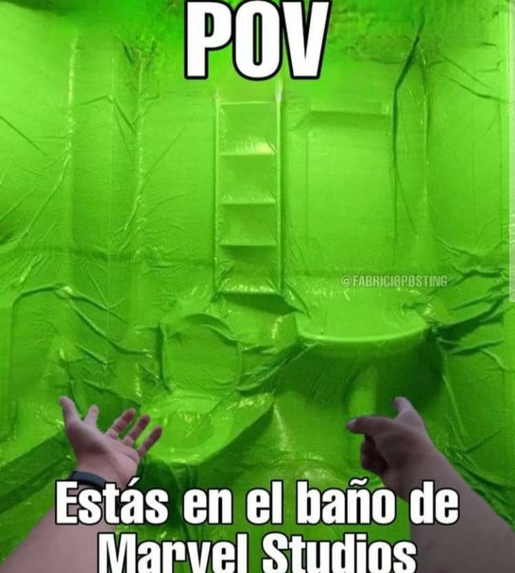
The image shows a bathroom that has been entirely covered in lime green plastic. two arms extend in front of the camera, and the caption says,

POV: You are in the bathroom at Marvel Studios

Some of this lack of color relates to more information about safety: the metallic mint-green 1964 Buick Skylark from the movie My Cousin Vinny would not exist today thanks to the research showing that white cars are the safest on the road. Thanks to the speeds that most roads are today, compared to the 1960s, that extra 12% visibility can be the difference between a safe drive and an accident, especially in low-light or dangerous weather situations.

Ok, well that explains the monochrome cars. For once the colorlessness is helping. But why are all of our interior designs boring? That one, I think we can blame on capitalism. The two biggest factors in deciding interior design (or exterior design) are: resell factor, and ‘calming’ or ‘soothing’ space. I’m not really going to bother talking about resell factor, because my thoughts are really simple: you live there now, who cares about the next owners. But this concern to have your living space act as a retreat from the big bad outside world is… definitely a problem. To quote an article on the top ten monochrome soothing colors,

Now more than ever, our homes are our retreats from the chaos going on outside. Whether you live in an apartment in one of the world’s biggest city or a farmhouse on a sprawling estate, it’s important that our abodes are designed to be restful, calming spaces where we can easily recharge at the end of the day.

I don’t have a lot of smart things to say, nor a lot of statistics to quote. People who study this more than I can feel free to chime in with where I’m wrong. This makes me think about the rise in gig economy and of how many people I know with multiple jobs in order to make ends meet. Of the long hours spent in those multiple jobs, and of how many part-time jobs are customer-facing (aka, draining). I could see the appeal of creating a soothing, restful, calming cave of a home in order to quiet how loud it is outside. There’s also a lot to be said of the value of natural light, and white or light walls reflect the most sun. The fastest way to make a small room smaller is to paint it in dark colors, after all, so paint it white and open the windows and your small apartment doesn’t feel so small any more! I’m also reminded of a conversation with an acquaintance where he said that colored paints were three times the price of white, so he painted everything in his house white and called it a done deal. I also know that a lot of people honestly like the blank canvas of a white wall, all the better to put their own personality. I admit, all of my art is in black frames, often with white mats, so that there is a cohesion between my otherwise incredibly unrelated artworks.

When it comes to this kind of frustratingly dull landscapes, it helps me to remember that colors come and go in trends as much as anything else. In the 1910s, a great many bathrooms were white. White enamel sinks and tubs, white porcelain commodes, white tiled walls and floors, white ceilings. Bright, washable, white. This was because the general public had just learned about germs and the importance of a clean bathroom space. A white bathroom will show the dirt (and germs) and so you will be able to raise your children in comfort, knowing that your shiny white bathroom is clean and safe.

What is the point of making me despair at the world and society’s Forcing Monochrome Upon Me? I will never know the reason for this particular article, but sometimes its to drain your energy. Sometimes its literally to make you feel like nothing can change so why bother? That was the primary thing Russian agents did on social media during the 2016 election. Sometimes its because the author themselves had a knee-jerk reaction and didn’t bother to fact check, so they’re passing those time savings onto you! And there’s always the oldie but a goodie of just Clickbait Title.

I don’t really have a moral for this week’s post. I guess don’t fall for a pretty infographic that reinforces your biases? And curate your own spaces however you like, in whatever way makes you happy – stop caring about who’ll inherit your space.


If you like the content of this blog, please share it around. If you like the blog and you have the means, please consider joining my lovely patrons in paying for the work that goes into it. Due to my immigration status, I’m currently prohibited from conventional wage labor, so for the next couple years at least this is going to be my only source of income. You can sign up for as little as $1 per month (though more is obviously welcome), to help us make ends meet – every little bit counts!