It’s time for some resin. I never catch up with posting all the stuff I create, but I’m doing my best.
I did my first tries with the burl Marcus sent and alas, there is something like too much blue.

©Giliell, all rights reserved
The structure of the burl pretty much vanishes inside , leaving only the outside visible. You can also see that I didn’t catch all the scratches, but I left it at that because they’re only visible when seen against sunlight, which isn’t something that usually happens when you wear a pendent.

©Giliell, all rights reserved
This one is smaller than the one at the top, cut from the same cast. With a lot of light you can guess the gold I added. I still love the burl and the second attempt is a lot better, but not yet cut and polished.

©Giliell, all rights reserved
These ones, OTOH, turned out exactly as blue as I wanted them. Because here the focus is on the contrast between the birch and the resin. I cut this and the second piece from one block as well, both being about 3X5 cm.

©Giliell, all rights reserved

©Giliell, all rights reserved
Awww fuck it, there isn’t such a thing as too much blue, because, well, blue.
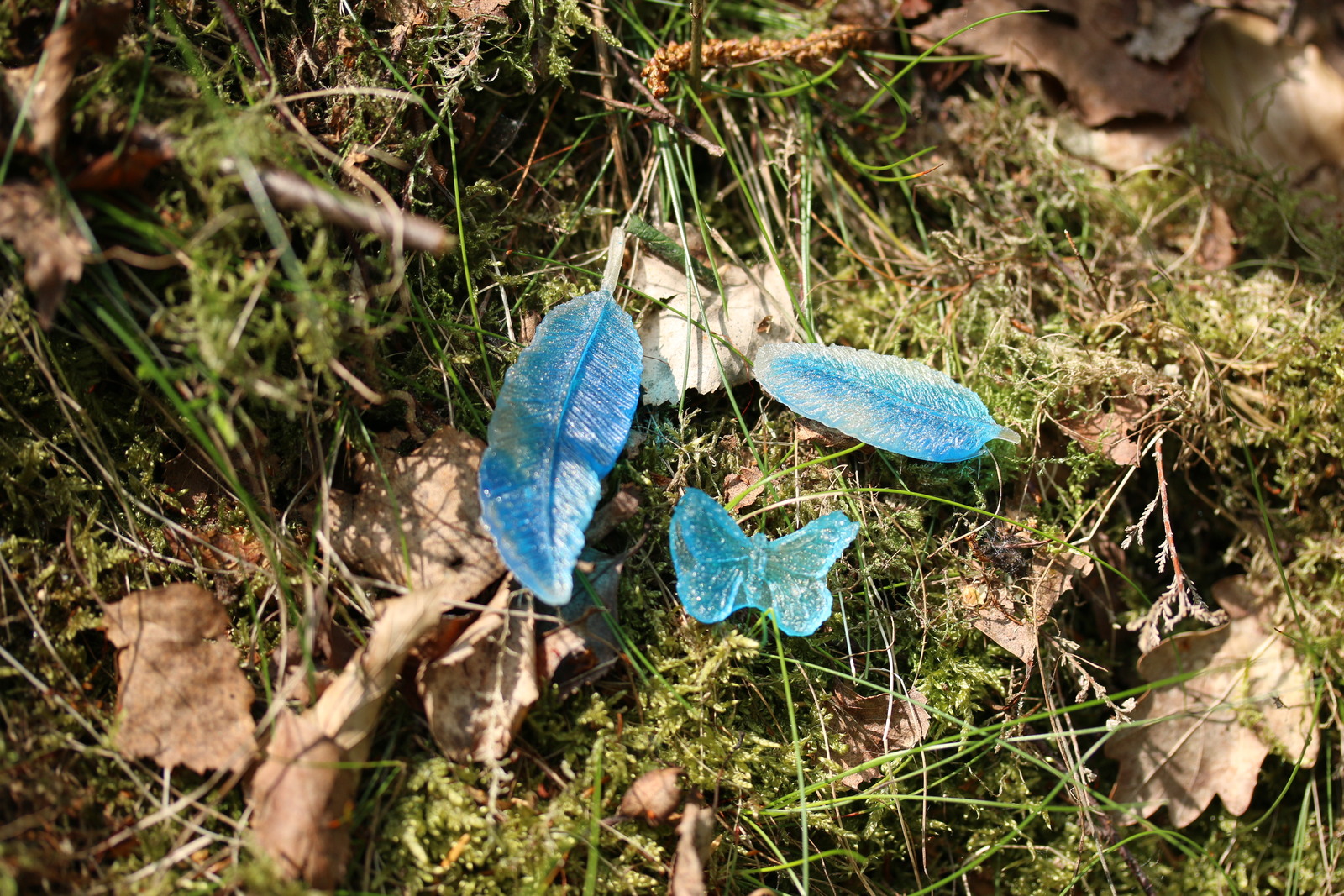
©Giliell, all rights reserved
Here’s some trinkets that will probably get incorporated into other pieces. They’re cast in silicone moulds for fondant, so the finish isn’t glossy, but I quite like them.