Puree With A Taste Of Triangles.

ALENA ZHANDAROVA.

ALENA ZHANDAROVA.

Alena Zhandarova’s works immediately caught my eye and imagination. Truly wonderful.

Exploring the uniqueness and diversity in each of her subjects, Russian photographer Alena Zhandarova continually pushes the borders of her perception by trying something new.

“I am fascinated by the opportunity to try myself as a storyteller with my own protagonists,” she says. Using the chance to transform her feelings and experience into distinctive visual language, Zhandarova breaks the found context and finds her own way to communicate with the found space. The series of portraits called ‘Puree With A Taste Of Triangles‘ is as bizarre as its name, breaking the convention of traditional portrait photography. The girls in Zhandarova’s images usually have their faces covered, blending with numerous patterns and colors and thus becoming a part of the background themselves. The photographer explains: “I am inspired by the idea of combining incompatible, creating something out of nothing, finding an amazing coincidence, which then develops into a unique story.”

Alena_Zhandarova_photography-15-1050x1314

Alena_Zhandarova_photography-4-1050x1314

Alena_Zhandarova_photography-12-1050x1314

There is so very much to see in each photograph, the delight is in the details as well as the overall photo. They can also be interpreted in many different ways. I am in love with her work, and I love the way she thinks. Ms. Zhandarova is featured at iGNANT, and her website is here. Go and delight yourself!

A Fitting Trump Logo and Two Border Walls.

tucker-viemeister-nazi-trump-logo-design-graphics-hero

© Tucker Viemeister.

American industrial designer Tucker Viemeister has designed a logo for Donald Trump based on Nazi insignia to reflect the billionaire’s “racist hate mongering”.

The logo, featuring a tilting letter T inside a white circle on a red background, resembles the swastika symbol used by the Nazis.

Viemeister created the logo in April last year, before Trump became the Republican party’s official presidential nominee, posting it on Twitter along with the words “I hope they [Trump’s supporters] don’t like it!”

He also published the design on his website with a short statement that says: “Design can show what bad things have in common, like this logo I created for Trump’s campaign of bigotry and violence.”

Following Trump’s inauguration as president and his introduction last weekend of the controversial executive order banning people from seven Muslim-majority countries entry to the United States, Viemeister said the logo had new and sinister relevance.

tucker-viemeister-nazi-trump-logo-design-graphics-_dezeen_1704_col_1

“Obviously the logo is a spin on the Nazi insignia because there is a correlation between Trump’s racist hate mongering and the Nazis,” he told Dezeen.

“I’m worried that his followers will adapt it for the very opposite reasons I made it,” he continued. “They might like that connection with those white power fascists.”

“I wish I could make something that would help those followers become more inclusive and tolerant so that we can all work together to solve the issues that we all confront.”

Via Dezeen. Tucker Viemeister’s site. Moving on to the fabulous IKEA border wall! Simple! Inexpensive! Can be put together with one hex key! Only two people required!

WallUS

Washington (dpo) – “Too expensive!” “Too complicated!” “Unrealistic!” – This is the sort of criticism US President Donald Trump is currently facing over plans to build a wall along the border with Mexico. An offer from home furnishings brand, IKEA, could solve all of these problems with a single blow.

The Scandinavian furniture maker has offered the USA a practical, ready-made solution with “Börder Wåll”. All they need to do is pick it up in a van from the nearest IKEA branch and put it up where they want it to go. Totalling US $9,999,999,999.99, “Börder Wåll” is significantly cheaper than a conventional wall. Estimates suggest that a conventional wall would cost between US $15 and $25 billion.

According to government press secretary, Sean Spicer, President Trump is currently inspecting the offer:

TrumpKatalog

The simple, Scandinavian designed border wall (with a 5 year guarantee) is primarily made of pressboard with a birch effect and can be assembled with the help of a hex key. A 12,000 page instruction manual with easy-to-understand pictures makes construction child’s play – as long as there is not a single screw missing.
“However, assembly requires two people: one person can hold the wall while the second screws it together”, it states in IKEA’s offer.
The basic model of the wall is 33ft (10 m) tall and 1,954 miles (3,144 km) long, although the height and length can be extended as desired.
IKEA has already announced that it will design other products in the next few weeks that will be compatible with “Börder Wåll”. According to inside sources, this includes products such as the “Gåwk” watchtower and the “Råtåtåtåtåtå” spring-gun.

Via Postillon. German version here. (No, this is not for real. There’s no Ikea border wall, okay?)

Then there’s the wonder of The Pink Wall:

Mexican firm Estudio 3.14 has visualised the “gorgeous perversity” of US presidential candidate Donald Trump’s plan to build a wall along the countries’ border.

In response to the controversial proposal, a group of interns at the Guadalajara-based studio came up with a conceptual design that would celebrate Mexico’s architectural heritage.


estudio-314-donald-trump-mexico-border-prison-wall_dezeen_2

estudio-314-donald-trump-mexico-border-prison-wall_dezeen_1

The giant solid barrier would run 1,954 miles (3,145 kilometres) uninterrupted from the Pacific coast to the Gulf of Mexico, and be painted bright pink in the spirit of the 20th-century buildings by Pritzker Prize-winning Mexican architect Luis Barragán.

“Because the wall has to be beautiful, it has been inspired in by Luis Barragán’s pink walls that are emblematic of Mexico,” said the studio. “It also takes advantage of the tradition in architecture of megalomaniac wall building.”

Estudio 3.14‘s Prison-Wall project – developed in collaboration with the Mamertine Corporation of the United States – was undertaken to “allow the public to imagine the policy proposal in all of its gorgeous perversity”.

Visuals show the barrier traversing hills, desert, a river, and the border city Tijuana. The structure would also incorporate a prison to detain those attempting to cross into the US.

“Moreover, the wall is not only a wall,” said Estudio 3.14. “It is a prison where 11 million undocumented people will be processed, classified, indoctrinated, and/or deported.”

The team suggests that the wall could employ up to six million personnel. It could also incorporate shopping centre straddling its width, and a viewpoint from which US citizens could climb up and look down onto the other side.

A series of graphics to accompany the proposal range from posters calling for workers, to US currency emblazoned with the wall’s pink trail.

Via Dezeen. Estudio 3.14.

Maintenance of Living History.

abgunstes-muiza-7-48470535

abgunstes-muiza-19-48470585

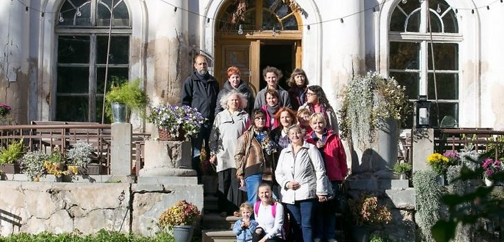
As rq explains: The story is simple, the family bought a run-down manor estate and are renovating it with their own hands and their own finances and they will make it into an artists’ enclave, for artists to stay and work essentially free of charge. The place used to be a school, and they’re also offering the local school children in older grades opportunity to assist in some of the woodworking and other easier jobs (extra credit).

There’s a guy and his wife doing something similar out where husband’s family has their farmhouse. They’re making the local manor (they’re all over the place, we were basically a summer-home territory for German barons back in the day) into a regional museum, to bolster efforts in the preservation of the local Latgallian dialect (some argue it’s a language). What makes it more difficult is the search for ‘original’ details – specific not only to the time, but to the region. Bit by bit, though, it’s coming together.
I admire people like this, because they’re not only bringing these places up to modern standards (which on its own is expensive and difficult and extremely slow, if you want to avoid major loans from banks) but they’re also trying to recover as much of the historical appearance in the furniture (or at least contemporary to that time).
I admire this effort too, greatly so. There are a ton of photos at the site, and I enjoyed every one of them – wish I was there with my camera! Have a look.

Diableries.

From a group of 11 tissue-stereo views of Satan (1860s–70s) (all images courtesy Swann tiontion Galleries).

From a group of 11 tissue-stereo views of Satan (1860s–70s) (all images courtesy Swann tiontion Galleries).

Hyperallergic has a great story on some 19th century stereoviews, some of which will soon be up at auction. Hell doesn’t look so bad, rather playful!

As one group of 19th-century French artists envisioned it, hell was no desolate destination for the damned. Rather, it hosted boating races, witnessed parties with a “live” band, and even boasted a lavish boudoir for one “Madame Satan.” Such are the scenes they depicted in their series of humorous stereoviews produced in the 1860s that capture a vibrant underworld of devils, skeletons, and satyrs, each carefully hand-colored so the frozen figures came alive with glowing red eyes.

Titled Diableries, the series was published primarily by Frenchmen François Benjamin Lamiche and Adolphe Block, as told in a publication, also called Diableriesthat chronicles the works’ history. Unlike most stereoviews, these images married sculpture and photography: sculptors (unidentified on the images) would craft small dioramas from clay that would then be photographed and printed on albumen paper. The artists then applied watercolors to the fragile prints, added a layer of backing tissue, and inserted the prints into cut-out windows of two cardboard frames. The tissue stereocards, therefore, offer two views: when seen with light hitting only their front sides, their images seem black-and-white; but when illuminated from the back, colors appear to render hell in vivid visions. The artists would also pin prick sections of the images and apply color to these markings so light passing through the holes would highlight details on costumes or settings, even making them sparkle slightly.

A full set had dozens of individually captioned scenes, guaranteed to provide viewers with a unique form of entertainment in 3D when placed on a stereoviewer. Stereoviews were highly popular in the 19th century, but the Diableries would have certainly stuck out from many other sets: collections of travel photos, artworks, and religious pageantry have quite a different tone from these scenes of skeletons riding bicycles, playing instruments in a bony band, and dancing in flouncy dresses.

[…]

Swann Auction Galleries is selling 11 cards (est. $600–900) as part of its forthcoming sale “Icons & images: Photographs & Photobooks.” A couple of these scenes show hell as you may expect it: in one, winged demons poke weapons at skeletons crowded in a massive cauldron while wide-eyed monsters gawk from dark corners; another shows the entrance to hell, governed by a three-headed beast and monsters holding pitchforks. Humor, however, is the clear, reigning mood in these Diableries: a sign above the beast in that latter image reads, “Speak to the concierge”; there’s also a skeleton lifting his top hat to a guard while a woman in the corner offers water for passersby to refresh themselves.

Much more to see and read at Hyperallergic.

The Materiality of Mourning.

Doris Salcedo, “A Flor de Piel” (detail) (2013), rose petals and thread (Harvard Art Museums/Fogg Museum, Gift of Mr. G. David Thompson, in memory of his son, G. David Thompson, Jr., Class of 1958, by exchange; purchase through the generosity of Elaine Levin in honor of Mary Schneider Enriquez; and purchase through the generosity of Deborah and Martin Hale, 2014.133. © Doris Salcedo, photo by Joerg Lohse, image courtesy the artist and Alexander and Bonin, New York, and White Cube, London).

Doris Salcedo, “A Flor de Piel” (detail) (2013), rose petals and thread (Harvard Art Museums/Fogg Museum, Gift of Mr. G. David Thompson, in memory of his son, G. David Thompson, Jr., Class of 1958, by exchange; purchase through the generosity of Elaine Levin in honor of Mary Schneider Enriquez; and purchase through the generosity of Deborah and Martin Hale, 2014.133. © Doris Salcedo, photo by Joerg Lohse, image courtesy the artist and Alexander and Bonin, New York, and White Cube, London).

Doris Salcedo’s The Materiality of Mourning is at the Harvard Art Museums (32 Quincy St, Cambridge, Mass.) through April 9.

Installation view of Disremembered IV (detail) in Doris Salcedo: The Materiality of Mourning, on display November 4, 2016–April 9, 2017 at the Harvard Art Museums. © Doris Salcedo. Photo: Harvard Art Museums; © President and Fellows of Harvard College.

Installation view of Disremembered IV (detail) in Doris Salcedo: The Materiality of Mourning, on display November 4, 2016–April 9, 2017 at the Harvard Art Museums.
© Doris Salcedo. Photo: Harvard Art Museums; © President and Fellows of Harvard College.

Hyperallergic has the full story on the exhibition. The Materiality of Mourning at Harvard Art Museums.

Also, go have a visit at the Center for Artistic Activism.

Cool Stuff Friday.

B1

A close look at the marker drawings of Ben Biayenda reveals a wide range of direct references from African tribal art to French Post-Impressionism and current pop culture. The Paris-based art student’s work celebrates black beauty in all of its diversity. His sensitive portraits depict black women in moments of intimacy, connection and self-care. His scenes are of beauty parlors and plant-filled bohemian apartments. In girl’s dinner, three black women sit down together to share some sushi rolls. An African mask, a Matisse cut out, and a poster of Angela Davis hang on the wall behind them. One of the guests has vitiligo, perhaps an homage to Winnie Harlow, a Canadian model with the skin condition.

B2

Biayenda started drawing black women two years ago, inspired, he says, by “black femininity, sisterhood, and little moments of beauty.” He is also inspired by black feminist conceptual artists like Adrian Piper and Michèle Magema to interrogate race, gender roles, Western beauty standards, and art itself through his work. Born in Namibia to French and Congolese parents, the artist grew up in France and was exposed to fine art at a young age. He grew to especially love French painters, from Jean-Auguste-Dominique Ingres to Henri Rousseau. “I was really fascinated by painting and I was going to museums in Paris. I really loved it, but there was some frustration to not see much black representation in famous paintings,” he recalls to The Creators Project over a Skype call. His response was to create his own version of art history through work that reflected his own standards of beauty, while drawing on the poses and atmosphere of the classic works he admired.

You can read and see much more at The Creators Project, his website and Instagram.

The Creators Project has a great look at Awol Erizku, and his aesthetic for photographing Beyoncé’s pregnancy:

1

Click on over to read the full story and see much more.

In the nick of time…

Nick

They arrived, just in time to accompany the pants™ and myself into town tomorrow. The Tyrranophobia is dark, a swirl of tobacco and opium, with a slash of jarring black cherry, or something like. I forget what’s actually in it. The Cryophobia I’m in love with, it’s like wearing clarity wrapped in Juniper. Of the samples, Debauchery won my little black heart. Spice, a hint of orange and clove, all rather debilitated and languishing. *Happy*