Yep, more. Click for full size.
From rq: 1) busstop artwork, for a campaign to build a publicly but not governmentally funded arthouse/gallery, title: Don’t Need War; 2) a street – if you go to the touristy places, things are cleaned up, but this is more typical, plus some cold February sun right down the middle!
Gotta say, I love Don’t Need War! Click for full size.
© rq, all rights reserved.
But it won’t be today, or any time soon, most likely. Avoidance Universe. For these, I used the spray fabric paints I got at Goodwill, and they work a treat. :D Click for full size.
Meltdown Avoidance, bright colours version. This is rather tricky, the injected colour doesn’t stay solid long before it explodes, and it makes focusing difficult, but still…fun. And distracting! Not at my best today, with being patient and stuff, so I’ll revisit this at some other time. I know 3 and 4 seem the same, but they aren’t. 4 is much more fetus-y. :D Click for full size.
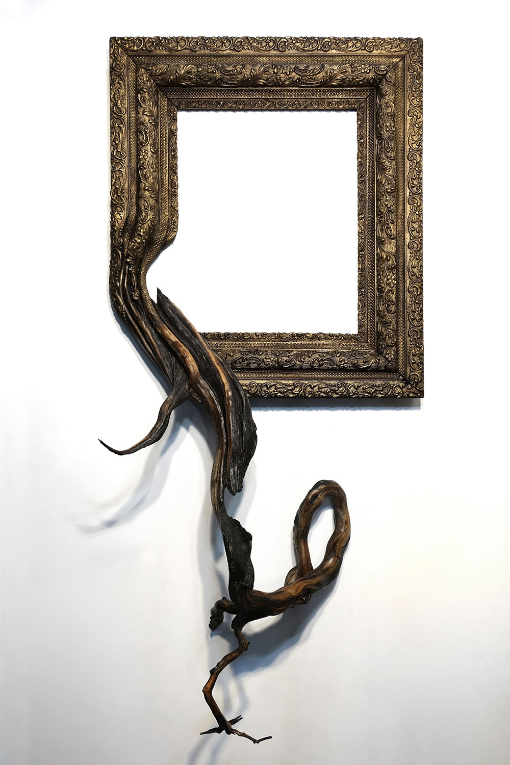
I, I am so blown away by these, they are amazing pieces in and of themselves, and the work is so time consuming, the artist can only manage a limited amount per year, around 25. I wouldn’t be able to do one in a year, but I’d certainly love to own one!
Since 2011, Oregon-artist Darryl Cox has been making “Fusion Frames,” sculptural hybrids of picture frames and segments of tree roots. Each piece begins with a search to find a frame that closely matches the reclaimed roots he obtains from manzanita, juniper, and aspen trees, or even from grapevines. The pieces require extensive amounts of woodworking and painting to seamlessly fuse the two objects together, meaning Cox can only produce around 25 or so pieces each year.
Cox will have work on view later this year at the The Art Museum of Greater Lafayette, and he’s now reperesented by the Vickers Collection. You can see more of his recent work on Facebook.
Oh, what I wouldn’t do for a manzanita piece. There’s another of the very few things which can make me homesick. Via Colossal Art.
Absolutely stunning wave photography. Few things make me homesick, but these do. I miss the ocean so very much.
You can see more (and buy!) on his website, and there’s also his Instagram and Facebook.
Via Colossal Art.
There’s a good article up about Canada 150 and whether or not Indigenous artists chose to participate. For some, it was an opportunity to get a sharp point of view home, and for others, it was nothing more than a celebration of colonialism and genocide, especially given how Indigenous people continue to be treated across Canada.
As Canada 150 celebrations extol the glory of Canada’s past and present, one group of artists is not so quick to join the party. Indigenous artists view the sesquicentennial with mixed feelings, with some using it as a platform to tell their peoples’ side of the story, and others opting to boycott the celebrations altogether.
“People come out and want to hear all these stories about Canada, and sometimes they don’t want to take the bad with the good,” says Vancouver-based playwright and composer Corey Payette, whose new musical, Children of God, tells the story of Cree children in residential schools. […] “For me it’s about educating non-Indigenous people, educating mainstream audiences, on what would this have been like if this had been your child? What would that have done to your family and the future of their children and the intergenerational trauma of that?”
But photographer Nadya Kwandibens feels the only right way to respond to Canada 150 is to boycott it.
“The way I see it is, these celebrations are a celebration of colonialism and, as an Indigenous person, I’m choosing not to celebrate colonialism,” said Kwandibens in an interview with CBC News from her home on Animakee Wa Zhing First Nation in northwestern Ontario. Her photos are positive, empowering images of young Aboriginal professionals thriving in urban centres and of elders teaching children. But Kwandibens doesn’t want to see them used in the context of Canada 150.
The Full story is here.
In a conversation, knipling came up, which is a type of lace making. I am, and always have been, in awe of people who can make lace, regardless of technique. It’s one of those skills which elude me. Charly was kind enough to send me a photo of one of his mother’s pieces, which is gorgeous! Definitely click for full size. Charly explains: My mother is skilled at knipling, but she was never that good at making non-abstract designs. I am the opposite – I can make realistic designs, but not abstract ones. So sometimes when she has an idea for something that should resemble reality, she employs my skill. This knipled black swan design I drew for her a few years back from a picture she found on the internet. She then made the actual lace and framed it as a picture.
A beautiful example of art collaboration.
Here’s a bit on knipling, and all I can think is what a mess of it I would make:
Amazing, wonderful work!
In January of 2016, artist Windy Chien devoted herself to learning a new knot every day for a year, tying a total of 366 by December 31st (2016 was a leap year). Although 366 knots might seem like a staggering number, it is nothing compared to the 3,900 included in Chien’s go-to knot manual—The Ashley Book of Knots, which took its author nearly 11 years to compile.
There is just so much to see! Via Wired. * Windy Chien’s Website. * Windy Chien’s Instagram.
Japanese artist Ayumi Shibata uses traditional methods of Japanese paper cutting to create miniature cities within vessels of glass. Her chosen materials reference the delicate relationship humans have with our environment and natural forces of our world, while also relating to the Japanese translation of “paper.” In Japanese, the word for “paper” is “Kami,” which can also mean “god,” “divinity,” or “spirit.” Kami are omnipresent in the Shinto religion, and reside in the sky, ground, trees, and rocks.
“Kami move freely beyond time, universe and places, appearing during events, as well as in our houses and our bodies,” said Shibata on her website. “These spirits also dwell in paper. In the religion of Shinto, white paper is considered a sacred material.”
Using this charged material, Shibata attempts to construct a sculptural dialogue about how we relate and respond to our natural world.
Beautiful and mindful work here. You can see and read more at Colossal.
Watch. Just watch.
Via Films for Action.
Alena Zhandarova’s works immediately caught my eye and imagination. Truly wonderful.
Exploring the uniqueness and diversity in each of her subjects, Russian photographer Alena Zhandarova continually pushes the borders of her perception by trying something new.
“I am fascinated by the opportunity to try myself as a storyteller with my own protagonists,” she says. Using the chance to transform her feelings and experience into distinctive visual language, Zhandarova breaks the found context and finds her own way to communicate with the found space. The series of portraits called ‘Puree With A Taste Of Triangles‘ is as bizarre as its name, breaking the convention of traditional portrait photography. The girls in Zhandarova’s images usually have their faces covered, blending with numerous patterns and colors and thus becoming a part of the background themselves. The photographer explains: “I am inspired by the idea of combining incompatible, creating something out of nothing, finding an amazing coincidence, which then develops into a unique story.”
There is so very much to see in each photograph, the delight is in the details as well as the overall photo. They can also be interpreted in many different ways. I am in love with her work, and I love the way she thinks. Ms. Zhandarova is featured at iGNANT, and her website is here. Go and delight yourself!
© Tucker Viemeister.
American industrial designer Tucker Viemeister has designed a logo for Donald Trump based on Nazi insignia to reflect the billionaire’s “racist hate mongering”.
The logo, featuring a tilting letter T inside a white circle on a red background, resembles the swastika symbol used by the Nazis.
Viemeister created the logo in April last year, before Trump became the Republican party’s official presidential nominee, posting it on Twitter along with the words “I hope they [Trump’s supporters] don’t like it!”
He also published the design on his website with a short statement that says: “Design can show what bad things have in common, like this logo I created for Trump’s campaign of bigotry and violence.”
Following Trump’s inauguration as president and his introduction last weekend of the controversial executive order banning people from seven Muslim-majority countries entry to the United States, Viemeister said the logo had new and sinister relevance.
“Obviously the logo is a spin on the Nazi insignia because there is a correlation between Trump’s racist hate mongering and the Nazis,” he told Dezeen.
“I’m worried that his followers will adapt it for the very opposite reasons I made it,” he continued. “They might like that connection with those white power fascists.”
“I wish I could make something that would help those followers become more inclusive and tolerant so that we can all work together to solve the issues that we all confront.”
Via Dezeen. Tucker Viemeister’s site. Moving on to the fabulous IKEA border wall! Simple! Inexpensive! Can be put together with one hex key! Only two people required!
Washington (dpo) – “Too expensive!” “Too complicated!” “Unrealistic!” – This is the sort of criticism US President Donald Trump is currently facing over plans to build a wall along the border with Mexico. An offer from home furnishings brand, IKEA, could solve all of these problems with a single blow.
The Scandinavian furniture maker has offered the USA a practical, ready-made solution with “Börder Wåll”. All they need to do is pick it up in a van from the nearest IKEA branch and put it up where they want it to go. Totalling US $9,999,999,999.99, “Börder Wåll” is significantly cheaper than a conventional wall. Estimates suggest that a conventional wall would cost between US $15 and $25 billion.
According to government press secretary, Sean Spicer, President Trump is currently inspecting the offer:
The simple, Scandinavian designed border wall (with a 5 year guarantee) is primarily made of pressboard with a birch effect and can be assembled with the help of a hex key. A 12,000 page instruction manual with easy-to-understand pictures makes construction child’s play – as long as there is not a single screw missing.
“However, assembly requires two people: one person can hold the wall while the second screws it together”, it states in IKEA’s offer.
The basic model of the wall is 33ft (10 m) tall and 1,954 miles (3,144 km) long, although the height and length can be extended as desired.
IKEA has already announced that it will design other products in the next few weeks that will be compatible with “Börder Wåll”. According to inside sources, this includes products such as the “Gåwk” watchtower and the “Råtåtåtåtåtå” spring-gun.
Via Postillon. German version here. (No, this is not for real. There’s no Ikea border wall, okay?)
Then there’s the wonder of The Pink Wall:
Mexican firm Estudio 3.14 has visualised the “gorgeous perversity” of US presidential candidate Donald Trump’s plan to build a wall along the countries’ border.
In response to the controversial proposal, a group of interns at the Guadalajara-based studio came up with a conceptual design that would celebrate Mexico’s architectural heritage.
The giant solid barrier would run 1,954 miles (3,145 kilometres) uninterrupted from the Pacific coast to the Gulf of Mexico, and be painted bright pink in the spirit of the 20th-century buildings by Pritzker Prize-winning Mexican architect Luis Barragán.
“Because the wall has to be beautiful, it has been inspired in by Luis Barragán’s pink walls that are emblematic of Mexico,” said the studio. “It also takes advantage of the tradition in architecture of megalomaniac wall building.”
Estudio 3.14‘s Prison-Wall project – developed in collaboration with the Mamertine Corporation of the United States – was undertaken to “allow the public to imagine the policy proposal in all of its gorgeous perversity”.
Visuals show the barrier traversing hills, desert, a river, and the border city Tijuana. The structure would also incorporate a prison to detain those attempting to cross into the US.
“Moreover, the wall is not only a wall,” said Estudio 3.14. “It is a prison where 11 million undocumented people will be processed, classified, indoctrinated, and/or deported.”
The team suggests that the wall could employ up to six million personnel. It could also incorporate shopping centre straddling its width, and a viewpoint from which US citizens could climb up and look down onto the other side.
A series of graphics to accompany the proposal range from posters calling for workers, to US currency emblazoned with the wall’s pink trail.
Via Dezeen. Estudio 3.14.