Which is below the fold, because NSFW.
Which is below the fold, because NSFW.
Well. That was interesting. :D I set up six more hearts the other day, very light on the textile medium, and extremely light on the India Ink, just a few drops to each, as they spread in interesting ways, given a bit of time. They were well on the way to drying yesterday, and I was on the way to taking them out to sit in the heat of the day, when for no discernible reason, I decided to stick them in a fair low oven (300 F). Then I remembered something I had to do on Affinity, and got well distracted. By the time I remembered, it had been maybe 15, 20 minutes. I pulled the tray out, and saw some rather alarming bubbles, warping, and solid white bits. This is the result. Textile medium does some interestin’ stuff when heated, so have a care. The cupcake/muffin tin I’m using is an old one I used to use for soap making. The half baked hearts which came up with colours – that was left over from the previous batch of hearts, which I hadn’t bothered to scrape clean. Prior to the oven, they weren’t getting into these hearts. Obviously, the baking changed that. Also, don’t try this with any pan you actually like, or want to use for something useful, like food, because – the peeling was particularly difficult this time around, and a fair amount of the ‘non-stick’ surface came up off the pan, and is a part of the Half Baked Hearts now.
The photo is for shit, because fucking ticks. Four of them. On me. While trying to take photos. Click for full size.
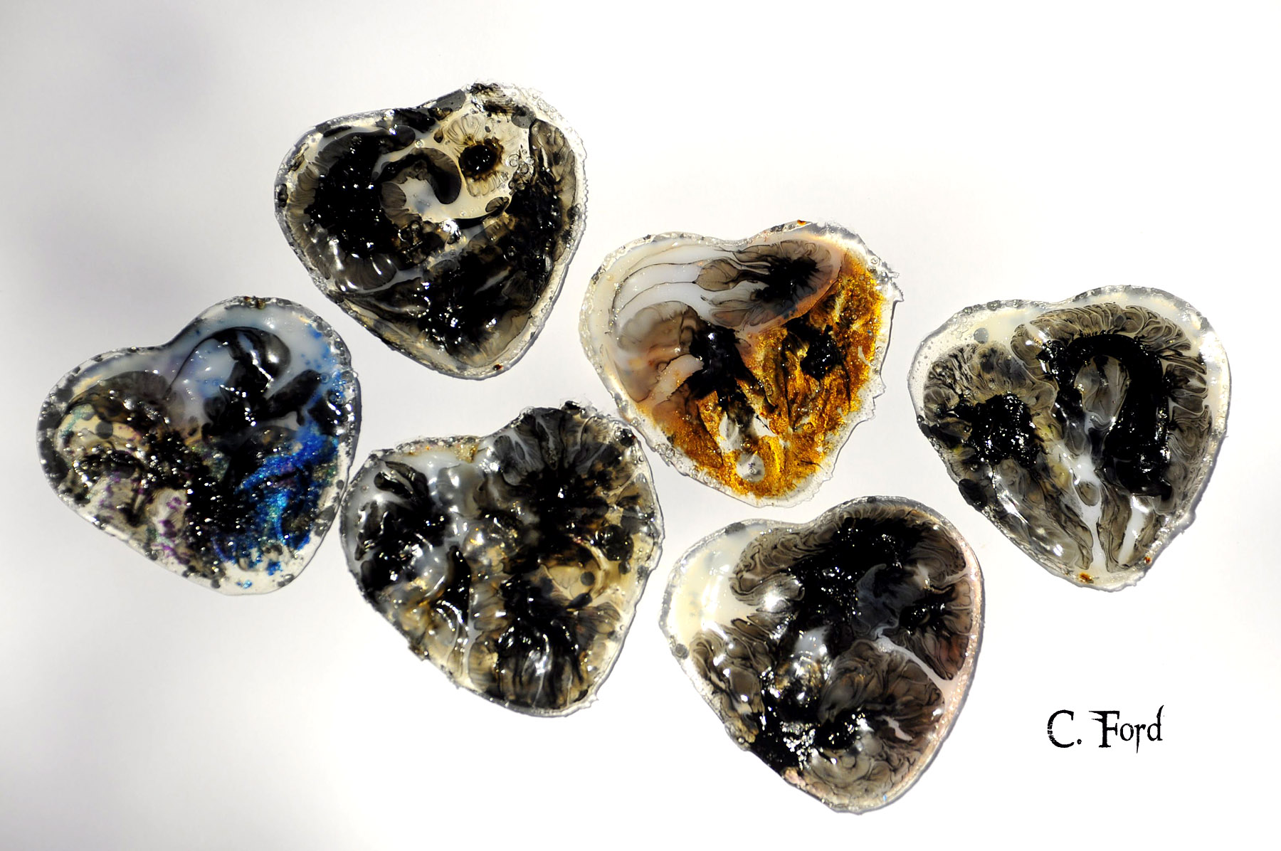
© C. Ford, all rights reserved.
When last seen. Two at time now, front and back. Click for full size.
When last seen. Two at time now, front and back. Click for full size.


© C. Ford, all rights reserved.

Morristown High School officials removed this artwork by junior Liam Shea from the school art show.
It seems that truthful depictions of the Tiny Tyrant aren’t allowed in a NJ high school art show. Why? Oh, some people got upset. Perhaps ‘some people’ should learn that you aren’t going to love, or like every piece of art you come across, so take a look, shake your fucking head or whatever, and move on. What you should not ever do? Decide it’s in your purview, as an onlooker, to decide what art is worth showing, and what is not. Supposedly, adults are supposed to be capable of coping rationally with something they don’t care for on a personal level. Two students had their work removed, after having only an hour to come up with it.
Honestly, people. When you see art you don’t like, suck it the fuck up. You can handle it. Stop looking at it, go on to something else. Oh, and if you’re parents, teach that to your sprogs, too. School Principals, you could grow a fucking spine and stand behind your students. That’s what you’re supposed to do, yes? While this has worked out well for young Mr. Shea, there’s nothing at all about the other student who had their work removed.
The Creatures of Yes take on climate change; Maizz maps endangered animals onto trees in Mexico; and the importance and controversy of colour, along with the white is right is might connection.
You can read and see more at The Creators Project.
You can see and read more about Animal Watching at The Creators Project.

The Apollo Belvedere, now at the Vatican Museums, was viewed in the 18th century as the model of beauty. Artists became fascinated with the statue after its discovery in the late 15th century, including Albrecht Dürer. (photo by Marie-Lan Nguyen/Wikimedia)
The Apollo Belvedere is the basis for much of racist thought and models, which persist to this day. This beautiful sculpture became a model for the epitome of beauty, proper physiognomy, and of course, the best skin colour, white. The whiter the better. The study of classical antiquity was of all consuming importance in previous generations, and many wrong and devastating conclusions were formed. Greco-Roman works were considered to be of a higher order and very pure, because everything was overwhelmingly white. Except it wasn’t. Science has confirmed that many ‘white’ works weren’t, they were painted, and reflected the diversity of the Greco-Roman world. This is, of course, very upsetting to people for pretty much every reason under the sun. It is a shock to see these pale works come to life in vivid, unapologetic colour, and it changes our perception greatly. No longer do such works have such a detached, pale, cerebral feel.
Modern technology has revealed an irrefutable, if unpopular, truth: many of the statues, reliefs, and sarcophagi created in the ancient Western world were in fact painted. Marble was a precious material for Greco-Roman artisans, but it was considered a canvas, not the finished product for sculpture. It was carefully selected and then often painted in gold, red, green, black, white, and brown, among other colors.
A number of fantastic museum shows throughout Europe and the US in recent years have addressed the issue of ancient polychromy. The Gods in Color exhibit travelled the world between 2003–15, after its initial display at the Glyptothek in Munich. (Many of the photos in this essay come from that exhibit, including the famed Caligula bust and the Alexander Sarcophagus.) Digital humanists and archaeologists have played a large part in making those shows possible. In particular, the archaeologist Vinzenz Brinkmann, whose research informed Gods in Color, has done important work, applying various technologies and ultraviolet light to antique statues in order to analyze the minute vestiges of paint on them and then recreate polychrome versions.
We are a visual species, and colour is of extreme importance in artistic representations, and it’s absurd to think that all of the astonishing art of the Greco-Romans was utterly devoid of colour in some sort of odd worship of paleness. There’s a great deal of resistance to the evidence of colour, which not only upsets set ideas and perceptions, but it’s yet another stake in the heart of persistent systemic racism. Much of modern white supremacy is founded on the white purity of Greco-Roman art, and people will cling stubbornly to that blind belief in white. It’s time to see reality, and reality is full of colour. Hyperallergic has an in-depth and excellent article on why we need to see the classics in colour.

Matt Omori.
There’s yet to be an official Game of Thrones Lego set for fans to geek out over, so programmer Matt Omori, a.k.a., YouTuber Tusserte, went ahead and built his own. In a project that took him around 18 months and over 100 hours of input, he’s built a Lego replica of the Red Keep throne room.
Omori designed the room from scratch after studying its appearances in the series and watching behind-the-scenes footage. The resulting model used around 15,000 pieces, 1,000 of which are just used as scaffolding for the base and can’t even be seen in the final model. Before it was built, Omori played around with designs in Lego’s Digital Designer software, which helped him nail the design virtually and let him know what specific parts he needed to buy.
You can see and read much more at The Creators Project.

Game of Thrones is a tale told in cloth as much as it is in blood and fire. Between the CGI-heavy battles with White Walkers and wildfire, the politics of presentation is key. Who can forget the end of Season Four when Sansa abandoned her girlish gowns for black leather and feathers, or Jon Snow’s Season Six shift from the black crow cape to the proudly wearing the Direwolf of Winterfell?
Costume designer Michele Clapton, who’s taken home two Emmys for her work on Game of Thrones. She opens up about her past and the creative process behind her most stunning ensembles in a new featurette. Along with nuggets about her fashion school days bouncing ideas off fellow New Romantics Steve Strange and Boy George, she concisely summarizes the role of a costume designer: “You know the story, you know what their relationships are. You need to say that somehow in cloth.”
This post contains minor spoilers for Game of Thrones.
Via The Creators Project.
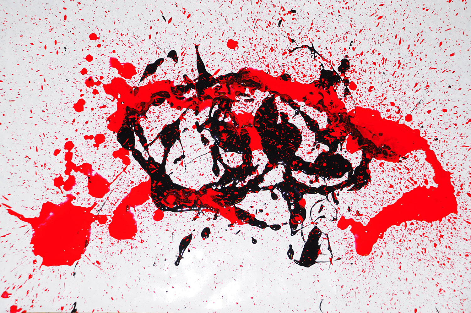
I have to consciously decide to do a piece in blue, being one of a handful of people on the planet who don’t particularly care for the colour outside of nature. So, spatter, splatter blue! Click for full size.


© C. Ford, all rights reserved.
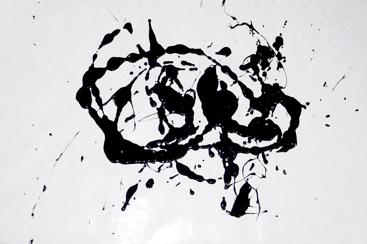
Very wet! Click for full size.
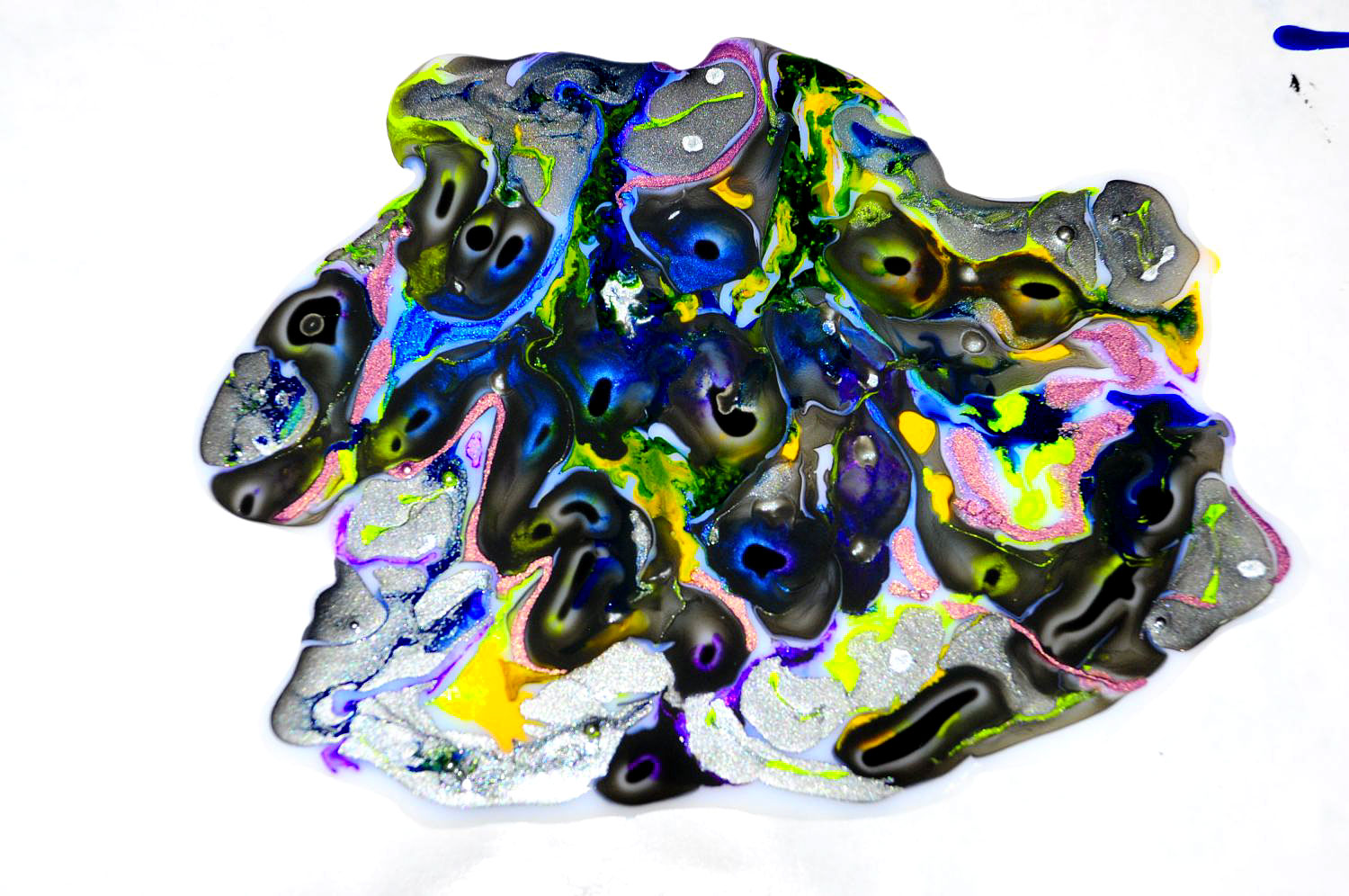
© C. Ford, all rights reserved.
Yesterday, I started the process for some peeled paint pieces. As noted before, acrylics are, of course, the paint of choice for this type of thing. However, if you have inks or other non-acrylics you’d like to use, just lay down a nice puddle of fluid medium first. I use Liquitex. I lay out my paints on the waxed side of freezer paper. It’s lovely peeling fluid medium, because you can do it in one lovely piece. (To be torn apart later, or not.) I took this one outside to photograph, had some fun with it. Then it was time for the more painstaking peel. Click for full size!


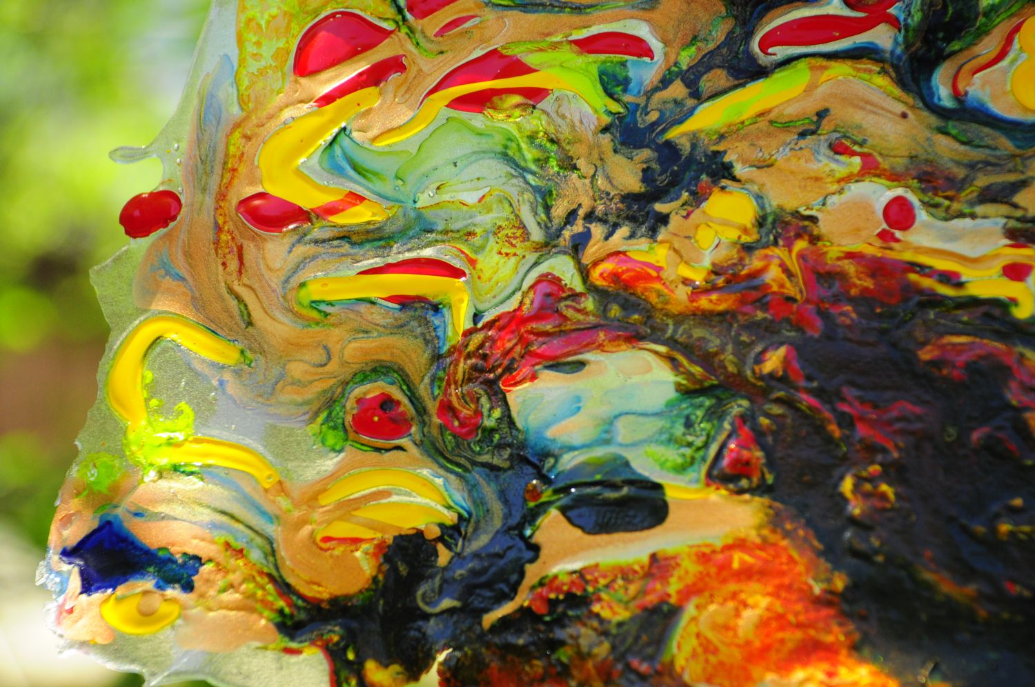

© C. Ford, all rights reserved.
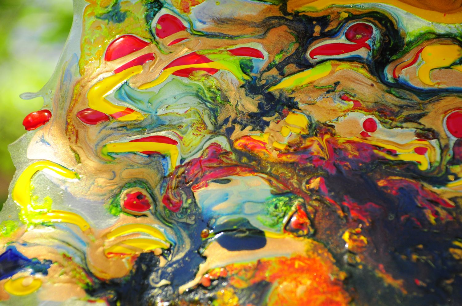
I finished the peeling started yesterday (more on that later), then decided to play a bit more, because what else are you gonna do when the server is non-functional? Reminder to self: don’t wear good jeans when pouring paint from a height with glee, stupid. Click for full size.

© C. Ford, all rights reserved.
As always, artists are at the forefront of the latest Tiny Tyrant Total Fuck Up, brilliantly skewering Trump’s idiotic, uniformed, grossly mistaken decision to withdraw from the Climate Accord. Apparently, Trump asked “at what point do they start laughing at America”, being utterly oblivious to how people have viewed this lost country since his campaign and election. Ever the Fucking Idiot.

Marian Kamensky, America First. Click for full size.
You can see more of Marian’s shiny skewering here.

Vasco Gargalo, Little Man.
You can see more of Vasco’s work here.

Ose Koer.
You can see more of Ose’s work here.

David Rowe. Excusez Moi.
You can see more of David’s extremely sharp work here.
You can see more at Raw Story.
One of the more enjoyable things about doing peeled paint with non-acrylics and fluid medium is watching how they morph over time. Click for full size.


© C. Ford.
