You’ll love these, amazing animals and plants, from Masayoshi Matsumoto!
Head on over to Isopresso_Balloon to see much, much more!
You’ll love these, amazing animals and plants, from Masayoshi Matsumoto!
Head on over to Isopresso_Balloon to see much, much more!
Click for full size.

© C. Ford, all rights reserved. Markers and Pencil on Bristol, 16″ x 20″.
Yesterday’s Cancer Chronicle was mostly a &^%$$#fest over the cancer decor in oncology and there’s also the awful decor of the infusion center. Raucous Indignation was nice enough to do a photo walk through of all his oncology work spaces, giving me a chance to see what other oncologists do when it comes to decor. I have to say, for the most part, this is much better than what I get to stare at every two weeks.
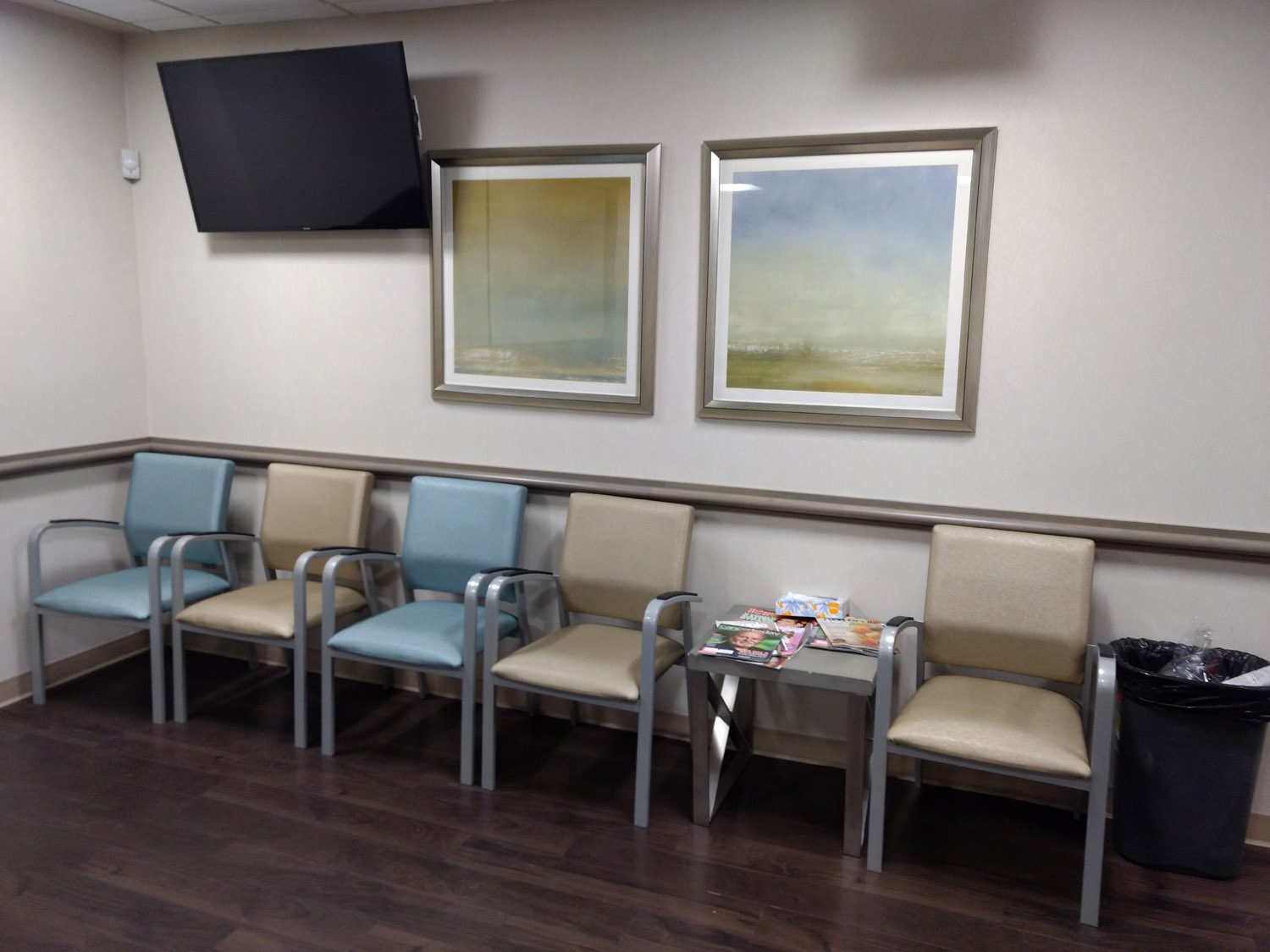
The waiting room. Okay, the pictures are fine, if on the bland side. Oh, do I ever recognize those chair colours! No, bad. That awful beige makes the blue look horrible. Black would make the blue pop, and nothing wrong with basic black, goes with everything. In the case of cancer decor, beige is the death colour, not black. Or, a tonal shift could make all the difference. Shade the blue more aqua, and replace the beige with a pale yellow. Right there, you have warmth and light without being obnoxious. And the walls, no, bad walls!

The lav. The painting is lovely, but it would probably be better if it were in front of patients, rather than behind. Cancer patients often have to spend much too long of a time in a lav, so having something to stare at is good.
Beautiful paintings! The carpet? No! There’s that godawful beige and icky brown again. There’s nothing wrong with beautiful, life affirming colours on the floor. You could get a nice multi-colour blue to go with the paintings.

Nice. I don’t worry about exam rooms, there’s always stuff you poke around in.

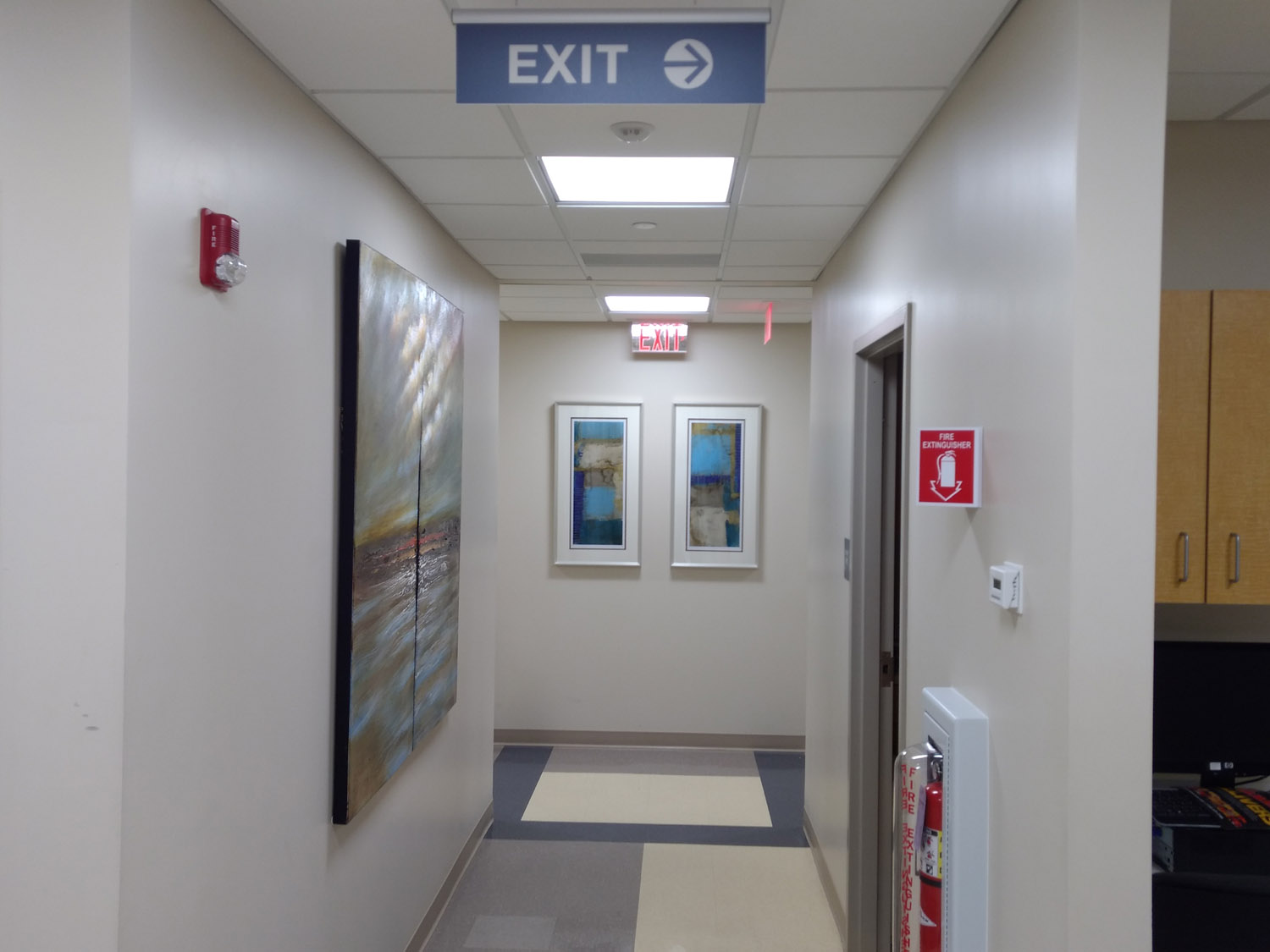
Very nice! I’m crazy about the photos, those are so fabulous! That sort of thing should be everywhere. The walls – no! Even eggshell white would be an improvement, but I’d go with a pale yellow. The blue chairs are okay, not wild about them, but those um, beige-green ones? Ick, no. Your visitor chairs are nice enough, why not go with blue and black chairs? Again, the black would make the blue pop, and would tie in with the visitor chairs. The curtains are quite nice. And I know this isn’t you, but hospital standard – the floors. Oh, awful.
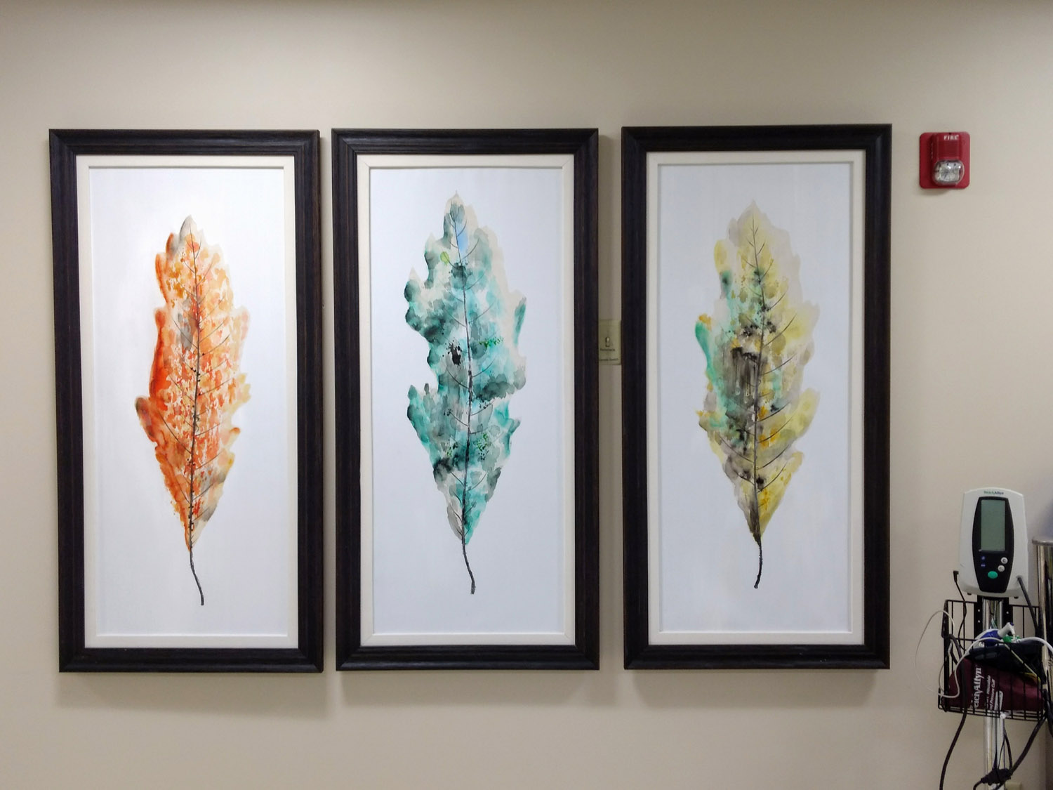
The triptych is fantastic, beautiful in every way. Those walls, though…
I’m working on First Reaction, and every time I use this one pencil, and it freaks me out a bit, because I keep seeing it crooked. It’s very easy to see pencils crooked though, you can make them all wavy on purpose. I finally paid attention and looked at the pencil, and it’s not me, damn thing is crooked. :D

© C. Ford.

“Game of The Star-Spangled Banner, or Emigrants to the United States” (1830), published by Edward Wallis.
Look how nice Turtle Island was before all the invaders showed up.
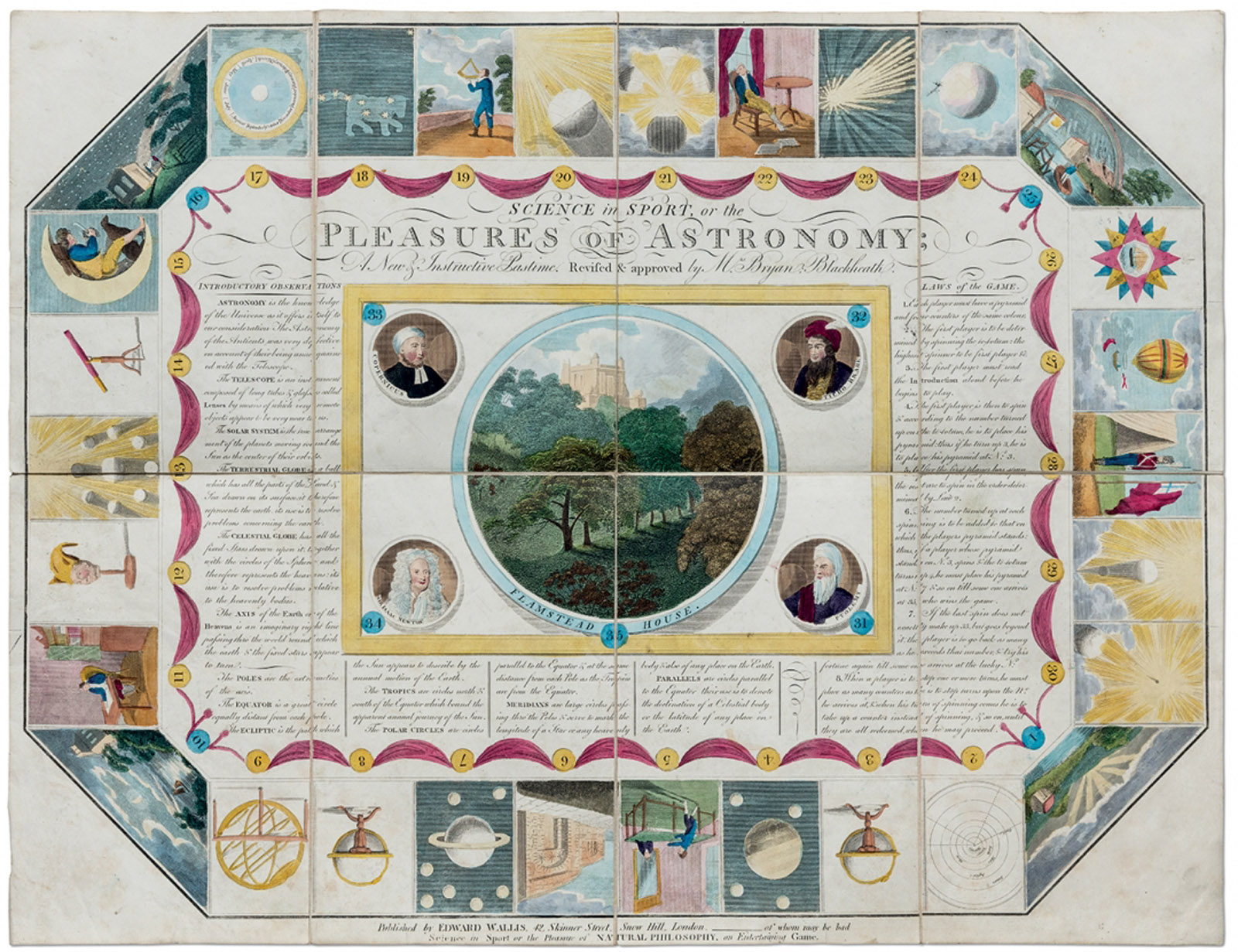
“Science in Sport or the Pleasures of Astronomy, A New Instructive Pastime” (1804), published by Edward Wallis.
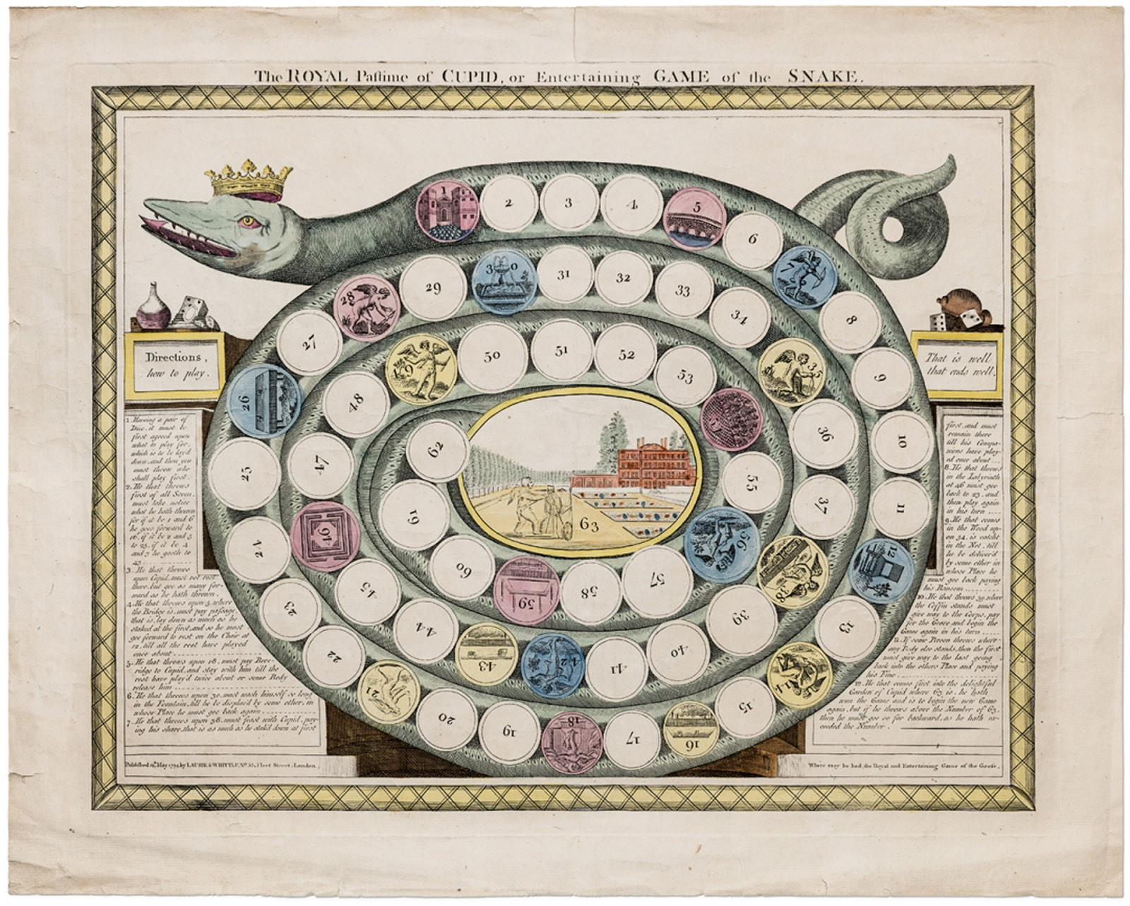
“The Royal Pastime of Cupid, or Entertaining Game of the Snake” (1794), published by Robert Laurie and James Whittle (all photos by Antoine Bootz/©Pointed Leaf Press).
Fascinating board games here, and you can see so many more, and read about them at Hyperallergic. I love the Elephant, but I have a thing about them.
Finally got a couple shots of the Infusion Center with my ancient coolpix. First is the station across from me, I waited until that person was done and had left. It’s like this all the way down, both sides. The nurses’s station is to the side of this chair. Second photo is my chair, got a bit of work done, and took this while I was still hooked up, but close to done. Click for full size. The worst effect of this cycle so far? My tea now tastes like a combination of soap & vomit. This might be a world ending event.


© C. Ford, all rights reserved.
So sorry for the bad flash, between one zillion things to do today, serious medication, and cancerland in general, I’m lucky I remember how to use a camera. Not a good effort, but it’s too damn cold to wander outside in my robe.
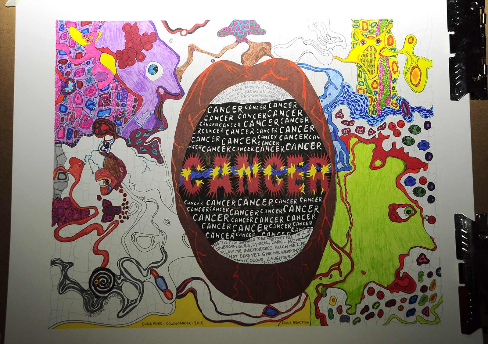
First Reaction, © C. Ford, all rights reserved.
Upper left corner, WTF Duck and Face, bound and gagged. Middle left, the remnant of pre-cancerous me. Lower left corner, the Welcome to Cancerland Mesmerowlbat. Upper right corner, the Cell Slug, she’s a good one. Lower right, Face – anxiety, fear. All bound in a cell matrix. The cancer cells are the red-purple ones. Markers on Bristol, 16″ x 20″.

Judith Bernstein, “Money Shot – Blue Balls” (2017), acrylic and oil on canvas, 104 x 90 1/2 inches.

Judith Bernstein, “President” (2017), acrylic and oil on canvas, 90 x 89 1/2 inches (all images courtesy the artist and Paul Kasmin Gallery).
Judith Bernstein, who is finally getting the attention she should have had all along (only took until she was 72), has a new show, Money Shot, and it is a scathing indictment of our current state of regime.
In Money Shot, Schlongface is an omnipresent demagogue. The character (similar to Cockman, who debuted in Bernstein’s works of the 1960s) has a cock and balls for a face. Schlongface is meant to represent Trump, but the figure can be spliced into innumerable moments of history. He is the pathetic villain, the dictator whose rampant destruction betrays both his predilection for rape and impotence.
What hits you on the nose feels like a kick to the crotch. The seriousness of these political and psychosexual implications, told through tongue-in-cheek (or cock-and-nose) wordplay and humor, are important themes in Bernstein’s work. In her impactful scale, enraged mark-making, and caricature, there is never an either/or. There are only contradictory couplings. Laugh. But fear.
[…]
In “President” (2017), Schlongface seems to merge with a foreshortened female figure whose legs are spread-eagle in the foreground. The figure’s crotch is stamped with the US Presidential Seal – with an asshole like a target beneath it. The political and psychosexual dynamic of Bernstein’s work turns on the complexities derived by the receiver.
Judith Bernstein: Money Shot continues at Paul Kasmin Gallery (293 Tenth Avenue, Chelsea, Manhattan) through March 3. You can see, and read much more at Hyperallergic.

Kate Kretz, “Cri de Cœur (Heart Cry)” (2018, after a detail of “Scène du Déluge,” 1827, by Joseph-Désiré Court), graphite on paper, 14 x 11 inches (courtesy of the artist).
While I understand poetic license, I’ll just add this is a father’s nightmare, too. That said, powerful artwork and poetry from Kate Kretz…
Here
the bitter dusty old men
dream
of the battle they shoulda won at Gettysburg
or finally
showing Daddy they could be a man
(in the street at High Noon)Here
the young ones (who can’t get laid)
are
momentarily
Duke Nukem from Bulletstorm Full Clip
(in overkill mode, for extra points)
Finally scoring.Here
another walking-anger-management-issue
finds a people-killing machine
(no problem)
It fires
fast and hard
a jolt
to finally feel something
Make their mark.Here
mothers
must forever wade in the nightmares that
their children
might be the next collateral damage
in
yet another lost man’s
fantasy
of self-actualization
Via Hyperallergic.
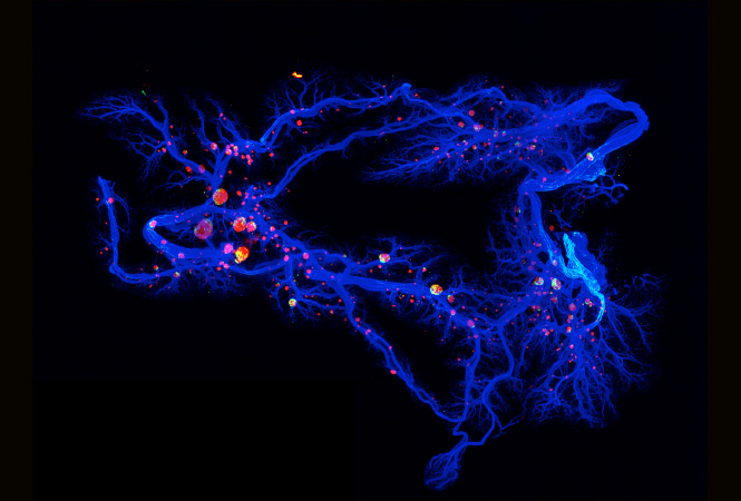
The Pancreatic Milky Way. By Jürgen Mayer, Centre for Genomic Regulation, Barcelona.
I’m a bit obsessed with cells at the moment, living in Cancerland will do that to a person. That said, our bodies are a wonder of microcosms, a universe we rarely think about or delve into with any true interest. Cell Picture Show has an astonishing range of cell images, from humans to plants to ocean to invertebrates. You can stay happily busy there for hours! And for all the textile artists out there, there’s a wealth of inspiration in the ‘Art Under The Microscope‘ section, where a textile artist has tackled various cell imagery:

Fire In Her Eyes, Rebecca Bernardos, University of Michigan
Art Quilt by Judy Busby, Fiber Artists@Loose Ends.
In this Picture Show, we continue the theme of beauty in science with artistic interpretations of scientific images. We partnered with the University of Michigan Health System to showcase a selection from the traveling exhibit Art Under the Microscope. Special thanks go to Fiber Artists@Loose Ends, UM Center of Organogenesis Bioartography Program, UMHS Gifts of Art Program, and Global Alliance for Arts and Health.
The zebrafish retina, unlike its human equivalent, is capable of regenerating in response to injury. Learning how zebrafish produce new photoreceptors, which are the light-detecting cells in the eye, may provide clues for designing therapies to reverse retinal degeneration in humans as a treatment for blindness.
Image: (Left) A section of the zebrafish retina is shown. The red feather-like cells are the photoreceptors, and the nuclei are marked in blue. (Right) Artist’s rendering using hand-sewn sequins to represent the bands of nuclei and red fabrics and handmade paper to depict the photoreceptors.
So, if you’re an artist, take some inspiration from ourselves, and the world around us, on a cellular level. If you just like looking at amazing and beautiful things, this is a place for you!

First Reaction, © C. Ford, all rights reserved. Click for full size.
Markers on Bristol, 16″x20″.

“First Reaction” © C. Ford, all rights reserved.
I started this last week in hospital, and I’ll most likely still be working on it at the next chemo session on the 21st. Markers on Bristol, 16″ x 20″. Click for full size.
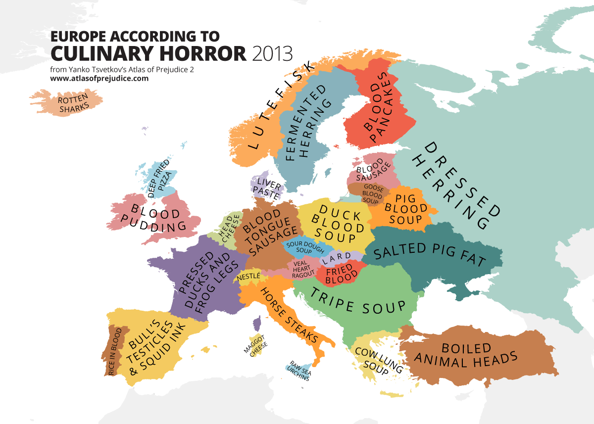
Map created by Yanko Tsvetkov from Atlas of Prejudice 2: Chasing Horizons.
I have to say, this made me laugh. One of my great grandmothers had a great love of blood based dishes, but I never did develop a taste for them. Out of all these, I don’t think Kyselo sounds bad at all, and that’s coming from someone who is not a fan of cooked mushrooms.
While European food has a very positive international reputation, it’s not all steak frites and pasta. As the map above shows, the continent also has its fair share of disgusting dishes and culinary horrors.
The map is the work of Yanko Tsvetkov and appears in Atlas of Prejudice 2: Chasing Horizons (also be sure to check out his first book Atlas of Prejudice: Mapping Stereotypes, Vol. 1)
You can see a linked list of all the foods in the map here, if you’re looking for more culinary info. Interesting reading all the way around! One thing is absolutely certain – there is absolutely nothing which would induce me to try maggot cheese. There are just some lines not to be crossed. :D