I got distracted. Again. Seems my brain has been having a bit of a vacation too, I’ve been quite the space case lately. Anyroad, came upon these um, attachments? Extensions? Falls? (Does anyone else remember falls?) I’d love to have some of these done with my hair, if it ever achieves thickness again. These are from 1840. Click for full size!


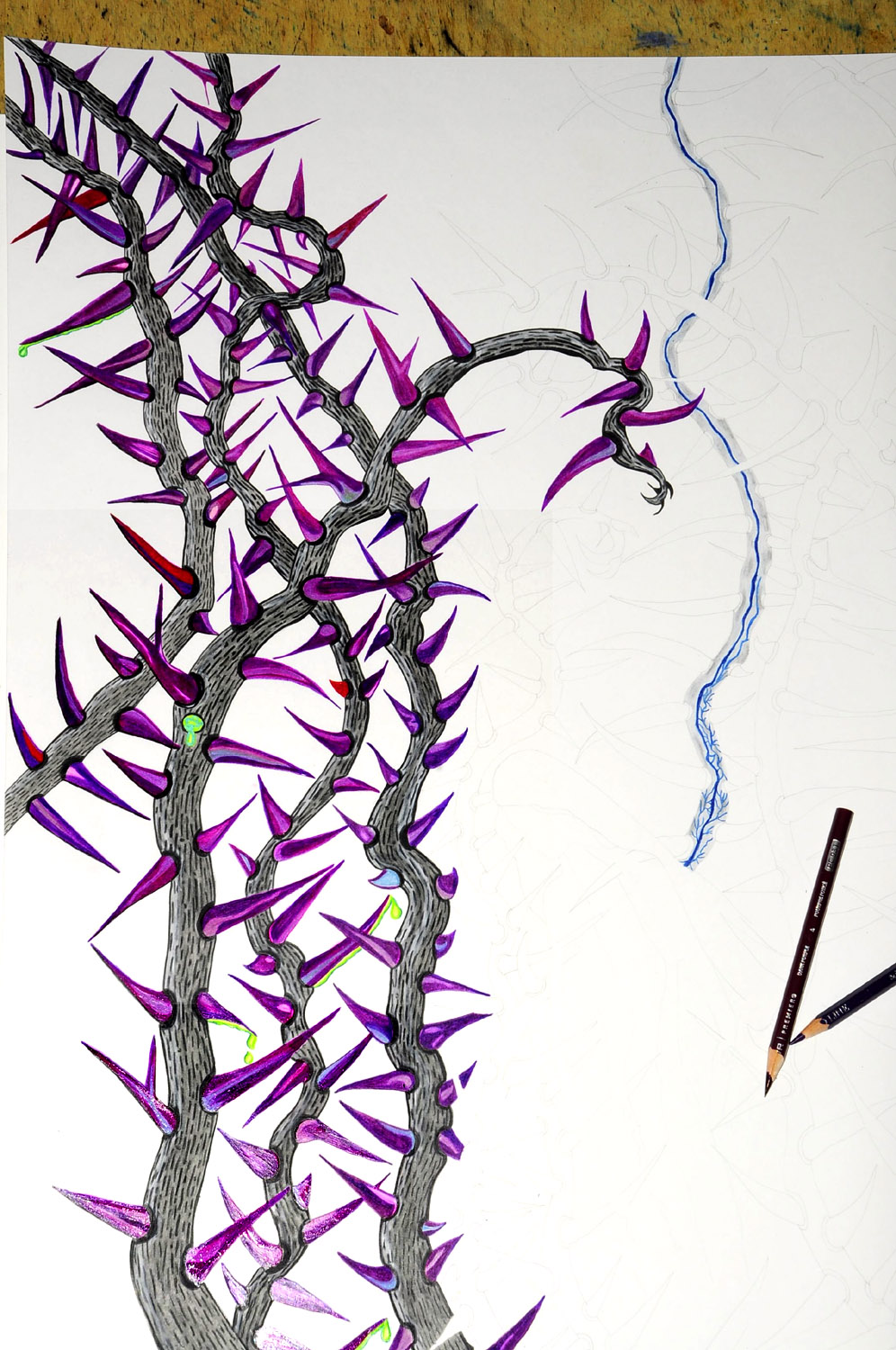
![The Problem [right} and the New Choice [left].](https://i2.wp.com/freethoughtblogs.com/affinity/files/2018/06/ThornProblem.jpg?ssl=1)