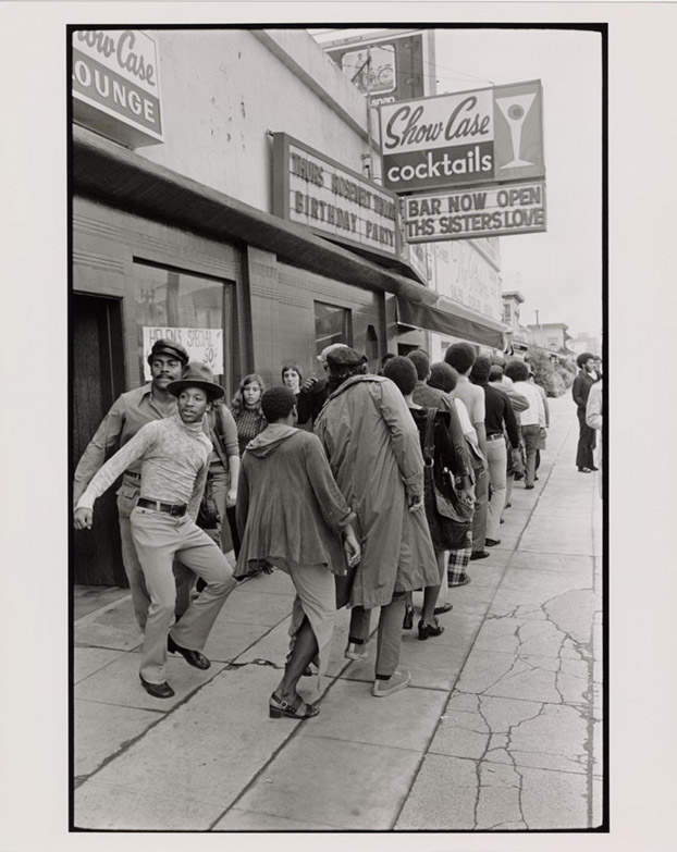
Finding The Perfect, Paint Worthy Egg.

Sandro Botticelli, “The Birth of Venus,” tempera on canvas (c. 1486, via Wikimedia).

Sandro Botticelli, “The Birth of Venus,” tempera on canvas (c. 1486, via Wikimedia).

Egg tempera! A time honoured technique. Many artists have at least played with egg tempera, even if they later chose a more modern and convenient medium. Karen Chernick at Hyperallergic has an article on how to source the very best egg you can for making your paints.

…But there’s also a centuries-old artistic tradition of painting using the eggs themselves. Egg tempera was a ubiquitous technique during the early Italian Renaissance, when it was considered the standard for portable easel paintings. Botticelli, Raphael, and Andrew Wyeth all painted with tempera. Today, the quick-drying medium, which employs a 50/50 blend of egg yolk and color pigment, is mostly in use by a brave few contemporary practitioners (who must not mind the smell of aging eggs in the studio).

These seasoned artists know what to look for in the perfect paint-worthy egg. Some of them, such as Mary Frances Dondelinger, have been known to use hundreds of eggs a month. Others are regulars at particular farmers’ markets, or swear by a specific brand of store-bought eggs. Just in case you’re not able to raise your own hen (which most agree is the very best option), here’s your guide to sourcing the ideal egg, according to six contemporary egg tempera painters.

The full story is at Hyperallergic.

Easter gingerbreads

We do not celebrate any religious holiday, but they are a good excuse for my mom to go on a gingerbread-baking spree. They are beautiful and delicious, and each year she comes up with new designs and styles. I do not know how she does it.

Gingerbreads

©Charly, all rights reserved. Click for full size.

Gingerbread

©Charly, all rights reserved. Click for full size.

Gingerbread

©Charly, all rights reserved. Click for full size.

Cy Twombly: Extravagant Synesthesia.

Cy Twombly, “Untitled (Gaeta)” (1989), acrylic and tempera on paper mounted on wooden panel, 80 × 58 5/8 inches, Private Collection, © Cy Twombly Foundation. Courtesy Gagosian.

Cy Twombly, “Untitled (Gaeta)” (1989), acrylic and tempera on paper mounted on wooden panel, 80 × 58 5/8 inches, Private Collection, © Cy Twombly Foundation. Courtesy Gagosian.

In her essay, “Cy was here: Cy’s up” (ArtForum, September 1994), Rosalind Krauss made this observation about Cy Twombly:

Twombly “misreads” Pollock’s mark as graffiti, as violent, as a type of antiform. And this misreading becomes the basis of all of Twombly’s work. Thus he cannot write “Virgil” on a painting and mean it straight. “Virgil” is there as something a bored or exasperated school-child would carve into a desktop, a form of sniggering, a type of retaliation against the teacher’s drone.

This reading of Twombly fits in with the commonplace critical narrative that the past is dead, and that it is only good for appropriation and ironic commentary but not much else. Krauss’s condescension towards Twombly is evident in her use of the descriptors, “bored or exasperated schoolchild.” In her neat hierarchical construction — a negative way of thinking that is recurrent in criticism and politics — Jackson Pollock resides at the top of the food chain while Twombly sits, at best, somewhere in the middle.

Krauss is not alone in her need to construct hierarchies. There are still lots of critics, curators, and artists content to ally themselves with established viewpoints as well as assert for the umpteenth time that painting and drawing are things that have been used up, that they are old threadbare coats that should been thrown out long ago. This is capitalist aesthetics in a nutshell — everything is disposable.

Cy Twombly: In Beauty It is Finished: Drawings 1951-2008 continues at Gagosian Gallery (522 West 21st Street, Chelsea, Manhattan) through April 25.

John Yau has an excellent look at Cy Twombly and his work, well worth reading.

Anatomy Atlas Part 1 – Spine

This first in a series of human anatomy sheets that I have drawn during my studies.  As future biology teacher I had to acquire some basic knowledge about most of biology – sort of  jack of all trades, master of none. However our class was one of the last where human anatomy was taught by a prominent Czech physician and scientist Profesor MuDr. Jaroslav Kos. He was eighty years old at that time and it was showing, however he still was formidable and very strict. I failed my first exam miserably, I do not even remember what the theme of the examination was. I think brain stem? Nevermind, it took me two attempts to pass and for the second attempt I really sat and learned latin like my life depended on it. He did not even let me finish on my second attempt  and waved me away with top grade after I described how  nervus olfactorius consists of multiple separated fila going straight through lamina cribosa directly into the bulbus olfactorius of the brain. I forgot most of my medical latin over time, but I still remember this.

Spine Drawing

©Charly, all rights reserved. Click for full size.

A fun fact about spine – the “S” shape of our spine and all accompanying problems it brings stem from the fact that it originally evolved for movement in water and later on land with lateral undulations, which was later yet modified for movement on land on all four with vertical undulations, which was even later modified for upright movement on hind limbs only. The spine was definitively not intelligently designed for vertical posture and load bearing. Evolution has done its best, but that is always “just enough”.

An Island

AnIsland_Painting

©Charly, all rights reserved.

This is a coloured sketch to one of my paintings. I cannot unfortunately make a picture of the final painting, because I gave it to my brother who now lives 400 km from me. All the paintings I gave him are at the moment not fulfilling their function, because my sister in law has stashed them away.  They “do not fit with the color scheme of their new appartment” which I did not take kindly, because they could keep the paintings during the renovations in mind if they wanted to. Click for full size.

A bummer – I have just reminded myself that a lot of my sketches are ruined or damaged. A few years ago I was reconstructing the roof and the workers have moved my stuff around without heeding my instructions. The impromptu cover was also built sloppily and my warnings that I live in very windy area were dismissed as needles worrying of an amateur. Inevitably the drawings were stashed under the impromptu cover which got ripped off in a gust of wind. And rain poured on them. I only found out a few months after they left, when everything was mouldy.

It would take a lot of time to airbrush it in Photoshop, so some of the pictures will unfortunately have maps on them.

Working On and Slobbery Dogs…

Lately, I’ve been working on the floor, so this is my fault, but slobbery dogs, aaaaauuuugh. One of the doors in my studio opens onto the lav, and the door was open. I go in for around 10 seconds, and Jayne promptly stands over the painting and drools. Now he’s sleeping the sleep of the innocent (What? I didn’t do anything! Why are you yelling? Can I have a treat?)

New Game: Foundation.

Foundation is a grid-less, sprawling medieval city building simulation with a heavy focus on organic development, monument construction and resource management.

The game features in-depth resource management akin to the Anno (Dawn of Discovery) series, expertly mixed with city building elements from SettlersSimCity, and Pharaoh all topped with narrative encounters inspired by Crusader Kings II to create the ultimate medieval ant-farm simulation!

In this strategy city-builder economy simulation game, players must create a prosperous settlement as the newly appointed lord of a region untouched by man.

Setting to redefine the city-builder genre, Foundation puts the emphasis on the organic aspects of urbanism in the cities of old, powered by Polymorph Games’ in-house game engine, Hurricane, which allows for full mod support and is optimized for the thousands of moving parts that come with building humongous cities.

Among other things, the engine provides the player with robust building tools to create countless unique monuments that can then integrated into your settlement.

With medieval architecture and urbanism at the forefront of its design, Foundation’s vision is to allow players to recreate cities of that period as they envision them or even as they really were.

You can read and see more about Foundation at Medievalists, or just head straight to the Kickstarter, which has garnered much more than the initial ask.

Banksy Blitz NYC.

One of the new Banksy murals in Midwood, Brooklyn. Benjamin Sutton.

One of the new Banksy murals in Midwood, Brooklyn. Benjamin Sutton.

Banksy’slatest series of interventions in the New York City streetscape continued apace today. This afternoon the artist revealed on Instagram that a mural in the Midwood section of Brooklyn that had come to widespread attention last week is in fact his doing.

The mural is a characteristically coy commentary on capitalism, although it is accompanied by a smaller piece that depicts a seal. The pair is located in Midwood, at Coney Island Avenue and Avenue I. The larger one features what looks like a real estate developer (equipped with both a briefcase and a hardhat) brandishing a whip in the shape a rising red line graph, while a procession of children, a woman, an elderly person, and a dog flee. Nearby, a smaller mural whose connection to the theme of gentrification is indecipherable, features a seal balancing a ball — formed by the unpainted circle where a sign used to hang — on its nose.

It’s always interesting, tracking Banksy, and this is no exception. Benjamin Sutton at Hyperallergic has the story.

2018 Sony World Photography Awards.

The Great wall of Namib. © Paranyu Pithayarungsarit, Thailand, Shortlist, Open, Landscape & Nature (2018 Open competition), 2018 Sony World Photography Awards.

The Great wall of Namib. © Paranyu Pithayarungsarit, Thailand, Shortlist, Open, Landscape & Nature (2018 Open competition), 2018 Sony World Photography Awards.

Oh, such amazing photography, glimpses of all the worlds within our world! I had to bookmark, because I have too much to do today and I have to be good and asleep early (5:30am wake up), but I’ll work my way through eventually. Have a wander and see wonders!

This was via Atlas Obscura, which highlighted twelve landscapes, including the one above.

Katastwóf Karavan.

Kara Walker with her “Katastwóf Karavan” at the Mississippi River Trail on February 23, 2018, in New Orleans. Josh Brasted/Getty Images.

Kara Walker with her “Katastwóf Karavan” at the Mississippi River Trail on February 23, 2018, in New Orleans. Josh Brasted/Getty Images.

[…] Walker titled the whole montage the Katastwóf Karavan, or Caravan of Catastrophe, the use of Haitian Creole signaling the mix of Caribbean and Southern histories that shaped New Orleans. Walker’s first public installation since the 2014 Marvelous Sugar Baby — the enormous Sphinx-like mammy figure that she built out of sugar in the now-demolished Domino factory in Williamsburg — the Karavan went up for the closing weekend of the Prospect.4 triennial, which ran for three months at multiple sites around New Orleans. The installation was freighted with layers of site-specific symbolism — none of it subtle if you knew a bit about local history, yet all of it obscured by years of avoidance or, at best, awkward notes in the narratives delivered by school curricula or tourist brochures.

Thus Algiers Point: Here, in the eighteenth century, traders warehoused disembarked captives — those who survived the Middle Passage — before selling them on the opposite bank in the markets that dotted the French Quarter and surroundings. This is where families were rent apart, humans assessed and packaged as commodities. Thus, too, Walker’s tableaux, relevant across the landscape of chattel slavery but especially here.

And thus the calliope, a direct retort to the one on the Natchez — “the OTHER calliope,” Walker called it on her handout for the event — and its sonic broadcast of a whitewashed history. Several times a day, the vessel’s instrument blares out to the city (there is no such thing as a quiet calliope) items from a hoary playlist such as “Old Man River,” “When the Saints Go Marching In,” “God Bless America,” and, yes, “Dixie’s Land.” […]

You can read and see much more about Kara Walker’s latest piece here.

And the siren sings…

© C. Ford, all rights reserved.

© C. Ford, all rights reserved.

I’ve been working in pencil too long, does my head in. Pigments are my true love, and always will be. They’ve been singing to me lately, which leads me to the matter of paints. A while back, a friend was thoughtful enough to send me a whole bunch of watercolours they weren’t going to use (Hi, Kestrel!), and I about screamed with delight when I saw the Sakura Koi paints. I haven’t had those in ages, and I love them. Love them to pieces. I’m not impartial to Sakura; I have a whole lot of their markers in my studio, and their products have never disappointed.

I’ve written before about the sheer gougery in art products, everything costs a bloody fortune. Just trying to recoup your materials cost in any given piece can seriously hike the price you end up asking. There is, of course, a staggering amount of snobbery in the world of art supply. Many people end up convinced that name equals quality. Sometimes, it does. Other times, not so much. Some people are so convinced that name equals quality, they don’t pay any attention to the actual quality of the product. This is oh so true when it comes to paints. The best way to insure the quality you want is to make your own, but that does your wallet no favours. Back to the Sakura Koi – the set I bought ages ago, I did buy because of price. Sakura manages to attach a reasonable price to their products, which is not a crime, in spite of many people thinking so. I was pleasantly surprised by the quality of the pigments, clear, bright, and luminous. It’s very easy to get distracted by the ‘big’ names, and spurn the reasonably priced stuff, but it’s truly worth your while to give the reasonable stuff a try, there are many gems there which you won’t be disappointed in at all, and they’re a kindness to that wallet too. The 18 set shown runs around $27.00 these days, and the tubes are a very generous 12 ml, so they’ll last a long time.

Von Wright’s Scandinavian Birds.

All of the stunning paintings in Svenska Fåglar (Swedish Birds) by the von Wright brothers (1929 folio version) are in the public domain, and free to download and use in any way you wish. This is exquisite artwork, so even if you don’t want to use it, have a wander anyway, your day will be better for it. Also in the public domain are Birds of Australia, Ornithological volume by John Gould (1804-1881), illustrated by Elizabeth Gould (1804–1841), which introduced more than 300 new birds to the world.