Here’s the answer for you. In the 1930s, Minnesota had an extraordinarily successful third political party, the Farmer-Labor Party, or FLP. And I mean really successful.
In 1930, the steady work paid off. Floyd B. Olson defeated the Republican and Democratic candidates for governor, beginning the third and most successful period of Farmer-Labor history. A gifted orator, Olson voiced the feelings of Minnesotans struggling with unemployment and economic hardship. Voters re-elected Olson as governor in 1932 and 1934. He was a sure winner for the U.S. Senate before he died of a stomach tumor in 1936.
Olson’s success, combined with skillful organizing, sparked dramatic growth in Farmer-Labor participation. Dues-paying membership in the party’s association rose to almost forty thousand as organizers set up clubs across the state. Hundreds of Farmer-Laborites held elected offices at all levels of government, from city council to U.S. Senate. In 1936, the FLP captured six of nine congressional seats, the governorship, and a solid majority in the state House of Representatives.
It was a progressive, socialist-leaning political party. It merged with the Minnesota Democrats in 1944, which brought it closer to the center, unfortunately, but at least it had those strong progressive roots. The name means something. This was a party with a tradition of standing strong for labor unions, small farmers, and the social safety net.
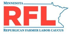
Our local Republicans, on the other hand, have always stood for the opposite, which makes it rather ironic that some of them (including our rep, Jeff Backer) have decided to form something called the Republican-Farmer-Labor caucus, or RFL. It’s trying to steal the sentiment, but not the substance, of the DFL. It’s also trying to steal something else. Here’s the logo for the RFL:
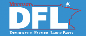
‘Round these parts, we’re all familiar with the DFL logo, but maybe you aren’t. Here’s that:
Notice any similarities?
Not even a spark of creativity, or an ounce of effort was put into that. These are terrible, lazy people who are also dishonest.


It’s a great history which, unfortunately, they do not live up to.
The DFL caucus system is uniquely flawed, and is remarkably anti-Democratic. People object to the Iowa Caucuses but at least everyone who shows up gets a vote. In Minnesota, for your vote to count for an endorsement, you have to survive each winnowing round: not just showing up, but getting elected to the next round and then the next.
Only elected state delegates get a vote on the DFL endorsements. I did the math once. Only a fraction of 1% of MN Democrats get a say on who they endorse. That is not democracy.
Move the endorsement convention to the weekend AFTER the primary (like Iowa does). Then the party can always disagree with the voters if a mistake has been made (MN does vote for the wrong ‘Anderson” on occasion).
Weaking the primary system weakens the party. There is a fraudulent neoliberal belief that contested primaries weaken the party but if you check the records, the winners of contested primaries do much better in the general election. With or without a meaningless party endorsment.
RFL? More like ROFL.
Yeah, rip up the current caucus system. My wife & I went through it recently — she actually got elected to go on to the next stage — but then learned that other obligations meant she couldn’t go, which meant our opinions meant diddly.
While we’re reforming, could we also remind the DFL leadership that the “L” stands for LABOR, not Loser?
Thankfully Minnesota got rid of their Presidential caucuses at least and will be having a primary instead in 2020.
Well, honestly, I prefer the RFL logo.
– A nice, clean background and overall a better use of the colors. The text really pops — a big, loud, red “RFL” jumps right out at me, while the rest does its job of filling in the details. It seems easier to read, and the intense blue and red are I guess a bit less jarring when they are separated with some empty space.
– They dispensed with the ugly and unnecessary hyphenation.
– There’s no weird star, projected at some wacky angle and placed in Ontario for no apparent reason. They certainly will do pointless things as a caucus, but the logo doesn’t give you any hint of that.
I do prefer how the DFL uses small caps, since all of the words should be capitalized in the name, not just the first one as the RFL has it (i.e., only the “R” is properly capitalized there). But it seems fair to say they made a little bit of progress with that crusty old design. Maybe the DFL should steal the improved version back from them.
Small caps: nice, but done wrong in the DFL logo. Small caps are not just caps at a smaller point size! They should be purpose-drawn characters, with stroke weights matching the “big” caps and the lowercase letters, and often wider for their height than the “big” caps. If you just scale down regular caps, they look too narrow and too thin, and the “big” caps stand out like sore thumbs. Many good fonts have small caps: see the RFL logo…
Or even ROFLMAO. Been a while since I have seen a disemvoweling event.
I have heard there are farmers who support Trump, which makes me sad, but why on earth would Labor support the Republican Party? If you want to see what Republican policy does to organized labor, you need look no further than Wisconsin.
I love the Frederick Douglas reference in the DFL logo.
Although, thinking again, even if the FLP was progressive, it’s still possible that’s not a Frederick Douglas reference. Hmm. Guess I’ll have to do some reading.
a leopard can change his spots but he still is a leopard.
uncle frogy
The weird star is a reference to the state motto ” l’étoile du nord ” or the star of the north. French fur trappers were some of the first Europeans in this region. I’m wondering why it is placed as if it is the actual North Star/Polaris as seen in relationship to the Big Dipper?
Of course the new bandit gang’s logo looks very similar to an older mafia’s logo: The Beginners Big Book of Patterns to Trace the new gang used did not have a swastika. This also explains why it looks like it was drawn in crayon.
I was brought up on this stuff, and it’s a great heritage. If you want to get the feel of it, see if you can find the 1978 film Northern Lights. It is set in eastern North Dakota, but is part of the same movement. I have a great book called Third Party Footprints (1966) by James M. Youngdale (local guy, lived near Benson) that collects material by radicals of the upper Midwest.
Even in the 60s, when I was in the 7th or 8th grade, there was a farmer’s strike — they blockaded the roads to keep trucks from transporting farm produce through Western Minnesota. My farmboy classmates were coming to school half-asleep after manning the blockades with their dads all night. With shotguns.
consciousness razor @5:
Any graphic arts critique should consider the audience for which the graphic is intended. The DFL logo is intended for Minnesotans. People of the North Star State are aware that the logo’s star is not in Ontario, it is in the sky. The hyphenation is not a style choice, it’s the name of the party. (If the Republicans had put hyphens in theirs, their logo would be even more laughable — and not due to aesthetic considerations.)
And the color use is unfortunate, but probably can’t be helped, since political graphics are now so heavily influenced by this “red state-blue state” thing which is a fairly recent development, and, I have felt, not helpful. In a variety of ways.
(I have a button from after the 1984 election, showing the one pinkish-red state on the blue electoral map, with the legend “Don’t blame me, I’m from Minnesota.”)
I remember when the Minnesota Republicans decided to rebrand themselves as the Indpendent Republicans (as if) in the wake of Watergate. Because, you know, they had nothing to do with Richard Nixon and his cabal of crooks at CREEP (the aptly-named Committee to Re-Elect the President). They had some stupid I-R logo that evidently didn’t last too long.
I’ve never understood why your Republicans use the wrong colour. Red is the colour for left-wing parties, it belongs nowhere near that cohort of diet fascists, actual fascists and worshippers at the altar of market fundamentalism.
It’s fine that your Democrats use blue – they’re about as right-wing as the Tory party here, and anywhere else would be considered the hard right. But the Republicans should really use a darker blue. Or, more realistically, both parties should use green to signify that their only real loyalty is to money.
Or did they choose red based not on the conventions of political iconography but on the conventions of military battle diagrams going back to Clausewitz? Traditionally friendly forces are depicted in blue, the enemy in red. Which would be appropriate as the pro-gun, anti-equality, climate change denying Republicans are very much the enemy of all humanity.
As I understand it, red and blue were assigned pretty randomly in US coverage up until the 2000 election, where the major networks happened to have all chosen blue for Democrats and red for Ratfucklicans, and because of all the extra coverage those colors stuck in people’s minds.
The colors have been red for Republicans and blue for Democrats since I was a child in the ’50s, and all the political paraphernalia I’ve seen that’s older than me reflects these same color choices.
R’s used to occasionally use blue or other non-red colors when running in very blue districts/states, most commonly at the lowest levels especially in non-partisan races (which of course never are).
The big break from red-blue came after Reagan when lots of Blue Dog Democrats started switching colors to confuse voters but for the most part wrong-color candidates are almost always running uphill races and use non-traditional colors to fool the voters. I don’t think it’s a coincidence that the Dems began actively color swapping when the neoliberals began taking over the party. Neoliberals feel no party loyalty, not to colors or ideology because there is always something more important to consider, with that something being a wedge issue they’ve identified and rallied ’round.
https://en.wikipedia.org/wiki/Political_colour#Red
https://en.wikipedia.org/wiki/Political_colour#Blue
No they haven’t. Have a look at the oldest U.S. election map dating back to 1880:
1880 Presidential Election
It has more to do with network television than anything else:
When red meant Democratic and blue was Republican. A brief history of TV electoral maps – Los Angeles Times
My bad. This is about TV maps and I was thinking parties self-identifying with certain colors.
A quick google image search for vintage political buttons shows a lot of exceptions with an enormous selection of red, white and blue buttons. R buttons usually have red on top, D buttons put blue on top. What really stuck out for me was Jimmy Carter’s green buttons. Many call him the first neoliberal candidate.