It’s the worst chart in the world.
Don’t think about it too hard. Don’t try to puzzle out what it’s illustrating. You’ll go mad.
It’s the worst chart in the world.
Don’t think about it too hard. Don’t try to puzzle out what it’s illustrating. You’ll go mad.

Ummmm, Jesus piss?
The link goes to Facebook but says, “This content is currently unavailable.”
Whenever I see a pie chart these days I think of this: http://wp.production.patheos.com/blogs/exploringourmatrix/files/2015/01/Venn-diagram-sky-and-pyramid.png
Well, either the creator misspelled C for Celsius or that drink is moving very quickly indeed. Maybe. Not sure how degrees translate into fractions. I’ll stop there. If I start picking at it it’ll only get worse.
P.S.: Polishsalami, love the chart.
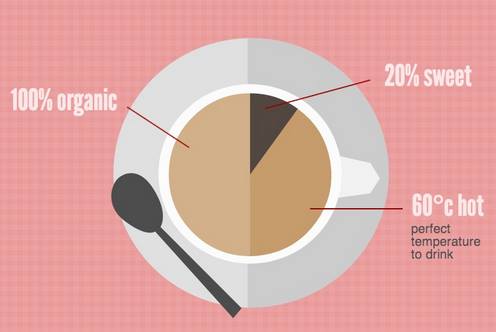
Never mind the fact that the percentages don’t fit the pie slices. Never mind that they’re using degrees celsius as if it was a percentage. What the hell does 20% sweet mean? That one doesn’t even make sense in isolation.
20% sugar by volume, maybe?
Half of the beverage is 100% artificial.
80% of the artificial portion is at a temperature of 60 °C, but it is not sweet.
Correction: Half of the beverage is less than 100% organic.
It’s so ridiculous, I can’t help but think it’s been designed to drive people mad in the same way as those memes with a quote from Gandalf attributed to Yoda next to a picture of PIcard.
What color does that organic part look to you guys? I see blue.
You mean it’s not a cute clock face?
Saad
You are wrong, wrong, wrong!!1! The organic part is obvously green!!
My guess is that is the formula for the Perfect cup of coffee.
But showing as a Pi chart is absurd.
My guess is that Bialystock & Bloom have ventured into the hot beverages trade.
So GMO is OK? Good.
It gets worse. The first use of it I can find is as a sickly Valentine’s card, comparing love to a cup of tea – and making a dubious ‘reduces type 1 diabetes’ claim for tea (there might be a benefit for type 2 diabetes, however).
Straining to be charitable:
It’s presumably the 3 reasons why the drinker likes the coffee, and giving proportions to them. If it wasn’t “20% sweet”, he’d like it only slightly less, since that’s a small slice of his enjoyment. If it wasn’t 100% “organic,” he’d only like it half as much, because apparently he buys into organic farming propaganda and has become oversensitive to the label, rather than the actual coffee contents.
PZ:
Dammit. I should have listened to you. I actually did think about it. Not _that_hard, but I still sat there trying to figure out what the fuck the image was trying to say. Haven’t gone mad yet though. I did throw my hands up in the air and give up.
I can’t even imagine what the thought processes were for whomever designed this abomination and whomever approved it. When the revolution comes, they WILL be the first to be stood up against the wall and shot!
That “c” should be capitalized for Celsius degrees. And I have seen one study that would move that up to 63 Celsius degrees – a round number is always suspicious.
That 20% wedge is nowhere near 20 percent. Why is the saucer divided as well?
If B. Kliban did pie charts, they might look like this.
@19
I think you have it with design it. It was designed as a graphic mostly that looked like a pie chart with no actual measurements included. I doubt the artist even understands what pie charts are outside an interesting graphic.
That graphic is to a real pie chart as the London underground stop chart is to a map.
uncle frogy
Assuming c is one full revolution of the speedometer needle, 60°c would be:
1⁄6 × c = 49965409.66 m/s
I’m so confused. The 60°c portion is actually 140°, the 20% sweet part is 11% of the graph, and obviously the 100% organic is only half.
I’m guessing that’s some of the tea approved by Prince Chuck that Comradde Physioproffe has in his latest post. It’s certainly in line with his (Chuck, not CPP) way of thinking.
https://proxy.freethought.online/physioprof/2015/04/07/fabuloso-tea/
the rest of the graphic isn’t any better
http://inspiredot.net/wp-content/uploads/2015/03/Crappy-Designs-That-Are-Too-Ridiculous-To-Even-Exist-5.png
oops http://piktochart.com/wp-content/uploads/2014/01/you-are-my-cup-of-tea.jpg
It’s not that bad. Saad explained it very well.
These are much better: Truth Facts.
I guessed that it represented a cup of coffee, didn’t think about tea but it works out the same either way. What goes into a cup of coffee… coffee beans (organic), sugar or artificial sweetener (organic), dairy product (organic), and water (inorganic). So, not 100% organic, and I doubt even half of it is ‘100% organic’ if you use that interpretation of the chart. So much fun to pick at trivial things.
The mildly deranged penguin points out the main clew to that pie, coffee, chart, and tea all being rubbish is there’s no cheese.
The real message: This cuppa costs $1 for the drink and $5 for the froth. Please pay up without further analysis of this graphic.
You’re all missing the point. The real problem here is that the spoon isn’t labeled.
WHAT DOES THE SPOON REPRESENT!?
It’s not a spoon, it’s a froth enhancer, a stirrers’ tool. It’s what you pay the most money for, the temporary use thereof.
The spoon is a lie!
That would be some pretty sweet tea. Just over 47 g per 8 ounce cup, or just under ten teaspoons.
I can think of several possibilities for what “20% sweet” means, none of which make enough sense to bother with.
Visualizations that make no sense.
It must be that “wellness tea” that I saw on one of the aisle signs at Whole Foods. The marketing folks were like, “How can we make tea even more pretentious?”
I hate the word ‘wellness’.
Who is responsible for that?
[Source]
Daz
I see your sensible and raise you knee-jerk
http://en.wikipedia.org/wiki/Wellness_%28alternative_medicine%29
chigau
Yeah, I hadn’t realised they were using it as the name of their treatment-methods. I’d assumed they were using it rather clumsily to mean ‘promotes a state of wellness.’ What a horrible mauling of language.
There is no spoon.
That’s a miniature lute.
Pass the tissues, my nose is bleeding.
WMDKitty
(/_o)(o_\)(/_\)
oh dear
what do you see?
chigau
Well, I tried to figure out that pie chart, and I think I burst a blood vessel…
@ brianpansky:
Win.
WMDKitty
ah. ok.
I thought it was that Japanese meme-trope about sexual arousal causing nosebleeds.
sorry
or
*winkwink*
It’s not a lute.
It’s the distal end of a Klingon warship.
chigau
I had one of those “If it weren’t for my horse, I wouldn’t have spent that year in college” moments.
https://youtu.be/sJ0s0KUUpxo
Being even more charitable:
I agree, it’s supposed to represent coffee. It is not, however, supposed to be one chart, but three, unwisely set into a single illustration.
The first chart is the left side of the inner ring, inside the cup. It’s the percentage of how organic the coffee is. Supporting this interpretation is that fact that does make up 100% of that “chart.” Maybe the saucer shouldn’t have likewise been colored, as that’s confusing, but, there it is…
The second chart is the right side of the inner ring, also inside the cup. That measures the sugar content of the coffee, and that is also an accurate number, being about 20% of that chart.
The third chart is the cup itself, with the handle deliberately designed to make the whole cup and saucer combination look like a control knob on a coffee maker or oven. This would probably be clearer if the temperature arrow was pointing at the handle and not on the contents inside the cup, but then again, it’s not the cup that’s supposed to be hot, but the coffee, so the artist was left with a choice of confusing alternatives.
Maybe this seemed clever at the time.
Or am I being too charitable?