![]()
A fascinating concept, and it’s rather fun to see a positive image of the future, like we did back in the ’70s. That said, just enjoy this, rather than be an asshole who just has to find fault with everything. You can read all about it at Dezeen.
![]()
A fascinating concept, and it’s rather fun to see a positive image of the future, like we did back in the ’70s. That said, just enjoy this, rather than be an asshole who just has to find fault with everything. You can read all about it at Dezeen.
Dezeen is not neglecting 4/20, they have an article up with their 5 top picks in the burgeoning weed business. Just a few here, click on over to see them all, and read about them!

Snoop Dogg’s Leaf Collection.
US rapper Snoop Dogg launched his Leafs line of edible cannabis products with packaging designed by Pentagram to skirt around US laws on controlled substances. The collection encompasses a variety of products containing cannabis, including chocolate bars, drops and gummy sweets, as well as boxes of flowers from various strains of the plant.

Jamie Wolfond.
Canadian designer Jamie Wolfond designed this simple glass pipe for smoking accessory brand Tetra. Crafted from borosilicate glass that doesn’t conduct heat, the pipe features a short stem pointing downwards, a long stem from which the smoke is inhaled, and a shallow chamber to hold the user’s substance of choice.

Printabowl.
Seattle startup Printabowl intended these water pipes for smoking pot to be put on display rather than be hidden “in a shoebox under your bed”. Each 3D-printed bong features a designs that references organic forms, such as angular crystals and rippling liquid.
It’s 4/20, if you have it, smoke it, and get your art on. There’s a lot to explore in the world of art and weed. We start with an exhibit at the Chesterfield Gallery in New York, with their show, Lit!

David Colton, ‘Untitled 2.’ Images courtesy of the Chesterfield Gallery.
You can see and read more here.

Sergio Garcia.

Illustration by Lia Kantrowitz.
Where the hell does “Roll It, Lick It, Smoke It” actually come from?
Nico Mazza.
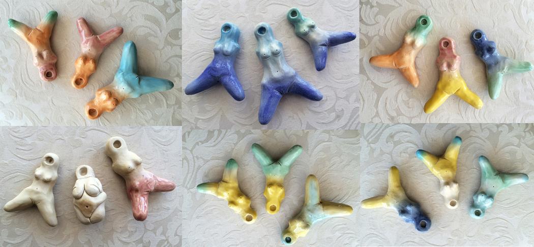
These Pussy Pipes Remind Us “We Have Been Smoking Out Of Dicks”.
Also see:
Zooted Illustrations Depict Everyday People Smoking Weed at Home.
Miniature Weed Worlds Blend Tiny Toys and Stoner Humor.
Traditional Chinese Paintings of Cannabis Aim to Change Perceptions About the Medicinal Plant.
Weed-Friendly Art Classes Invite People to ‘Puff, Pass & Paint’.
“PeopleIRollOn” Gives Celebrities the Best Weed Beards on Instagram.
Magnetic Putty Magic (Extended Cut) | Shanks FX | PBS Digital Studios from Joey Shanks on Vimeo.
I have got to get some of this stuff. What a cool toy. And if that’s not enough, let’s visit some more wonderfully psychedelic ferrofluid art:
I recommend watching that full screen.
The combination of microscopes and magnetic ferrofluid produces results that indistinguishable from magic—and stunning CGI—in this new short from chemist-turned macro photographer Linden Gledhill and Concept Zero founder Nikola Ilic. The only added ingredient Ferrofluid Magnified needs is a big bowl of something psychoactive, and you’re off to never neverland.
Gledhill is known for his stunning, pearlescent images of objects that are unexpectedly beautiful under a microscope, such as DNA and butterfly wings. He mixed ferrofluids, which are full of nanoscopic magnets, with solvents, gels, paints, flowers, and LED lighting for added trippiness. Prints on canvas from the film, which will fund the duo’s next collaboration, are available here.

You can see and read more about magnetic putty here, and about the ferrofluid art here.
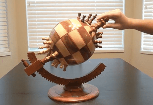
Photography and media by Ben Meyers.
Here’s a new way to look at, and play chess!

Look very carefully, that’s not a parrot. Give yourself a treat, and go explore the magic that is Johannes Stötter Art! And don’t miss the Chameleon!


What America’s National Parks will look like by 2050 if we fail to act against climate change.
Hannah Rothstein has taken some of the iconic WPA (Works Progress Administration) National Parks Posters, from 1938 to 1941, and updated them to 2050 and a catastrophic future if we do not act on climate change. It’s a striking and effective way to get the message across, because the art and legacy of these posters is so well known, and they are beloved by many people. The WPA posters were a message and invitation to weary, beaten down people dealing with the Depression, that there were wonders, come and see! They were a promise of hope, of a better future. Now we have too many people who are actively denying climate change, or apathetic about it, little realizing that yes, it will most certainly impact them, and not in a good way. These re-worked posters are as brilliant as the originals, reminding people that if we choose to not act, we are inviting the harbingers of doom. These are a call to action, and I hope they start popping up all over the place.
You can see all of the posters, and purchase an original or fine art print here.
Via Raw Story.

Three Dotty Foxes in the Pines.
The textural, nuanced scenes of brightly colored, frolicking creatures look collaged out of paper or brushed onto canvas, but in actuality, Michèle Brown paints with pixels on an iPad. A former art teacher and typography-trained artist who worked in fine art for most of her adult career, Brown was forced to pivot her professional and artistic goals due to an unexpected change in her health.
“I had to stop working because of a long-term illness,” Brown tells Creators, “which only allows me to be out of bed for about five hours a day. When the iPhone came out, I started playing and drawing on it while I was bed bound, and really got into it when the iPad first came out. I have tried all sorts of styles with it, but it really seems to suit my illustrative and imaginative side.”
Brown’s scenes evoke children’s book visuals are defined by an earth-toned texture and warmth. Her individual artworks often include imagery of wide-eyed animals that slice together large swaths of color, coming together in a scene that mimics a paper mâché or acrylic piece, but in reality, is a work of tablet and iPhone artistry. Brown’s fine art offerings are similarly immersive. Less amiable and imbued with their own unique texture, the artist’s fine art works possess a different lexicon of shape and form. Based in Cornwall, the British artist grew up both in France and the UK and has honed her bilingual skills and understanding of both cultures.
“I’ve created an imaginary world which I call Spottyland because of one of the first characters to come out of it, Spotty the fox. Nothing awful happens in Spottyland; the animals can be a bit naughty, but they are all vegetarian and underneath they have hearts of gold. Humor is a big part of what I do. I’ve been influenced by cartoon strips and dreadful puns, but only if it is kind. I like to make people smile and bring a bit of lightly mischievous harmony to the world. It is a place of safe retreat in an increasingly uncertain world.”
You can see and read more at The Creators Project. To see more works by Michèle Brown, visit her main Instagram, as well as Spotty the Fox’s website, and Brown’s fine art Instagram.
WHO’S AFRAID OF RED, YELLOW AND BLUE: Citydressing Campaign / Mondriaan to Dutch Design / The Haque (NL) 2017.

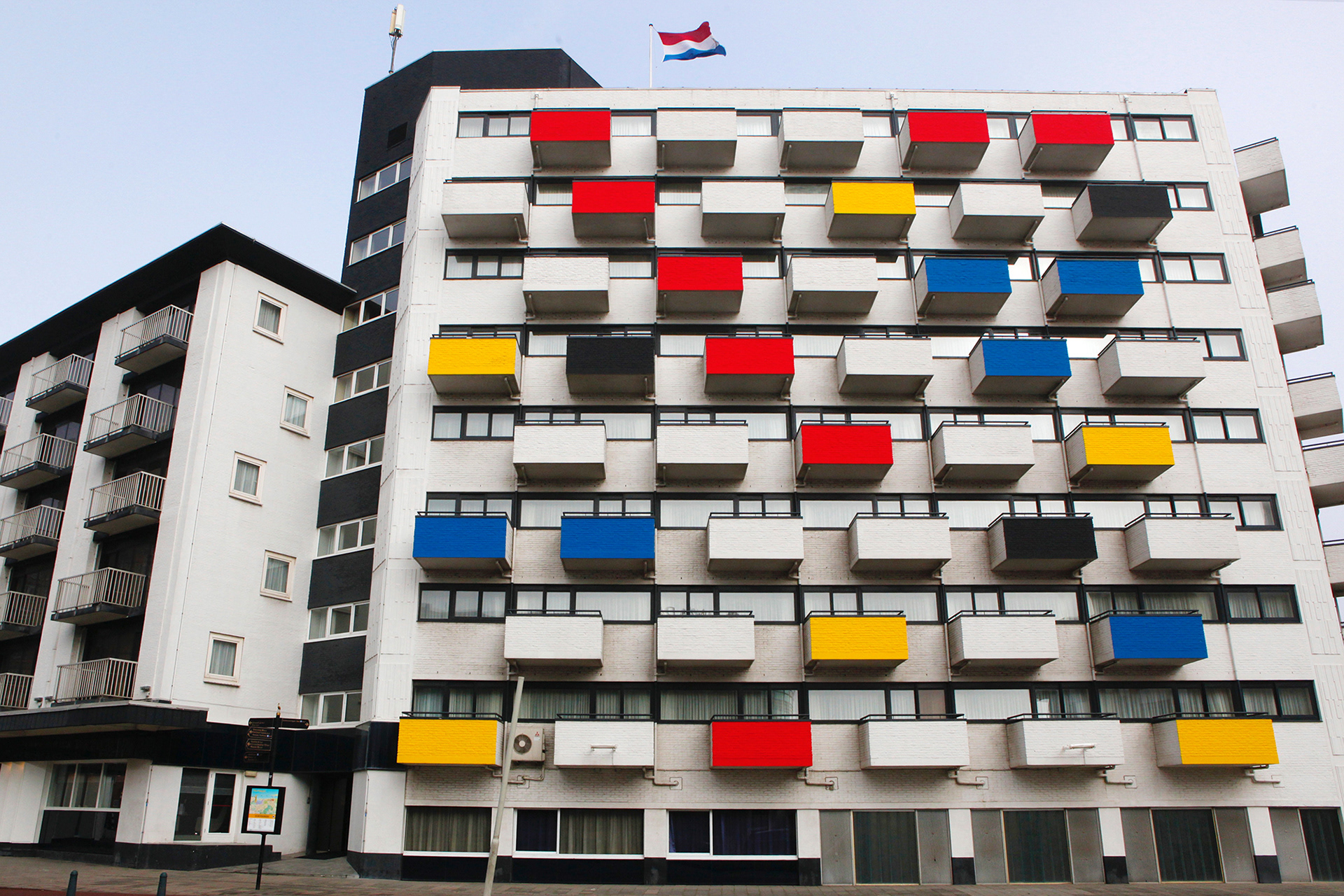
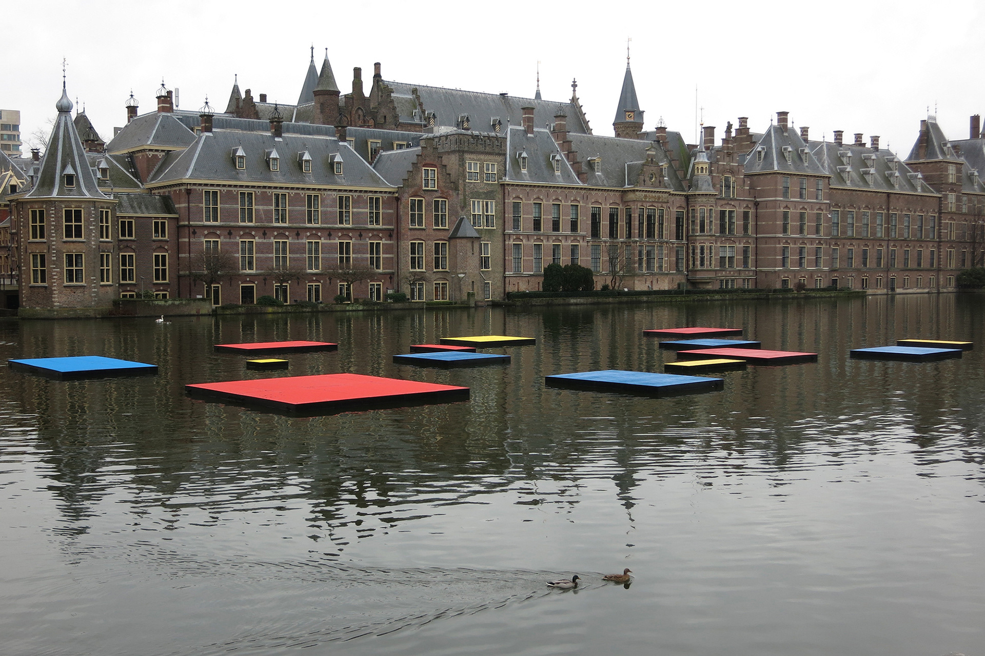
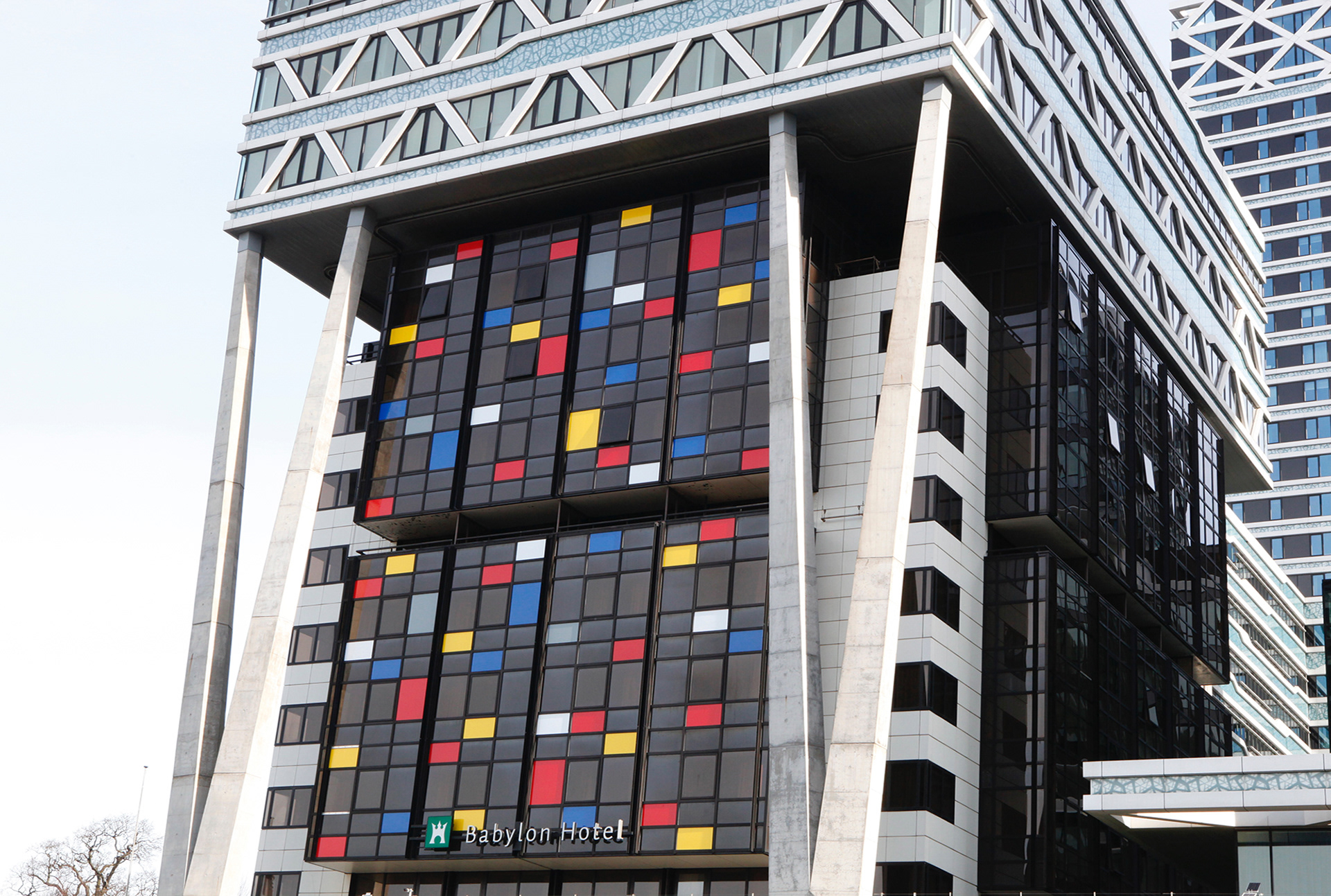
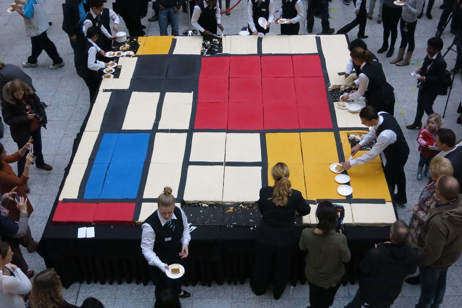
THE CITY AS CANVAS
Dutch art movement De Stijl was founded one hundred years ago this year. Inspired by Stijl artist like Piet Mondriaan, Bart van der Leck, Gerrit Rietveld and Theo van Doesburg, studio VOLLAERSZWART developed this citydressing campaign to “Mondriaanising” The Hague.FREESTYLE
To start the citydressing for the celebration of the theme year “Mondriaan To Dutch Design, The Hague unveiled the largest Mondriaan in the world. The painting with the familiar red, yellow and blue surfaces and straight lines is being exhibited in one of the city’s most striking buildings: City Hall. A unique composition, precisely because of the combination of Mondriaan’s work and the iconic architecture of architect Richard Meier. The Hague City Council decided to honour the world renowned artist, as Gemeentemuseum The Hague has no less than 300 of his paintings in its possession. The design was created by artists Madje Vollaers and Pascal Zwart of Studio VOLLAERSZWART. Last weeks, a number of prominent buildings and locations in The Hague got a Mondriaan / De Stijl makeover.Special Thanks to: Gemeentemuseum The Hague, Municipality The Hague, The Hague Citymarketing and Cubord Signmakers.
What an amazing celebration! I love all of it. There’s much more to see at the website!
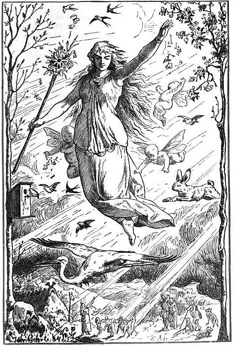
“Ostara” (1901) by Johannes Gehrts.
Eostur-monath, qui nunc Paschalis mensis interpretatur, quondam a Dea illorum quæ Eostre vocabatur, et cui in illo festa celebrabant nomen habuit: a cujus nomine nunc Paschale tempus cognominant, consueto antiquæ observationis vocabulo gaudia novæ solemnitatis vocantes.
Eosturmonath has a name which is now translated “Paschal month”, and which was once called after a goddess of theirs named Eostre, in whose honour feasts were celebrated in that month. Now they designate that Paschal season by her name, calling the joys of the new rite by the time-honoured name of the old observance. – Bede, in De temporum ratione.
Don’t know about you, but Ēostre has smiled upon me, the sun is shining today! Hope everyone has a lovely day, and remember, Jesus is mything in action!
Descent of Night. A very hurried shot, rain still threatens. Now, all I need are some trifolds and good weather to get a good shot. Click for full size.

Descent of Night, acrylic and ball point pen on gesso panel, 18″ x 24″. © C. Ford, all rights reserved.

Azuma Mokoto and Shiinuke Shunsuke.
Need to brighten up your universe and recapture a sense of wonder, delight, and glee? Look no further than AMKK, a world of intense, joyful artistry and botany. They are featured on The Creators Project, where you can see so much, and read all about these magical artists, then you can go and wander over to their website, and get absolutely lost in the most amazing, oh, well, just have a wander, it will do your non-existent soul so much good!
The right side stars on Descent of Night are done. On to the sinister side! Click for full size.

Descent of Night © C. Ford, all rights reserved.